

Play asset pack
Avatar Link Room's itch.io pageResults
| Criteria | Rank | Score* | Raw Score |
| Project Documentation | #11 | 4.000 | 4.000 |
| Final Presentation | #23 | 3.000 | 3.000 |
| Research + Development | #24 | 3.000 | 3.000 |
| Creative Development | #48 | 2.000 | 2.000 |
| Overall | #48 | 2.600 | 2.600 |
| Technical / Workflow | #68 | 1.000 | 1.000 |
Ranked from 1 rating. Score is adjusted from raw score by the median number of ratings per game in the jam.
Judge feedback
Judge feedback is anonymous.
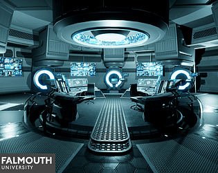
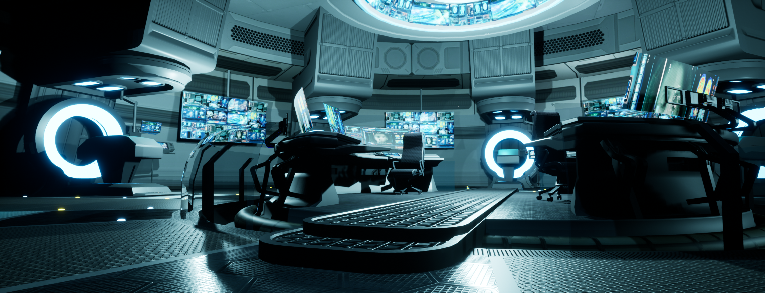
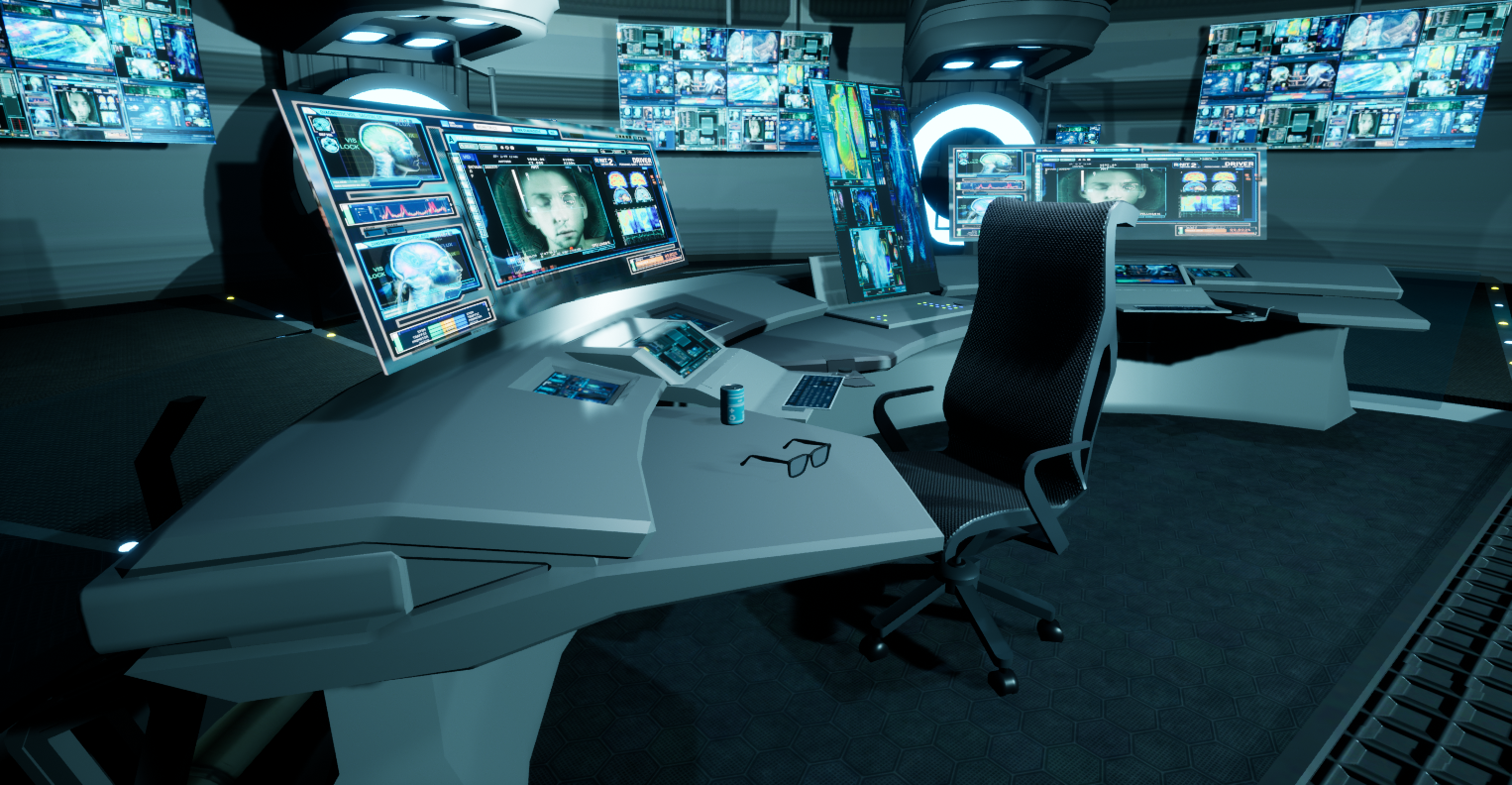
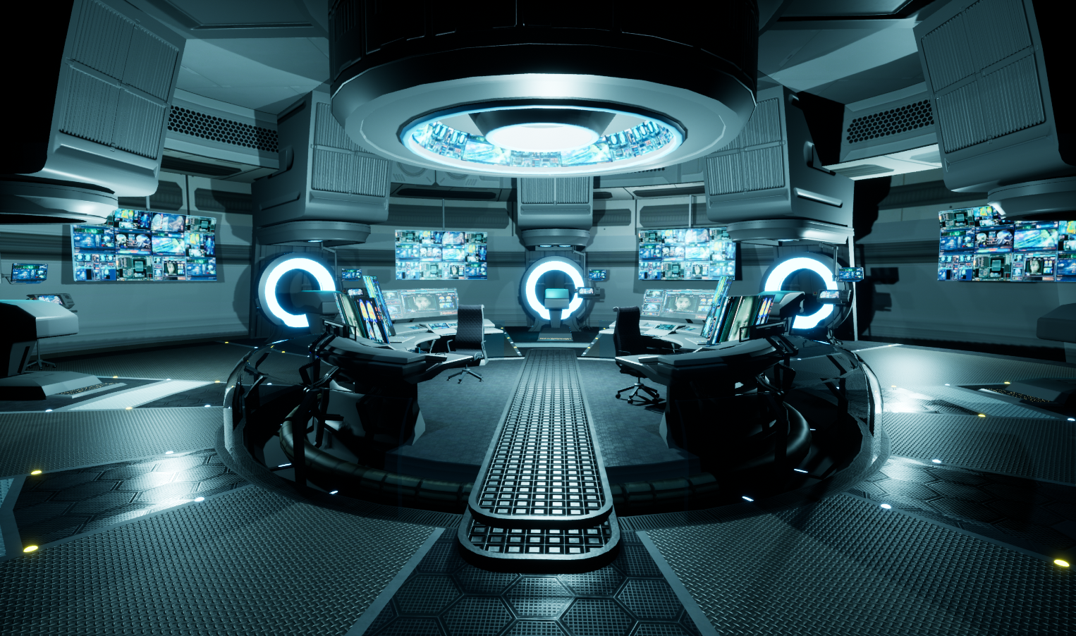
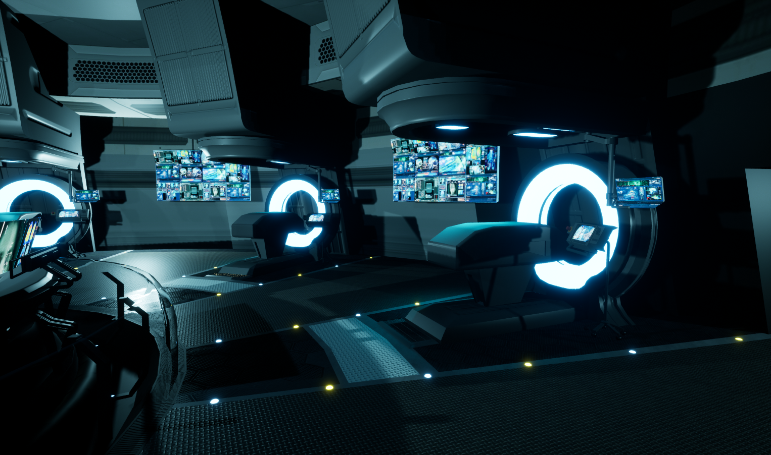
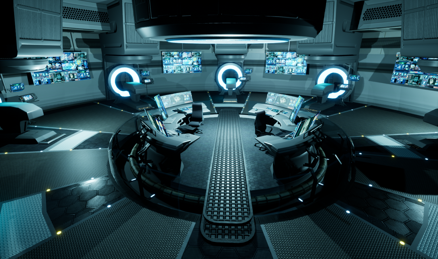
- Part 1: R&D Pre pro work In terms of R&D and basic prepro research it seems pretty on point a lot of dissecting of shapes and references to get shape and scale correctly which is great to see, the minor inspirational changes from both the movie and ben procters work is always a nice take but would have personally loved to have seen more personal input in the reworks. A minor gripe would be here don’t always just look at source material -> look at what inspired the source material go a level deeper. Look into actual MRI machines and how they are made as that would help solidify your build, look into monitors and their build up to make it more believable especially as you don’t want to strip out details verbatim from both concept and movie. Am lacking also general texture references (references to denote what kind of material make up you will want to do or follow again other then main references) look up used equipment, used MRI machines and so on. Also lacking lighting references, look up rooms with lightings you would like to mimic as the lighting (a point I will come back to on the follow parts) In general, a good amount of research but very narrow in scope and a bit too focused on the source material (11/20) Part 2: Creative Art Looking through the document there is a minimal amount of attempts to break outside the confines of the theme and topic they picked no real heavy redesigns of equipment or of the room, they did limit themselves in that regard by picking and focusing heavily on the source material. Personally would have licked to have seen. A lot of the assets as well executed don’t get the opportunity to shine properly due to lacking technical use cases (which I will address also in the following technical parts). Not majorly creative shapes or designs, a lot of the items seem like they wouldn’t work unlike in the movie they try and ground it still within believable tech. Creatively not a lot of risks taken here and a bit closer to the source material, try and give it your own spin look at references and blend them together and ground them. (8/20) Part 3: Technical Art This is where I feel its going to be a lot to digest, technically there is a lot lacking and this is in due to what I feel is lack of knowledge which is why were here. A lot of aliasing but a lot of it, and that is easily remedied using just more geo, were entering an age/generation where polygons are getting cheaper so don’t be afraid of adding edges and triangles where needed. Nanite is going to be the norm in the following generation so push those silhouettes more. General modeling seems fine but a lot of hard edges and chamfers that are kind of just unacceptable. Working in a modular setup you should have cohesion and uniformity and find a way to blend it all together using a mixture of techniques - Trim sheets - Tillable textures - Weighted normals - Baked normals - Decals Sheets - And many more (you can think outside of the box here) But not a lot of it is shown here and those that are shown are used incorrectly. Trim sheets – texel density is way off. Edges all hardened no baked details whatsoever except on some assets and they are used incorrectly. UVS that are stretched and warped on screens and reused screen over and over in the exact same setup. Chairs that are heavily aliased Materials that feel off Artifacting on certain assets Lighting feels a bit off as well, no general base global lighting it all feels extremely point heavy with spotlights. A lot to dissect and a lot of it are small things coming together to put the whole scene a bit off balance. The quality of assets are a bit too ranged between them as well. General assessment: the quality of each technical aspect is ranging heavily and it puts a heavy load on the final product and its something that should be addressed when possible as the new generation of in-house pipelines are not only more high fidelity but also more focused on cohesion. 5/20 Part 4: Documentation Documentation has been good, showcasing every step of the way in a week by week basis which is good. In a work setting you are entrusted to get the job done on your own with the occasional feedback session or required question here or there. The way the documentation is well done and clean, using a website is very lovely and it is clear they had fun working on it which is always important. Very in depth explanations on every week basis as well shows the mindset they had as they worked on it and the issues at hand and how they tried to address it. Also showing repositories and screenshots of their work ethic is always a plus in my book and anyone in the industry would appreciate this work ethic. Can always add more info or concepts but what’s here is great and should be continued. 16/20 Part 5: Final presentation I find the presentation to be fine but the project itself just doesn’t cut that fine line and just feels overall lacking, the work ethic is there but some techniques should be refined and pushed for an overall better final. 11/20 Final Score – a good start and a lot of wiggle room to expand your skillsets from this point forward 50/100
Challenge Tier
Rising Star
Chosen brief
Environment Art (Standard)
Leave a comment
Log in with itch.io to leave a comment.
Comments
No one has posted a comment yet