Play asset pack
A soldier's Workshop's itch.io pageResults
| Criteria | Rank | Score* | Raw Score |
| Creative Development | #6 | 4.000 | 4.000 |
| Research + Development | #10 | 4.000 | 4.000 |
| Final Presentation | #12 | 4.000 | 4.000 |
| Overall | #25 | 3.400 | 3.400 |
| Project Documentation | #33 | 3.000 | 3.000 |
| Technical / Workflow | #51 | 2.000 | 2.000 |
Ranked from 1 rating. Score is adjusted from raw score by the median number of ratings per game in the jam.
Judge feedback
Judge feedback is anonymous.
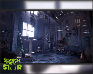
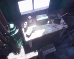
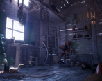
- Hi Tashan! Firstly, well done for doing such a good job in such a short timeframe! I loved the video: the composition was strong and the music complemented it very well, definitely one of the strongest parts of your submission! :) In my opinion, your research and development was there, but needed a little more. Overall, the composition of the scene is great and it’s clear where you have pulled inspiration from the references. In future it is very important to have references for individual props, including having references for small details such as rust on an axe. When aiming to make something look realistic it’s all about these finer details, so building up a catalog to pull from at any time will be beneficial in both the short and long term. This feeds into the textures. The placement of the dirt marks/rust can be a little overwhelming at times. Try dialing back on these to rethink where the dirt/rust will naturally fall e.g. instead of dirt on the front of the axe, having it in old crevices would be more true to reference. Furthermore, having a bit more colour variation in the wood would add that extra interest/variance. For future documentation it is also very important to show your texel density. The scene needs to have a set texel density you should aim to stick to, regardless of map size. For example, the hero prop looks a little blurry compared to its surroundings. Don’t be scared of having to use a 4k map to make sure you can fit everything on one texture set, but just make sure the texel density is consistent. Creatively, I really enjoyed seeing you recreate Jakub Rozalski’s style. The scene does have a strong atmosphere- well done! It’s great to see you using shaders such as the fog on the floor to add to this, along with utilising unreal’s post processing. To create an even stronger atmosphere, focusing on building a story with the lighting would push your submission to the next level, the harsh white light does wash out your textures slightly so just watch out for that! Personally I think it's very cool that you worked from mostly photos for the cabin! You’re definitely on the right track but the wireframes could do with some work. It will show a good sense of optimisation if you can get all the assets to be consistent in terms of geometry detail. When parts of the mesh have so many polys that the wireframe becomes indistinguishable and the silhouette doesn't need that much detail, something needs to be done. The hero prop and radio are big culprits for this. They look more like a highpoly waiting to be baked into a normal map than a game-ready asset. Welding together edge loops which don’t add to the silhouette will really help, so you don't end up with a small detailed prop having the same count as the other half of the scene. Overall, good presentation pdf, clear and pleasure to read :) I absolutely loved the video! Being really nitpicky, I would have tuned the glare/light flares a little but overall brilliant! I would have liked to see a little more technical breakdowns including tri counts, map sizes used, texel density etc, but it was nice to hear your thought process.
Challenge Tier
Search For A Star
Chosen brief
Environment Art (Standard)
Leave a comment
Log in with itch.io to leave a comment.


Comments
No one has posted a comment yet