


Play asset pack
Origin 520 EVO's itch.io pageResults
| Criteria | Rank | Score* | Raw Score |
| Research + Development | #1 | 5.000 | 5.000 |
| Creative Development | #3 | 4.500 | 4.500 |
| Overall | #4 | 4.400 | 4.400 |
| Technical / Workflow | #4 | 4.000 | 4.000 |
| Final Presentation | #7 | 4.500 | 4.500 |
| Project Documentation | #11 | 4.000 | 4.000 |
Ranked from 2 ratings. Score is adjusted from raw score by the median number of ratings per game in the jam.
Judge feedback
Judge feedback is anonymous and shown in a random order.
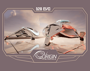
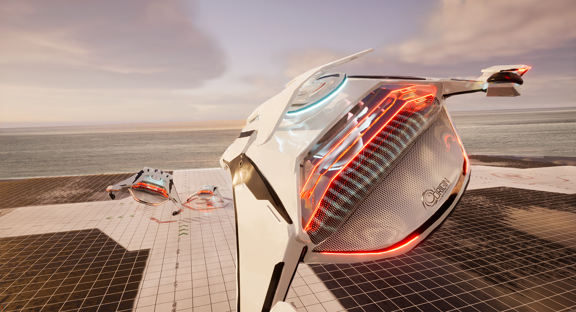
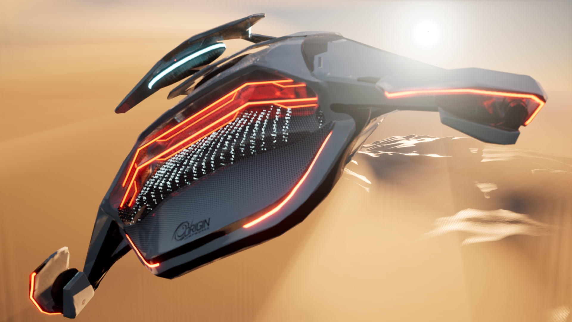
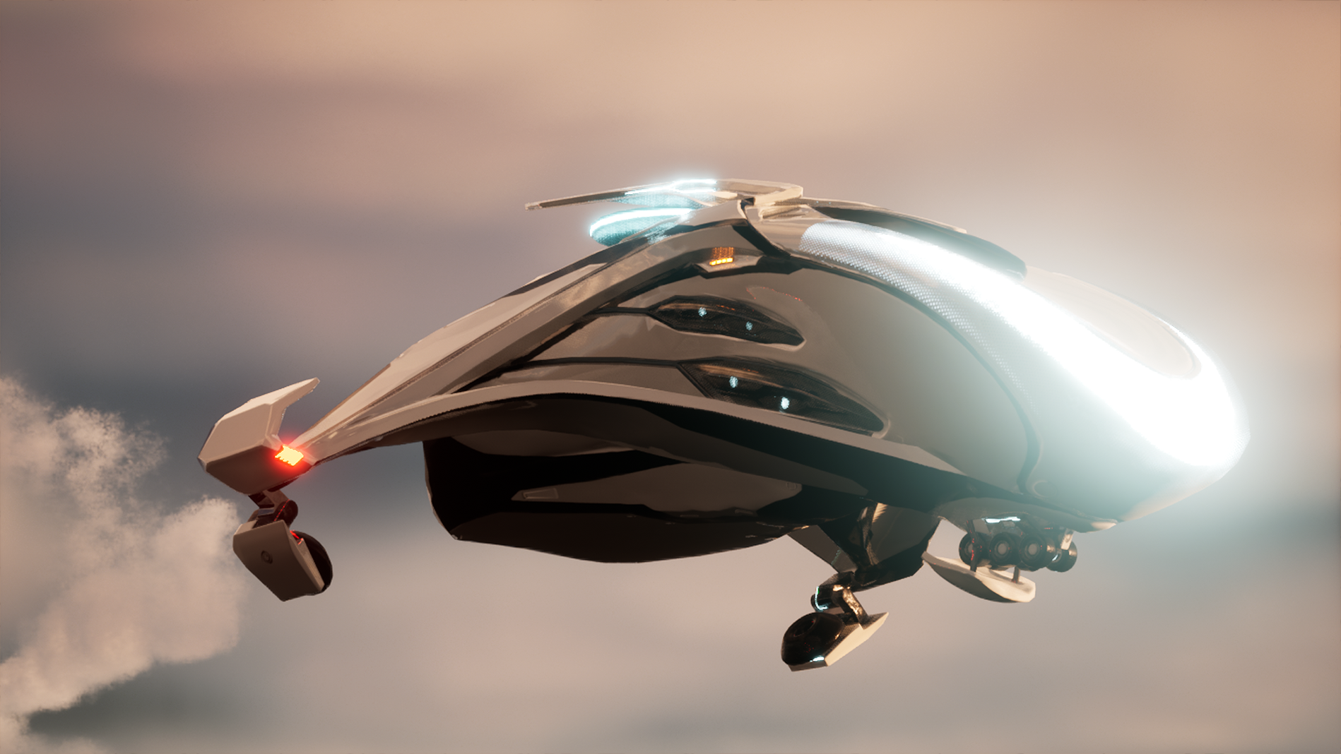
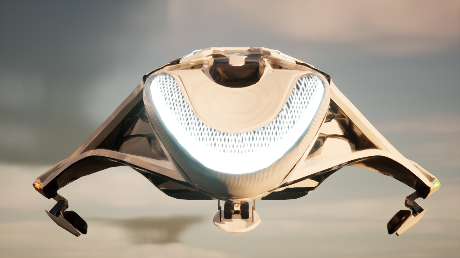
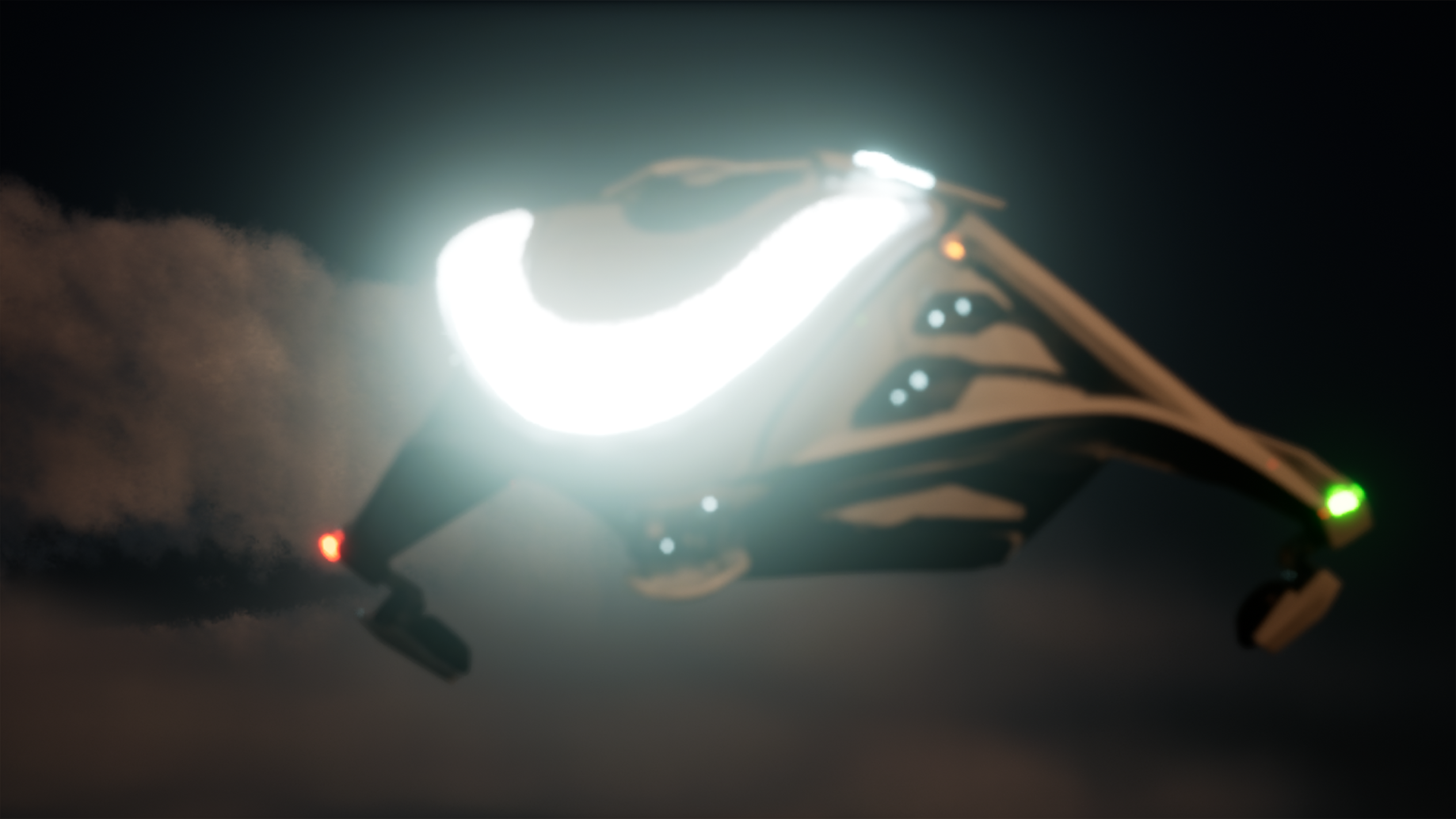
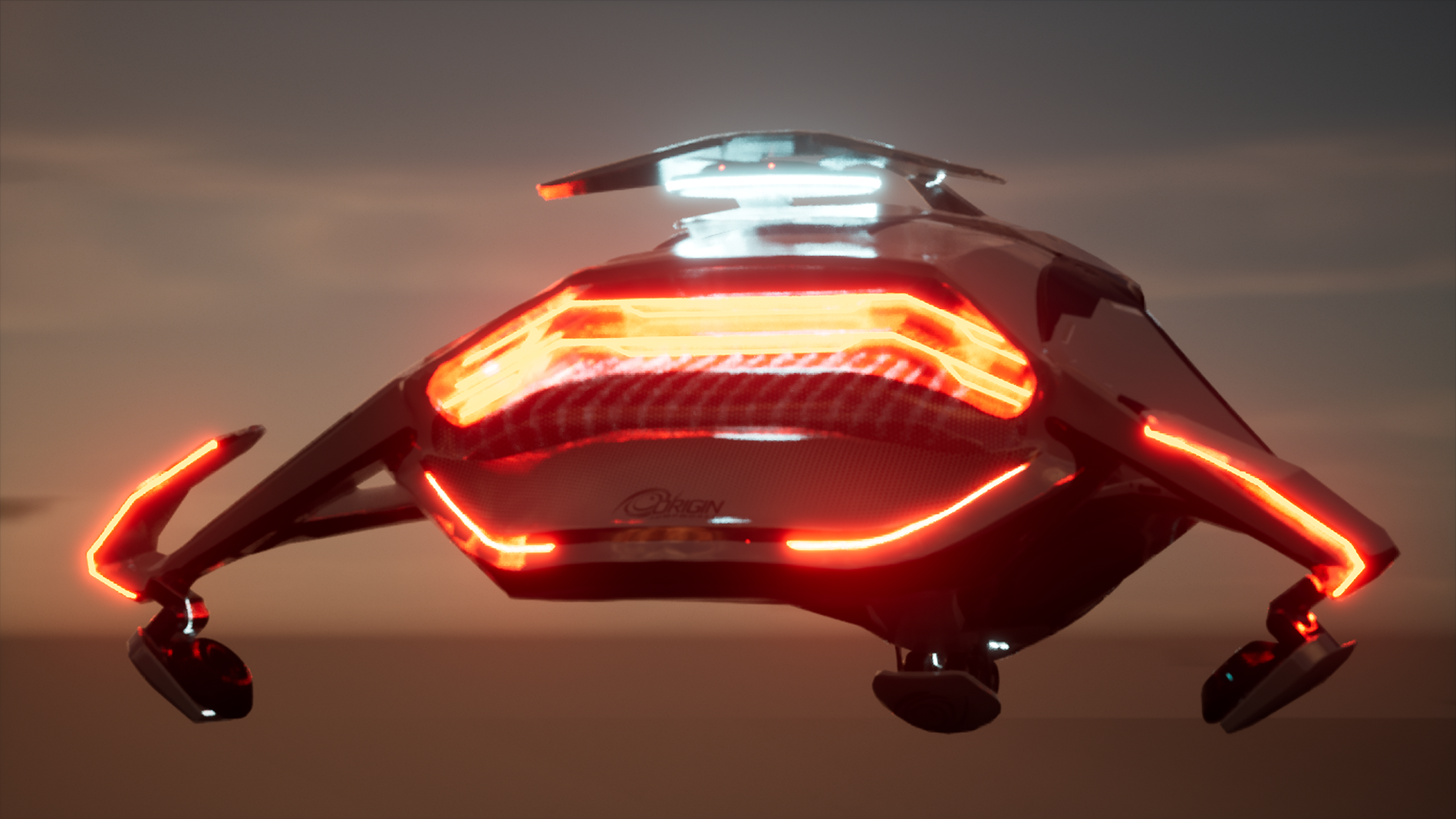
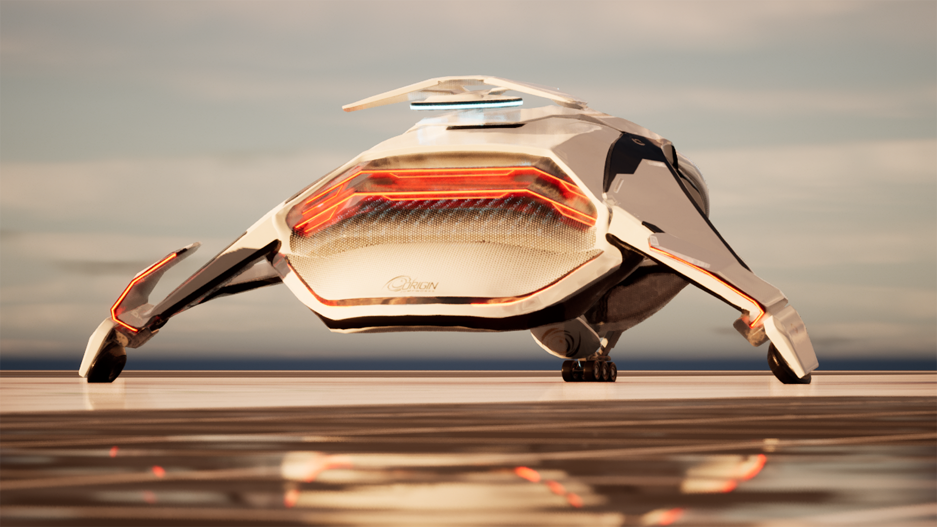
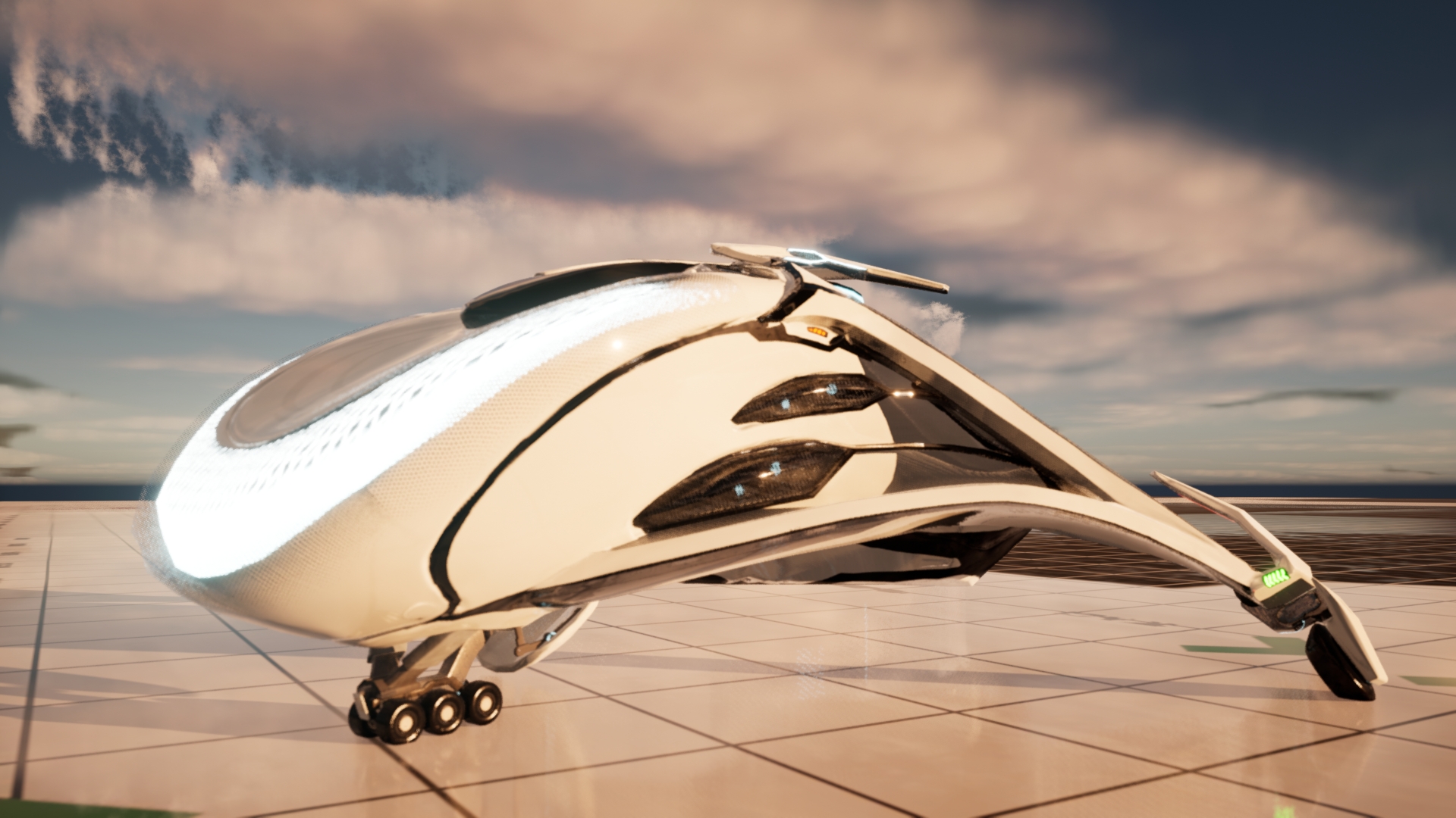
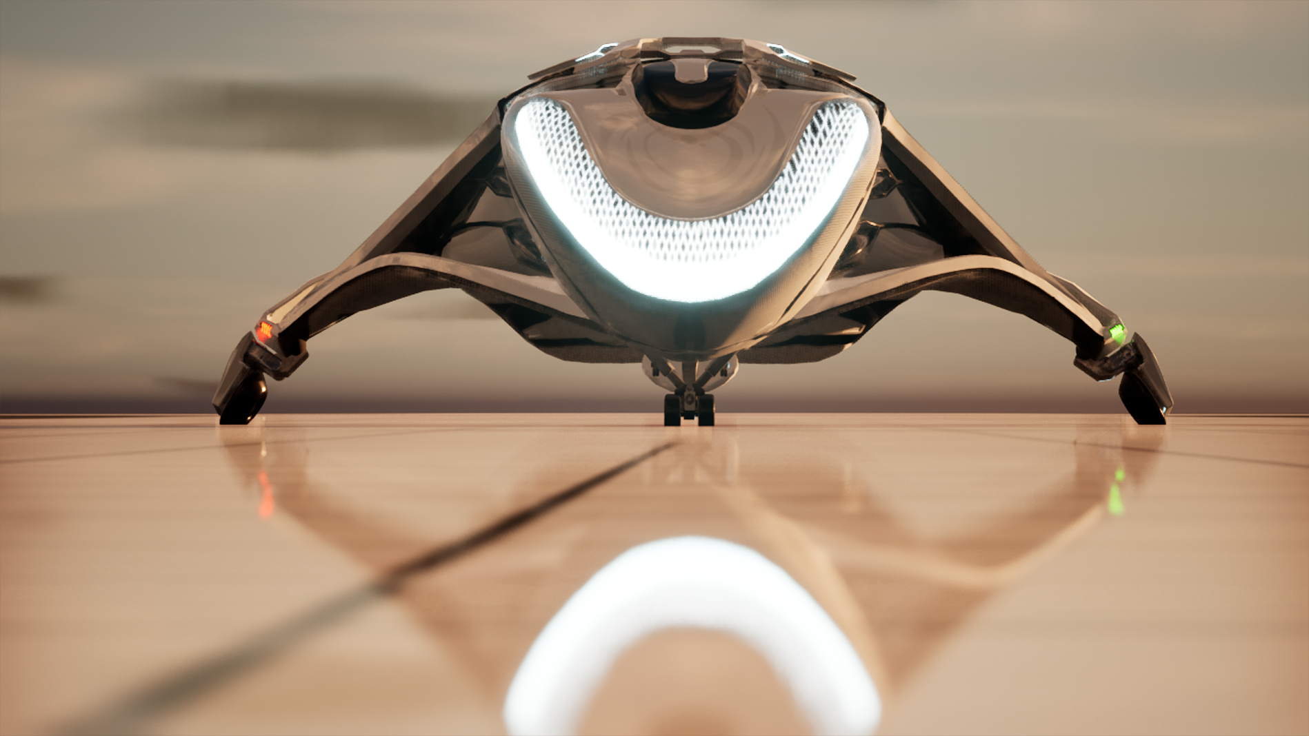
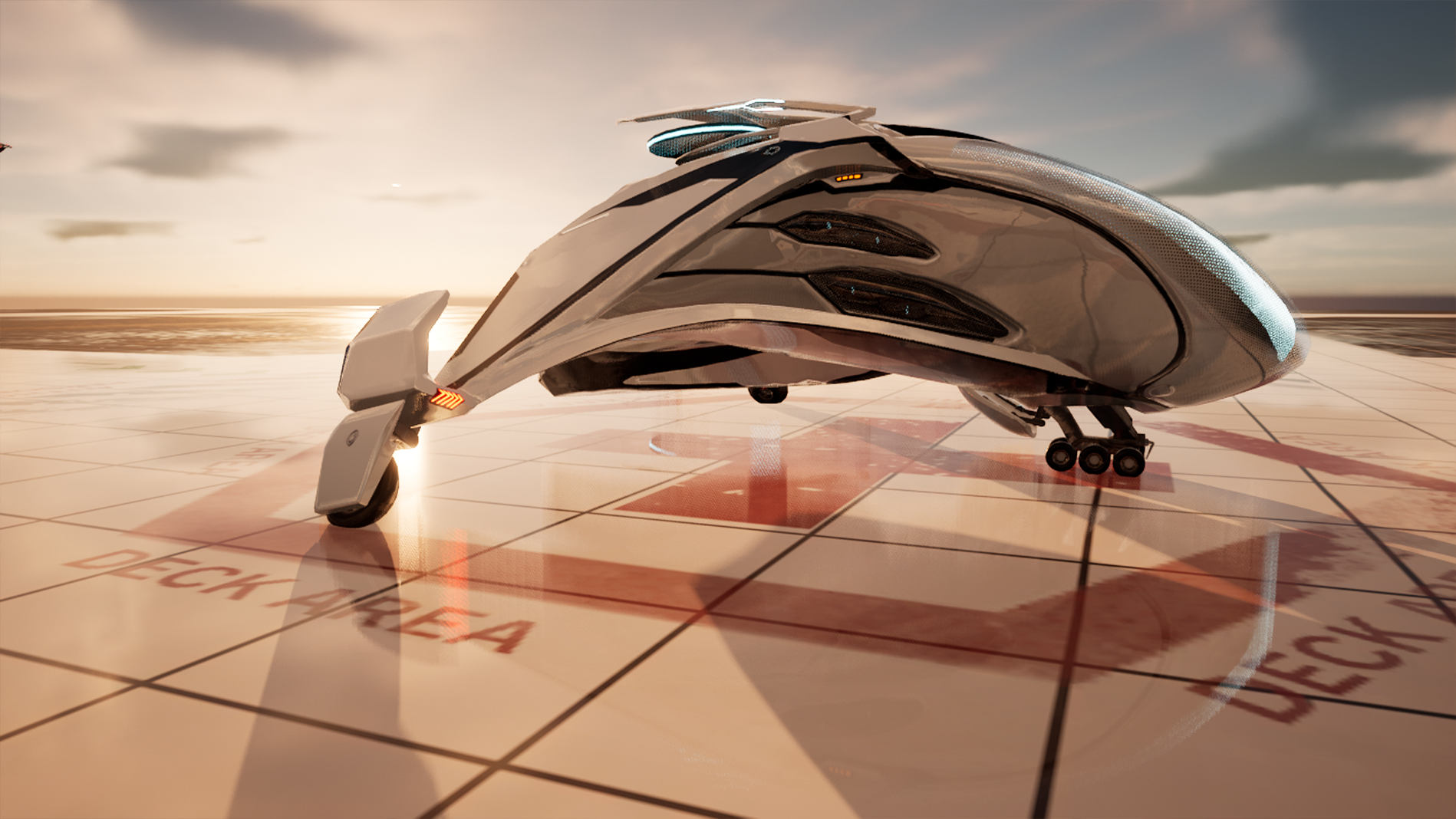
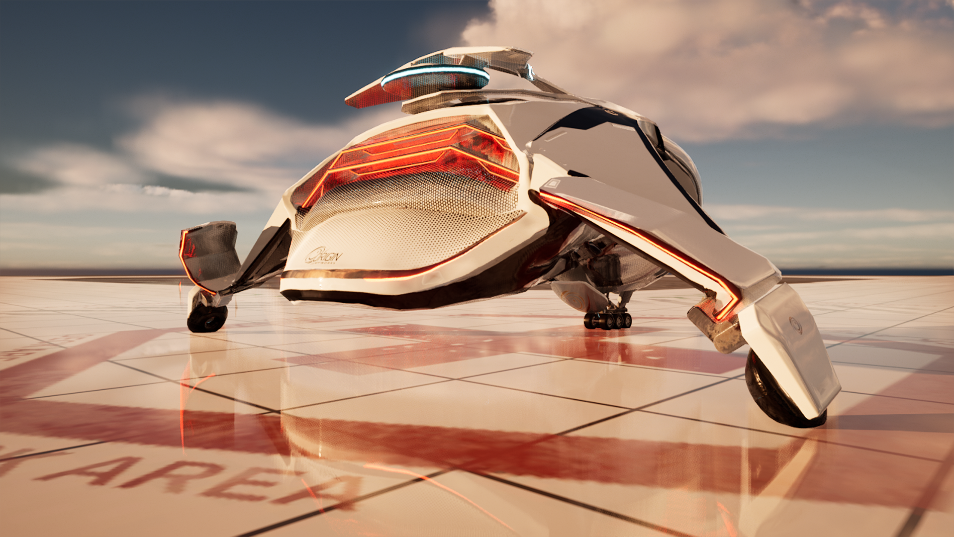
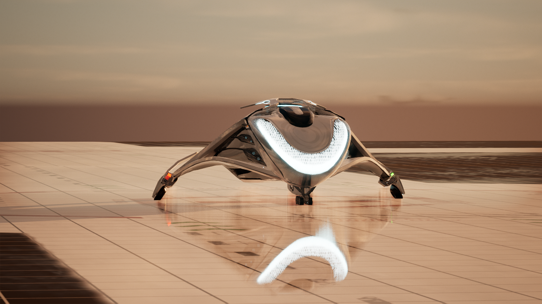
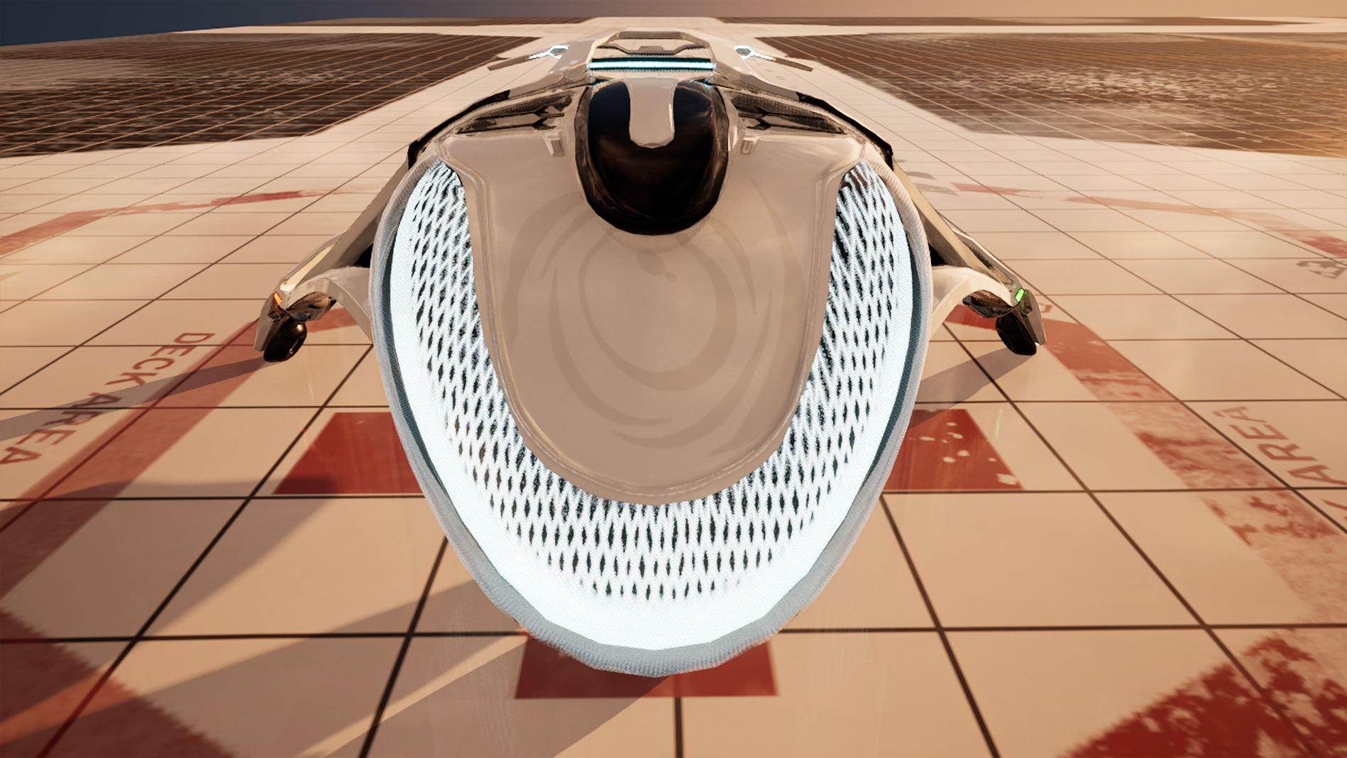
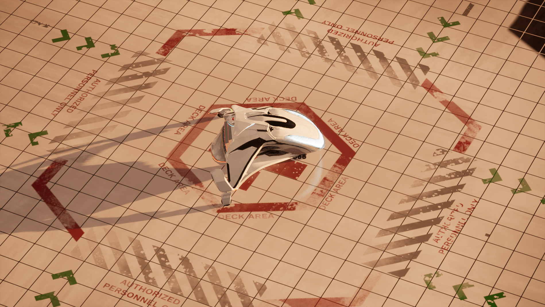
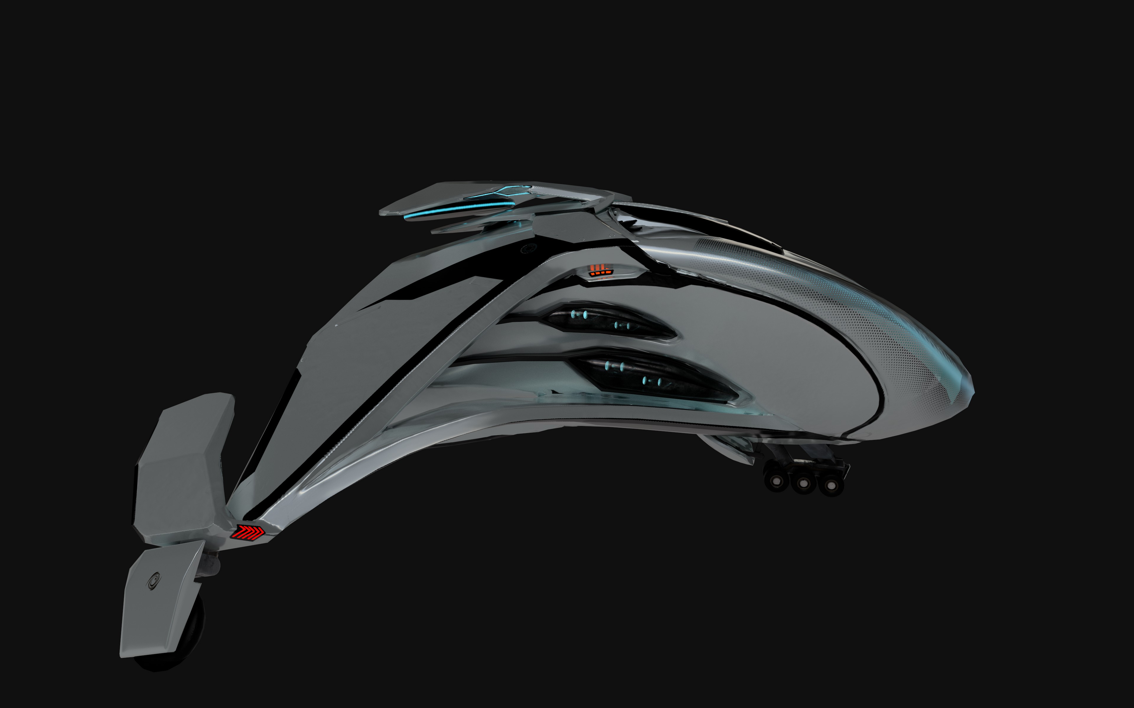
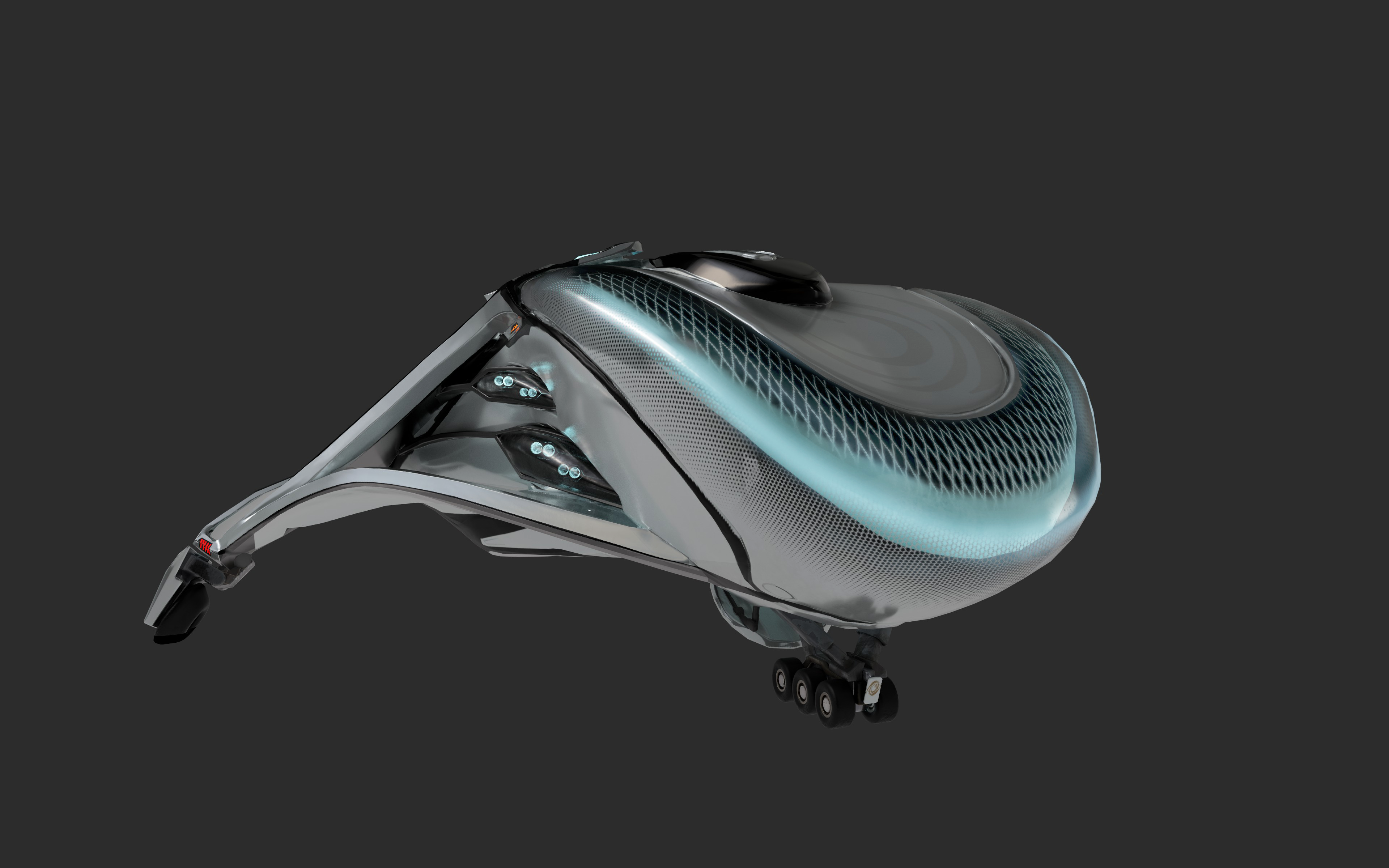
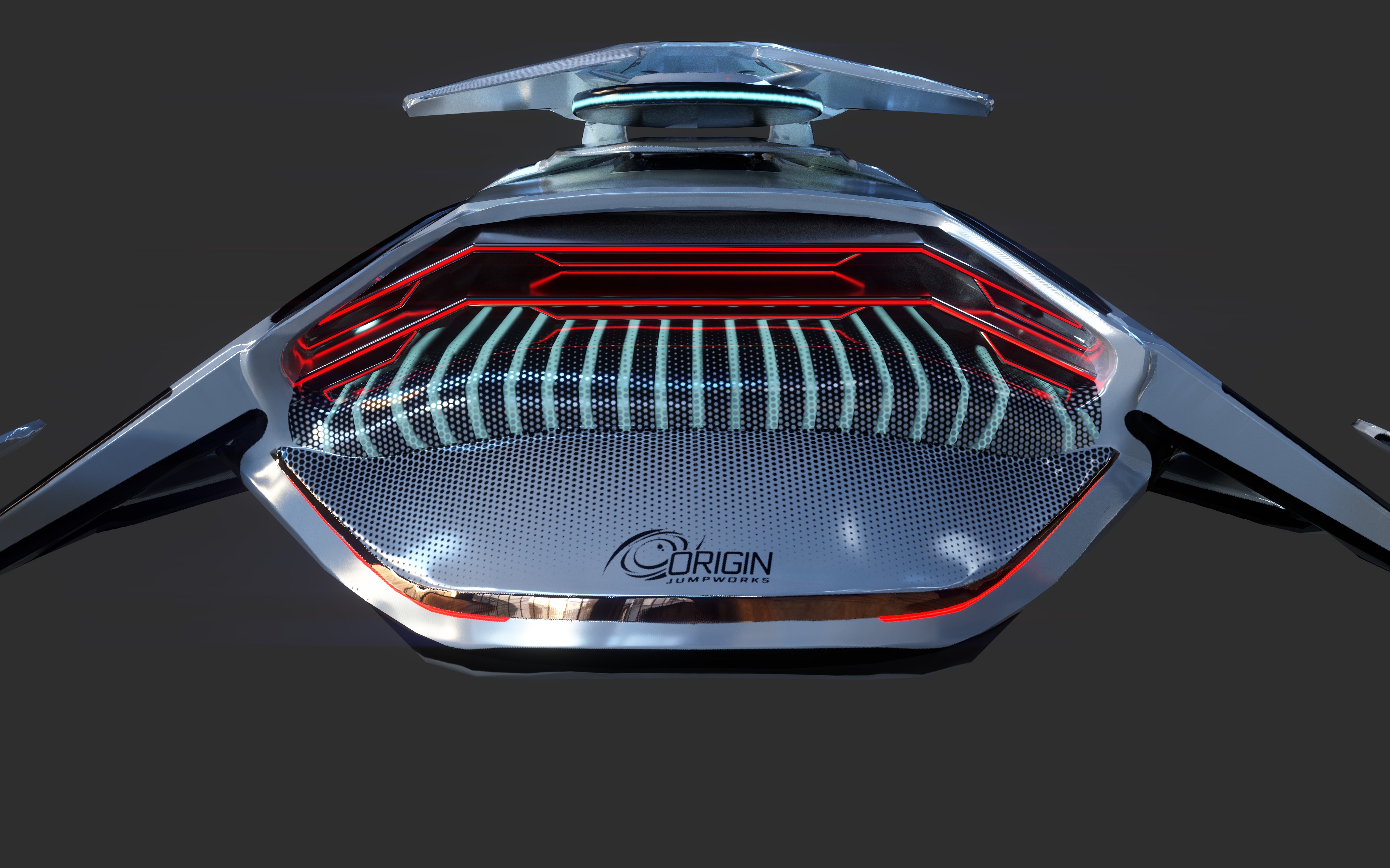
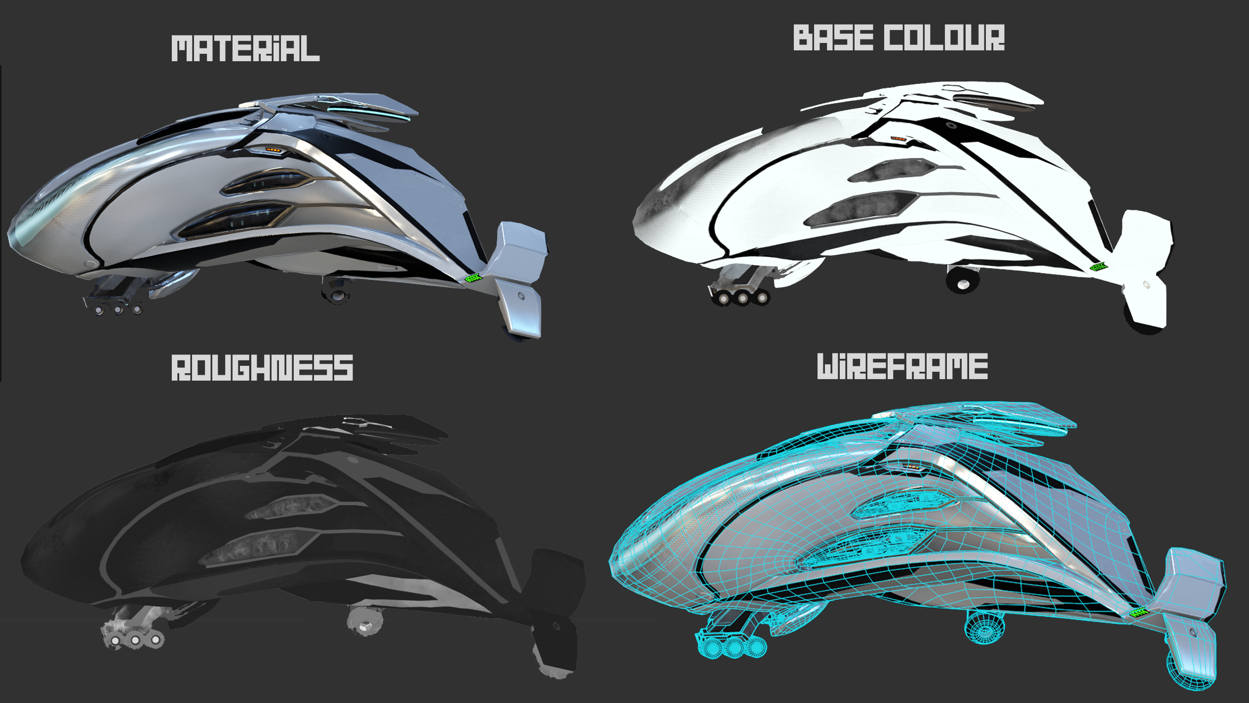
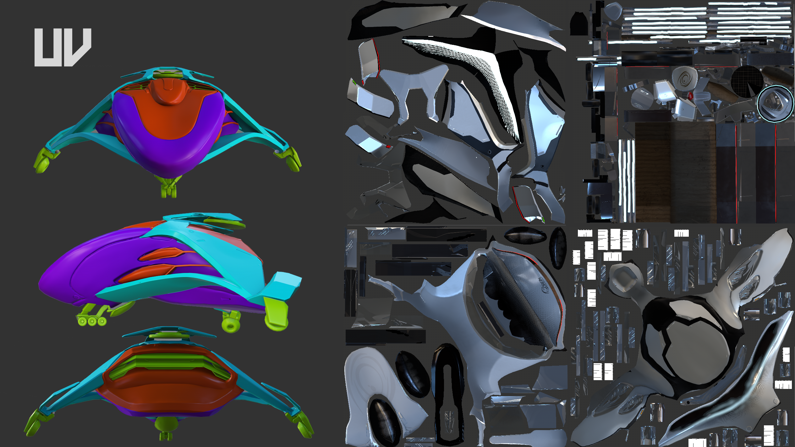
- I have included a more specific half rating in the feedback to give you a better idea of where you sit as the 1-5 system felt quite limiting with the criteria assigned to each star. The official star rating shall be similar to the overall score. R&D 4.5/5 There was a good amount of focused reference gathering. Reference contained both origin ships and real-world references. The shape was focused around an eagle and orca which came across in the design. Reference was clearly used at various stages throughout the process with various details drawn from real-world examples. The concept displayed some of the key design cues from origin however one issue for me is felt a little bit too bulky compared to most other origin ships due to its length/width-to-height ratio Creative 4.5/5 Manufacturer Style - The design feels interesting and unique due to the natural curve while still feeling viable and grounded. The shapes and forms flow nicely into one another as I would expect with an Origin ship. Forms and Details. - The actual forms of the ship are appealing and again have a nice flow to them. There is a nice amount of breakup and detail across the ship. The details are of good complexity so as to not overcomplicate the sleek design language of origin without being plain and boring. The panel lines work well to break up the bulky form of the ship. One particular aspect that I didn’t at first realise its purpose is the kind of search lighting visor/windscreen. It is a cool design element and fits the rescue function at the same time. Both in the visor and around the ship the use of patterns to add colour breakup and interest was nice. Incorporating the logo into the design as a feature on the smaller origin ships was also good to see and shows care had been taken at the reference stage to look at the existing ships in detail Technical 3.5/5 Textures & Shaders - Textures had a nice fidelity to them, for the most part, this is likely because of the 4+ texture sheets that were used it. However, even with that, I did notice either some baking or aliasing issues in a couple of places. I am not sure about the resolution of these but for a bigger ship like this a tileable and decal workflow would have worked wonderfully Modelling (technically) - I think there could have been areas where the poly count of been reduced as the topology was pretty evenly dense across the entire ship. At the same time, a few areas had a little bit of faceting that could do with a little bit more. In particular the nose and cyclical shape on top which was acknowledged by you at the end. Also, landing gear was considered and how it would move which is nice to see Documentation 3/3 Presentation - The documentation was good and contained plenty of images and details of the workflow including wireframes so I could get a good idea of the process. Final Presentation 4.5/5 Rending - Firstly I will say the renders in Iray look really nice. However, the final results inside the game engine didn’t match the standard that had been set throughout the rest of the work. All the hard work and what is an interesting-looking ship could have been showcased in a better light. I thought the choice of floor in the UE scene was odd as it felt more like a default material and didn’t play nice with a glossy white ship. The showroom or another scene would have probably worked better. There were some nice shots and some that didn’t work (either bit of an odd camera angle, ones that exaggerated the noise of the floor). A few of the engine render felt a little low resolution for some reason. But in the shots that did work the lighting was nice, and playing around with depth of field created some interesting shots. I think the glow from the searchlight was a bit overpowering in a couple of shots and could have been tweaked a bit. Overall I feel this was a strong design and you nailed that initial design you set out for yourself. It has some fantastic details and interesting areas that make you want to look in more detail. This is a great entry just fell down a little at the last hurdle but otherwise well done!
- origin is no joke, its such a hard art style and you have done a really nice job of adding your own spin on it whilst it clearly being an origin ship great work if im being picky the front landing gear could be a bit more subtle and elegant but i am being picky there , really like the showroom you did for it aswell nice touch
Challenge Tier
Search For A Star
Chosen brief
Vehicle Art (Cloud Imperium)
Leave a comment
Log in with itch.io to leave a comment.