Play 3d environment
Blue House's itch.io pageResults
| Criteria | Rank | Score* | Raw Score |
| Creative Development | #6 | 4.000 | 4.000 |
| Final Presentation | #7 | 4.500 | 4.500 |
| Overall | #14 | 3.800 | 3.800 |
| Technical / Workflow | #19 | 3.500 | 3.500 |
| Research + Development | #22 | 3.500 | 3.500 |
| Project Documentation | #29 | 3.500 | 3.500 |
Ranked from 2 ratings. Score is adjusted from raw score by the median number of ratings per game in the jam.
Judge feedback
Judge feedback is anonymous and shown in a random order.
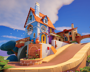
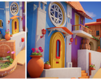
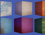
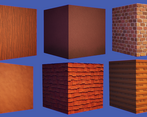
- Lovely final render and excellent use of tileables, modelling is a little blocky in places but that is a minor note as can be solved very easily since main forms are there. Love the birds in the background as well and framing of final render, massive fan of this.
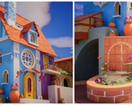
- Hi Ibolya, Overall your project looks lovely and well polished. Research + Development You've done all the right things on this references wise, however when looking at the concept and doing a direct comparison with your scene we can tell their are few main differences in the treatment of your materials. I'd suggest to have a closer look of the style used by artist. The way he resolved corners, the gaps and then do your own reasearch on stylized textures and sculpting is key when it comes to build something more cartoony. Also there is no studies on camera angles to showcase your work, studies on the lighting setup and the mood. I know you've picked a reference to match but I would still suggest you explore more of those to add your very own touch to the atmosphere. Technical / Workflow My only critic here would be to add more normal baking and sculpting. Also the approach could have been different with hand painted textures on some hero props and main features. Creative Development Even though your project lands on the higher tier quality I've been more severe as this is a direct A-B copy from an existing concept. There are major differences in terms of style between your scene and the reference, especially when we look at the fountain, circular bricks at the bottom. On the original design there are some size and shape variation, some mold also on them and a lion head as a fountain. You've missed some props like the bumper on the road, some flowers pots. The folliage of the vegetation highly differs and porportions of the concept are more stylized, look bigger overall, especially for the lamps near the entrance door, the tiles on the small roof on the left, etc. My advise would be to start modeling with a camera and try to match the same proportions the best you can. Final Presentation You really need to show a A over B for this kind of task. Alexandre - senior hard surface artist - VFX Industry
Challenge Tier
Search For A Star
Chosen brief
Environment Art (Standard)
Leave a comment
Log in with itch.io to leave a comment.


Comments
No one has posted a comment yet