


Play asset pack
Anvil Aerospace Para-Mediship's itch.io pageResults
| Criteria | Rank | Score* | Raw Score |
| Technical / Workflow | #4 | 4.000 | 4.000 |
| Final Presentation | #22 | 3.500 | 3.500 |
| Creative Development | #24 | 3.000 | 3.000 |
| Project Documentation | #33 | 3.000 | 3.000 |
| Overall | #35 | 3.200 | 3.200 |
| Research + Development | #52 | 2.500 | 2.500 |
Ranked from 2 ratings. Score is adjusted from raw score by the median number of ratings per game in the jam.
Judge feedback
Judge feedback is anonymous and shown in a random order.
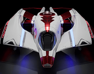
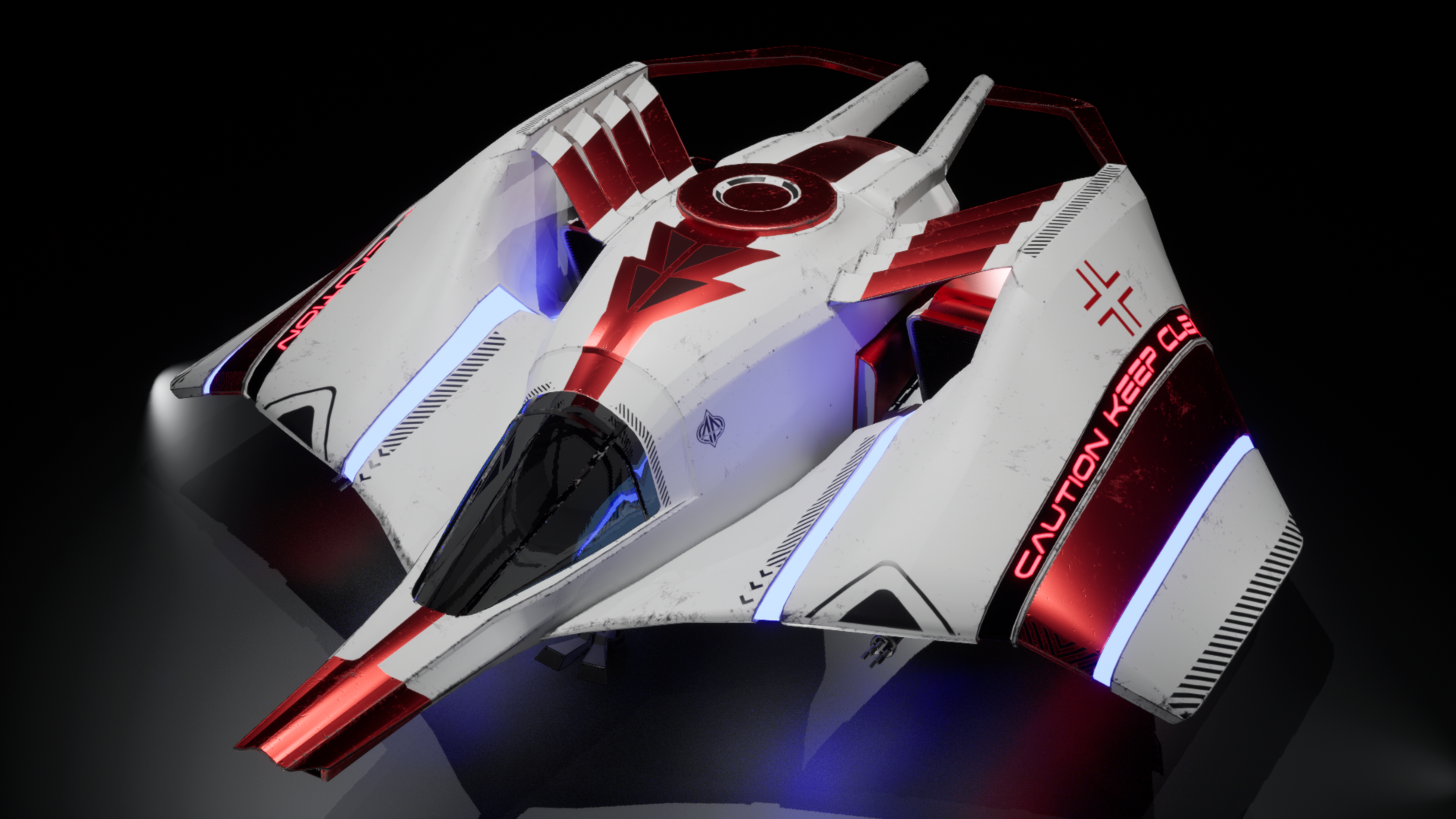
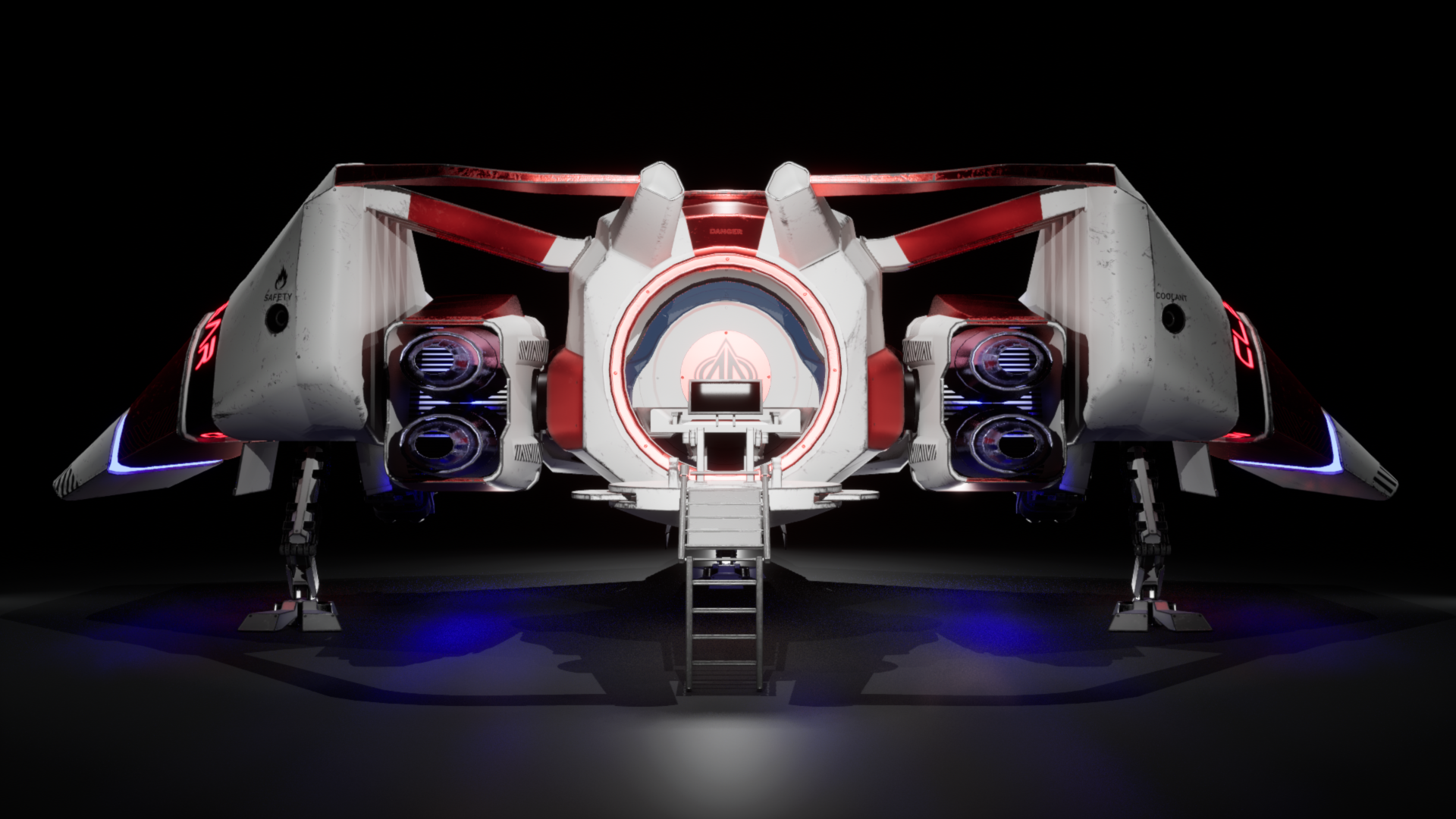
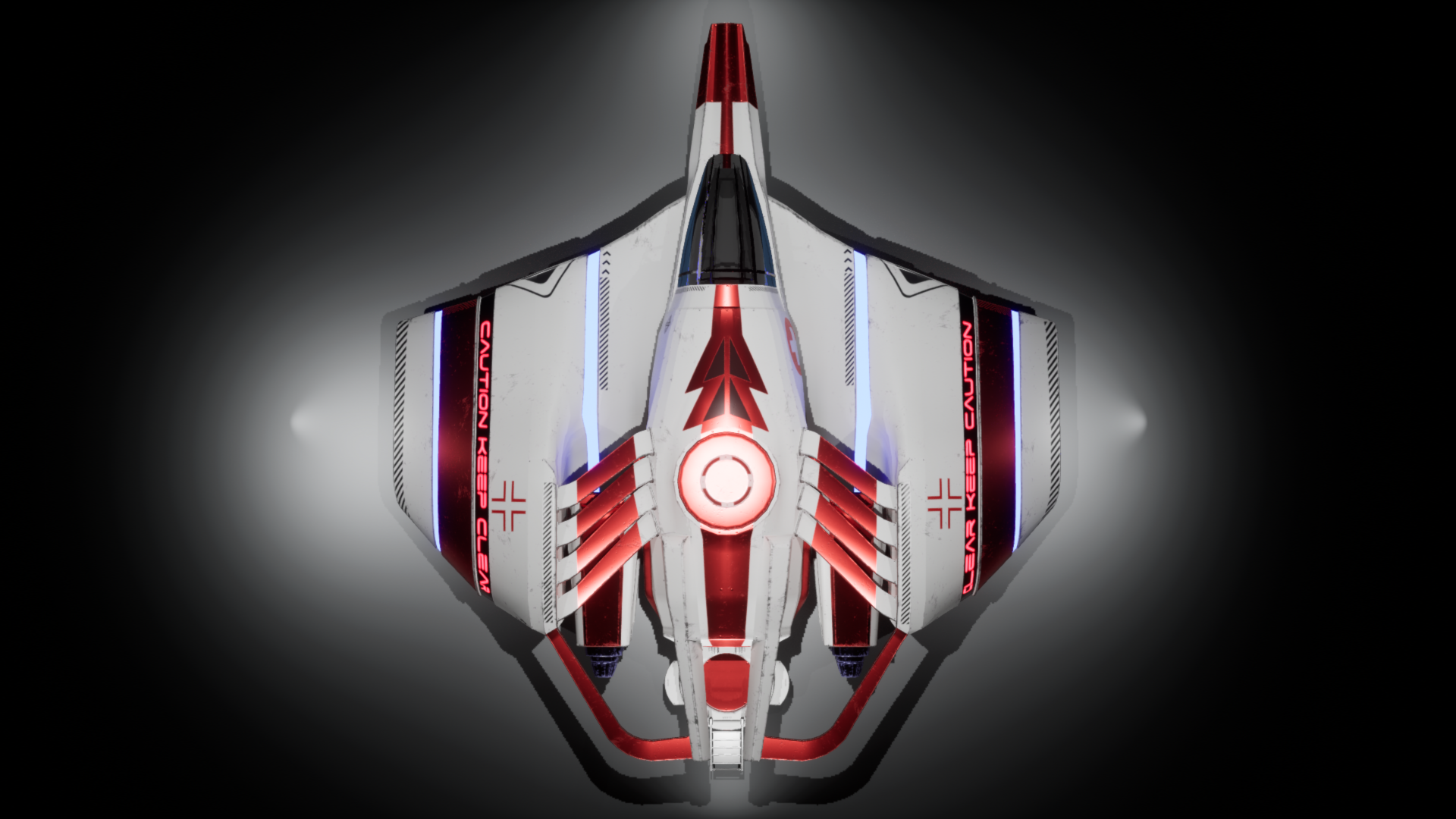
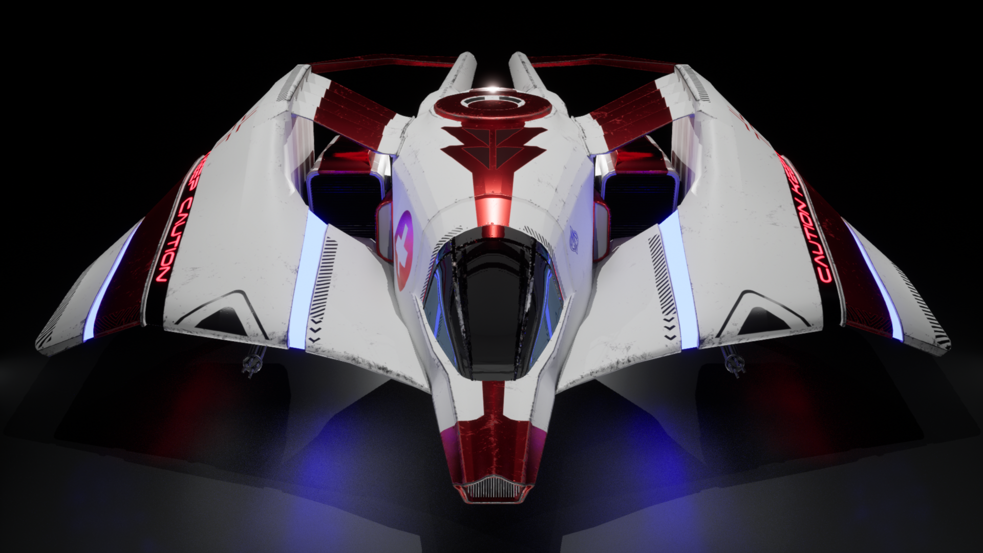
- Doesn't really give me anvil vibes this ship but never the less really like the rear especially on this ship and the use of panning materials, nice work.
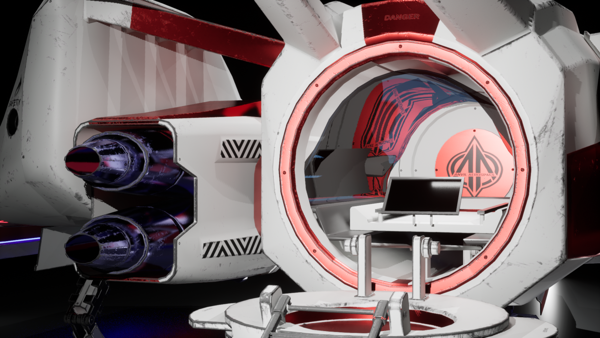
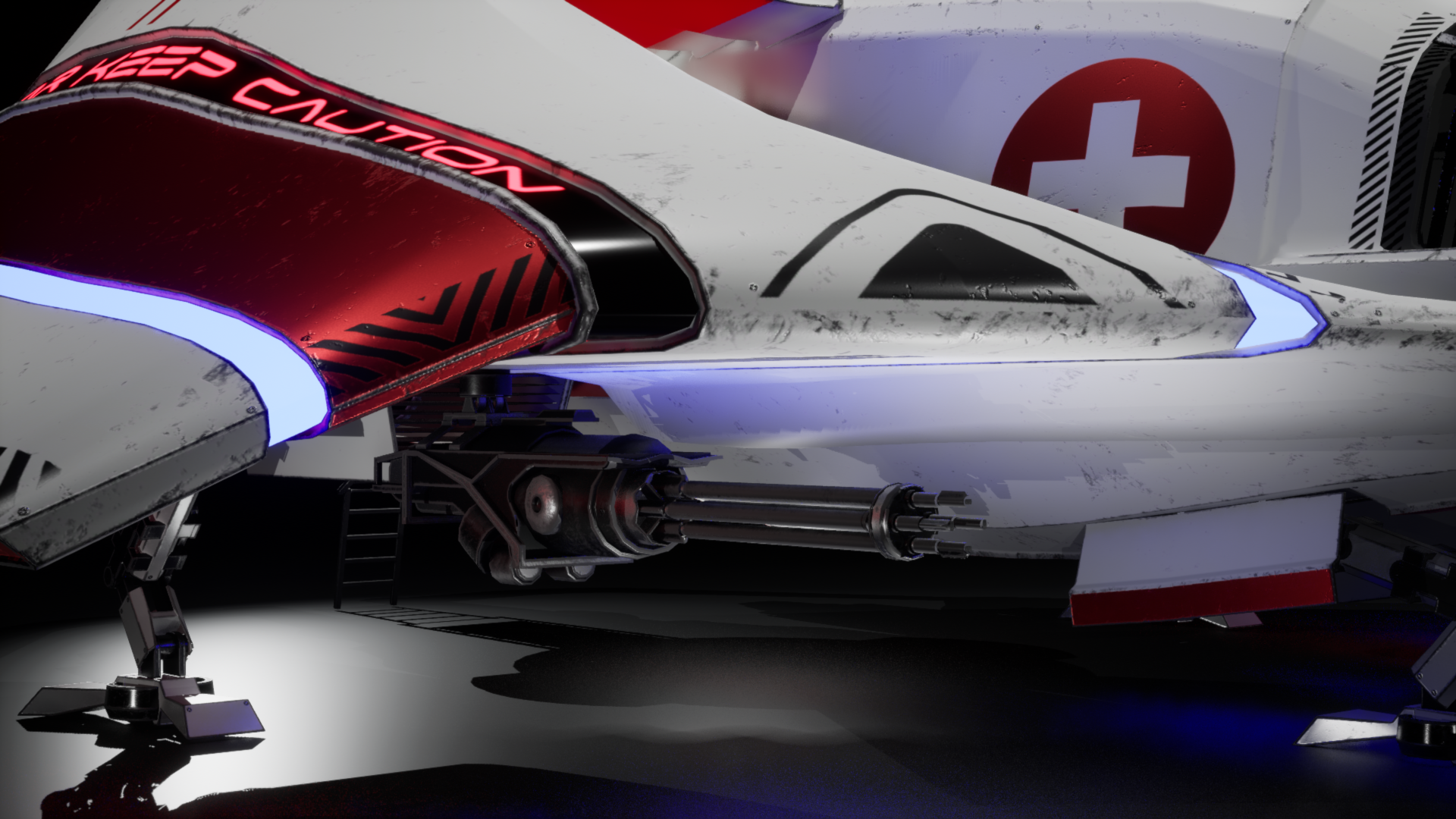
- I have included a more specific half rating in the feedback to give you a better idea of where you sit as the 1-5 system felt quite limiting with the criteria assigned to each star. The official star rating shall be similar to the overall score. Research & Development 3.5/5 Good level of R&D Considered the various manufacturers with a small amount of background to help guide the design. Most elements of the design had appeared to be thought through including the interior space I would of liked to see more Anvil ships on the mood board as this may have helped establish the more angular style of Anvil Small side note: I believe Anvil was outside the scope of the brief (not sure if that was clear to pick between the 3 manufacturers) however I’m not bothered about but be careful with things like that. Creative Art 3.5/5 Manufacturer Style - I like the overall design although i feel the design needed to more angular to have felt more at home with other Anvil ships. There is an attempt to pick up a few anvil features with the longer nose and circular shape on top that feature in several of their ships. Forms and Details - The forms were a bit smooth and basic across the front half of the ship but there were some better secondary forms in the rear half and this is also where the design was more angular. Worth mentioning here is that colour plays an important role in helping to break up the large shape of this ship. A few additions such as the scrolling medical text which fits thematically with the high class/paying clientele were a nice touch and gave trauma team vibes from cyberpunk. I think some panel lines and additional small details (bolts, fixings etc) really would have added a lot of value to this ship. One area that I found that was conflicting with the quick rescue medic idea, was the ladder entry design for the back which felt a bit counterintuitive to speed Some thought was added to wear the ship but this felt a little bit procedural and details didn’t really have any story or cause/wear pattern to them. Technical Art 3.5/5 Modelling - could be more optimised in places however overall seems fine as it is a curvy ship. The main culprits were the cylinders on the landing gear/weapons. There were a few smoothing errors which are a little disappointing. For the majority, the texturing was quite simple. A baked approach was used which limits the fidelity. For spaceships a workflow utilising tileables, trims sheet and decals help to be able to add all those details in high quality. Shaders for pulsing glow and scrolling text are a nice touch and show consideration for how to utilise shaders to enhance the art. Also, a basic glass material was made that sells the appearance of glass. Documentation 3/3 Plenty of documentation covering most/all parts of the process with plenty of images. Would have maybe liked to see a little more of the design process. Final Presentation 3.5/5 Overall a reasonable ship. Some key areas such as lack of detailing on the exterior let this down a bit. I believe the artist went for a showroom-style presentation however I think the lighting could have been improved as it made the white material feel quite flat and dull. There were a couple of nice shots where the lighting worked a little better for the shot. Overall a good effort, with some interesting details and thematic touch such as the moving text. Nice work.
Challenge Tier
Search For A Star
Chosen brief
Vehicle Art (Cloud Imperium)
Leave a comment
Log in with itch.io to leave a comment.
Comments
No one has posted a comment yet