Play asset pack
The Kraken's Cache's itch.io pageResults
| Criteria | Rank | Score* | Raw Score |
| Research + Development | #1 | 5.000 | 5.000 |
| Final Presentation | #1 | 5.000 | 5.000 |
| Overall | #5 | 4.200 | 4.200 |
| Creative Development | #6 | 4.000 | 4.000 |
| Project Documentation | #11 | 4.000 | 4.000 |
| Technical / Workflow | #23 | 3.000 | 3.000 |
Ranked from 1 rating. Score is adjusted from raw score by the median number of ratings per game in the jam.
Judge feedback
Judge feedback is anonymous.
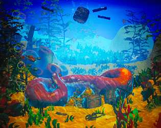
- Hi Katie! Firstly, a huge well done for getting this done in 3 weeks - you've done a fab job! I really enjoyed your scene and reading through your documentation. The video was a great touch :) I can tell that you spent a lot more time on your main assets rather than the foliage/composition on the scene, so Ill be concentrating on these. I can really appreciate you using the shaders though as making a scene underwater is difficult! I am very impressed with your main assets. They deserve their own portfolio post away from the scene as they are so eye-catching! Speaking from my own experience, the Sea of thieves art style can be very challenging at times, and yet I can clearly see where you've pulled inspiration from. If you were staying completely true to SoT, both the sculpts and textures would have to be even more blocky, with very limited blending, but I love how you have combined it with Leagues to make it unique to your own scene. Your R&D for the project is very strong, and I can appreciate how you created a concept for the scene as it shows how passionate you were when approaching it. For next time, I would have liked to see a little more evidence of collecting references of sculpts/textures for the art style as these can be hugely beneficial later down the line, but you're on the right track! Again, your final renders of the models are lovely! The handpainted feel from your textures is inspiring! I would have liked to see the texel density along with the tri counts for next time, as these are really important to show! Your wireframes look mostly solid. There could be slight improvement a little on removing tris which aren't adding to the silhouette for next time. Your sculpts are great, especially the tentacles. Imo you may have gone a little overboard with the barrel and chest. The SoT art style is quite rigid and simple, whereas yours looks a little soft/spongey in areas. This just emphasises making sure you have enough references of all areas of the production process! Side note, I know that in this case, as your scene is only meant to work from a specific angle, there's no need for the back of the tentacle. But going forward you'll want to show the world that you are prepared to make proper game scenes where the player might want to crawl around, and other artists might want to use the asset upside down or in different positions. Overall great final presentation though! And a great submission. Please keep going, Im excited to see what you do next! Tips for SoT style: - Zbrush brushes to use: Hpolish, Orbs Flatten Edge, Orbs damage cuts, Pinch and Damstandard - Textures simply use a square brush and avoid blending!
Challenge Tier
Search For A Star
Chosen brief
Environment Art (Standard)


Leave a comment
Log in with itch.io to leave a comment.