Play asset pack
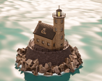
Visitor of the Tide's itch.io pageResults
| Criteria | Rank | Score* | Raw Score |
| Final Presentation | #23 | 3.000 | 3.000 |
| Research + Development | #24 | 3.000 | 3.000 |
| Project Documentation | #33 | 3.000 | 3.000 |
| Creative Development | #48 | 2.000 | 2.000 |
| Overall | #49 | 2.600 | 2.600 |
| Technical / Workflow | #51 | 2.000 | 2.000 |
Ranked from 1 rating. Score is adjusted from raw score by the median number of ratings per game in the jam.
Judge feedback
Judge feedback is anonymous.
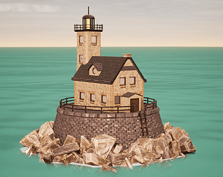
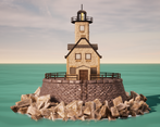
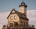
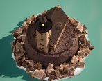
- hi Madeleine Research + Development I would have love to see more specific and deeper research on every small aspects of the light house. The windows, the lighthouse on the top, railings, etc. Technical / Workflow It would have been great to wireframe, Uvs, and trimsheets, some normal backing process as well. Creative Development Developing your own style is a very difficult task and feet. I do encourage you to push it. The ground where the light house sits could have a different treatment than the stones around the base. Even a different type of stone would have been better to make it " cleaner ". On one of your reference of a lighthouse there are gaps between each pannels / stones. This gives more sense of depth to the design. For now your lighthouse feels flat and needs more cavities / imperfections. Final Presentation It would be great to have wireframe, greyscale renders. Alexandre Quintin - senior hard surface artist - VFX industry
Challenge Tier
Search For A Star
Chosen brief
Environment Art (Standard)


Leave a comment
Log in with itch.io to leave a comment.