Play asset pack
500i Star citizen spaceship concept's itch.io pageResults
| Criteria | Rank | Score* | Raw Score |
| Final Presentation | #23 | 3.000 | 3.000 |
| Creative Development | #45 | 2.500 | 2.500 |
| Overall | #49 | 2.600 | 2.600 |
| Technical / Workflow | #49 | 2.500 | 2.500 |
| Project Documentation | #51 | 2.500 | 2.500 |
| Research + Development | #52 | 2.500 | 2.500 |
Ranked from 2 ratings. Score is adjusted from raw score by the median number of ratings per game in the jam.
Judge feedback
Judge feedback is anonymous and shown in a random order.
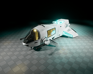
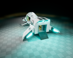
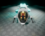
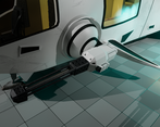
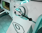
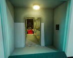
- I have included a more specific half rating in the feedback to give you a better idea of where you sit as the 1-5 system felt quite limiting with the criteria assigned to each star. The official star rating shall be similar to the overall score. R&D 2.5/5 Reference - It seemed to consist of mostly origin ships and with some other star citizen references which are good to see when aim for a specific style. When collecting references it is always good to collect some additional real-world references alongside the style reference as this influences decisions in the design that make objects feel grounded and also often inspire little details that are key to really pushing a piece further. Initial Concept - Although the primary references were Origin, the sleekness commonly associated with that brand was not captured in the concept. However, it was good to see several concepts had been explored before starting. Creative 3/5 Manufacturer Style - The ship doesn't particularly feel like it fits with the Origin style. It is missing a few of their key style features; the previously mentioned sleek and pointed shape that is normally pretty flat. And the flowing lines and forms that transition from the body into the features such as wings. Forms and Details - Overall the form was a bit boxy with the wings in particular. The wings also felt a bit stuck on because of this. Origin can be a difficult style because of this flowing design. In general adding some details (fixing, joint lines, wear) where parts join to one another can help them seem like they are meant to be together. Although the exterior design wasn't particularly in line with Origin there was an attempt in places to introduce smooth curves. The glows were a nice consideration that is in line with Origin ships if a bit strong in your case. Also to note there are a few intake type details which are nice to see. I think a few extra panel lines could have helped break up the large main body shape. I was particularly impressed that the whole interior had been thought out including the dashboard Technical 3/5 Workflow - This appears to be a ‘baked’ workflow as far as I can tell. This limits fidelity particularly on this sort of scale. A Tileables, Trim and Decal workflow (mid-poly workflow) in line with star citizen would have been more appropriate Shaders & Texturing - There was no mention of the baking process but the UVs were laid out 0-1. If you are laying out UVs 0-1 for baked workflow it would be best to utilise this and bake down details such as air intakes unless large in size. Modelling - It appears that you had a turbo smooth modifier on the model which in the majority of cases would be no for a game model. Again technical standpoint all size requirements had been considered in order to be able to fit the full interior Documentation 3/3 Presentation - Overall the documentation was sufficient and had plenty of images to get a good idea of the process. It missed out a couple of details about the textures and the wireframes were the simplified view of a turbo-smooth modifier. Final Presentation 3/5 I think a fair job was done on the final renders with warm and cold contrast of colours of the lighting to create something pleasing to look at. The renders could have been topped off by quickly applying some other material rather than the checker material underneath. The glow could have been toned down a little as it felt overly bright in the renders. Although not a final render it was to have a video of the animated door. Overall this was a good effort and shows a good thought process with regard to how things work/move or are laid out which can be a big part of 3D roles regardless of the speciality Also to note, I reviewed this as I did all the SFAS vehicle entries as didn't realise until filling out on the website that you are a rising star entry. So if you are still early on in your 3D journey then don't take the feedback to heart and more as advice/tips for the future.
- Lovely lighting, main feedback is the ship doesn't really fit the origin art style, its very blocky.
Challenge Tier
Rising Star
Chosen brief
Vehicle Art (Cloud Imperium)


Leave a comment
Log in with itch.io to leave a comment.