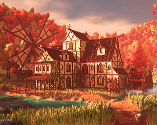
Play asset pack
Autumn Watermill's itch.io pageResults
| Criteria | Rank | Score* | Raw Score |
| Technical / Workflow | #4 | 4.000 | 4.000 |
| Creative Development | #6 | 4.000 | 4.000 |
| Overall | #9 | 4.000 | 4.000 |
| Research + Development | #10 | 4.000 | 4.000 |
| Project Documentation | #11 | 4.000 | 4.000 |
| Final Presentation | #12 | 4.000 | 4.000 |
Ranked from 3 ratings. Score is adjusted from raw score by the median number of ratings per game in the jam.
Judge feedback
Judge feedback is anonymous and shown in a random order.
- this is stunning, the use of wind and subtle birds tweeting the lighting the silhouette *chefs kiss* the box says feedback so i guess i have to say something negative so perhaps a different skybox could of helped and a night time shot with the windows glowing but that's really being picky
- Great overall, nice execution on craft level. Nice to see a dynamic scene with moving parts. The only thing that brings this down from a clear 10 is the lighting in the scene. Other than that its really well done!
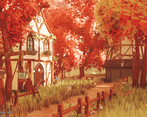
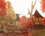
- Super nicely put together is this submission and achieved a lot in the time given! Great to see a thorough amount of research and concepting done before starting any asset creation! It's clear that it helped shape the final form. Some areas could do with additional tris like the arched windows / circular window at the top of the building. With how much of a presence they make in the scene, it'd really help as it's something that catches a players eye from the off. I do like the shapes you've got going on in the building to break up any solid straight lines. What would be nice is to layer the trees in the background so they're not all the same height to get some extra depth going. Material work is ace with lots of techniques being explored. Personal favourite is the wood grain! :) A few of them I feel fall a little flat when combined with the lighting such as the plaster on the building walls. Especially in your 3rd render, the brick sections that have peeled away work nicely but the plaster could do with some of the darker details coming through. Documentation is super detailed and goes through each step of the process! Assessor: Adam Fautley (Environment Artist @ XR Games)
Challenge Tier
Search For A Star
Chosen brief
Environment Art (Standard)
Leave a comment
Log in with itch.io to leave a comment.


Comments
No one has posted a comment yet