

Play asset pack
ARGO Hauler Class C's itch.io pageResults
| Criteria | Rank | Score* | Raw Score |
| Creative Development | #6 | 4.000 | 4.000 |
| Research + Development | #9 | 4.333 | 4.333 |
| Final Presentation | #10 | 4.333 | 4.333 |
| Overall | #11 | 3.933 | 3.933 |
| Technical / Workflow | #16 | 3.667 | 3.667 |
| Project Documentation | #31 | 3.333 | 3.333 |
Ranked from 3 ratings. Score is adjusted from raw score by the median number of ratings per game in the jam.
Judge feedback
Judge feedback is anonymous and shown in a random order.
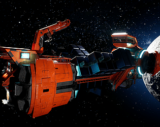
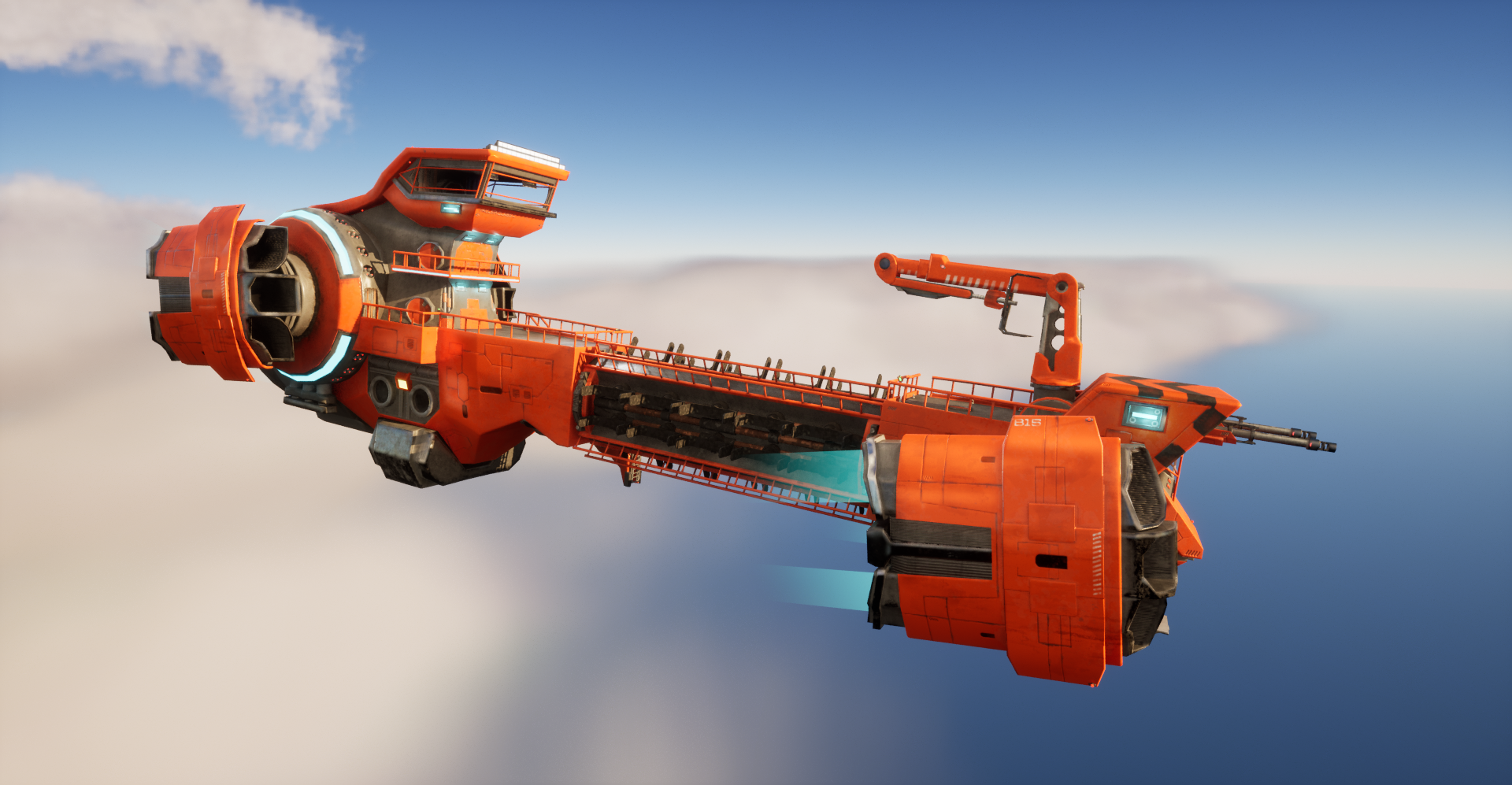
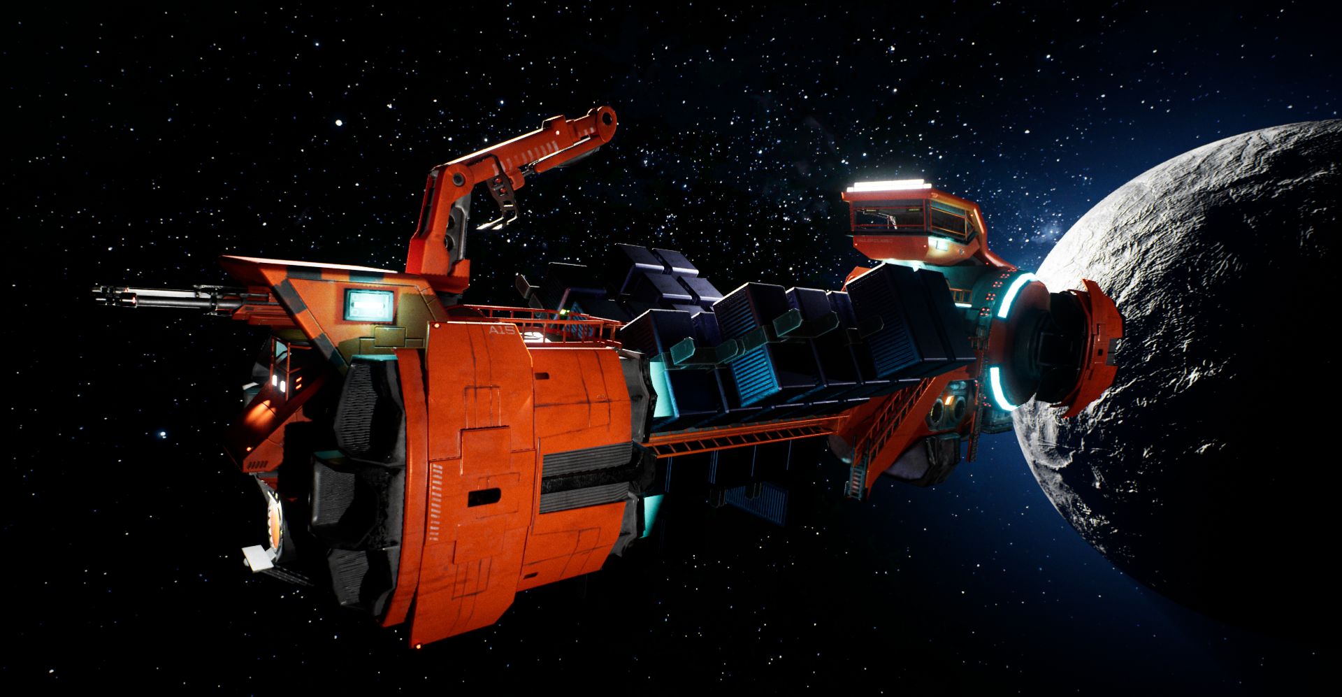
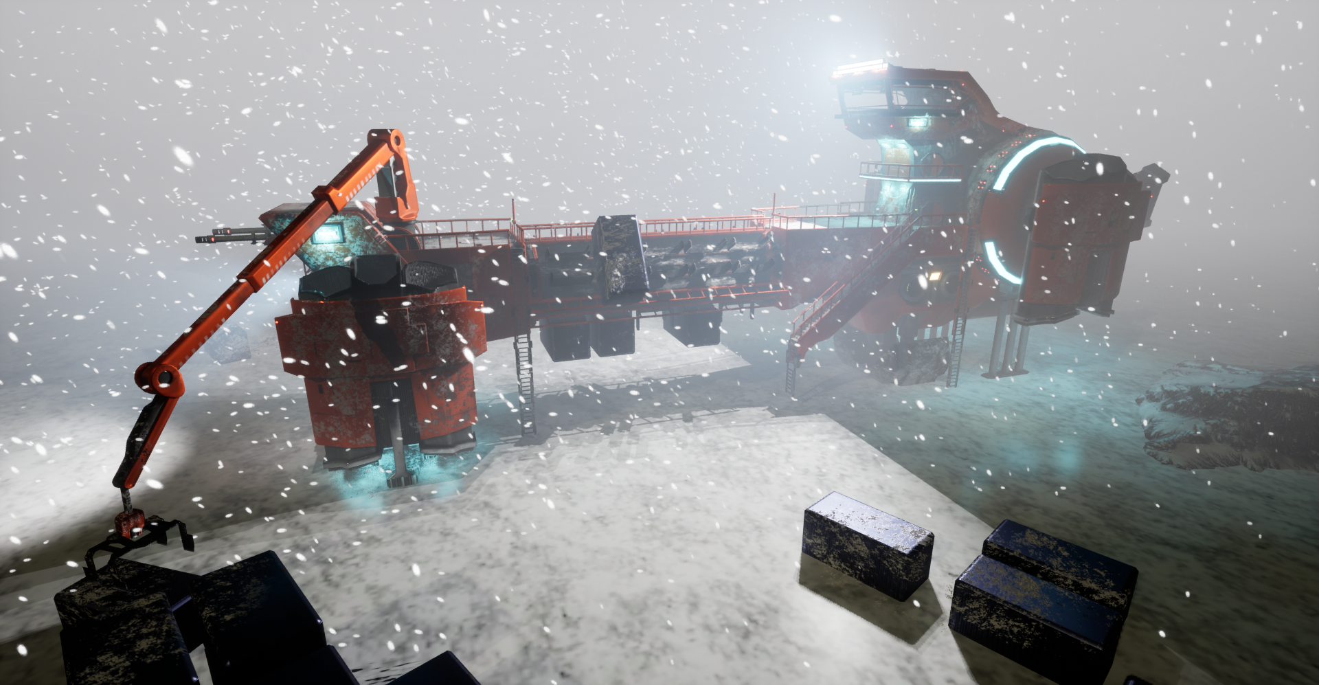
- I have included a more specific half rating in the feedback to give you a better idea of where you sit as the 1-5 system felt quite limiting with the criteria assigned to each star. The official star rating shall be similar to the overall score. R&D 5/5 Reference - Plenty of references including the Argo ships crucial to ensure the style and real-world references to help drive other design elements. Initial Concept - I like the process the initial design went through and that you were willing to accept the initial designs weren't really working and try a different approach. Overall I liked the initial concept and it took plenty of design cues from Argo and other areas of star citizen. It was nice to see key area had a small space dedicated to them in the concept. Creative 4/5 Manufacturer Style - This matches the Argo style well in overall design with a focus towards industrial functionality. There are several key elements that are shared across multiple Argo ships such as the VTOL shape you incorporated Forms and Details - The forms overall work pretty well but I'd have liked to see more tertiary forms to break up some of the larger flat sections as even with panel lines in place some areas felt very flat. There were also a few areas that felt very sharp and square and leaning to the large chamfers of Argo could have really helped soften some areas such as the bridge and shape over the weapons. However, implementing one of the more iconic shapes from Argo in the form of the VTOLs really helped cement the Argo feel. The purpose of the design is very clear and it feels very functional as if you could imagine it operating in-game. The colour breakup felt fairly well balanced with the strong orange dominating most areas and technical area/functional areas getting the secondary black colour. Subtle use of warning hazard, again very on brand, help add additional colour break up. One little thing I think was overlooked was the ends of the crates were just completely flat. This is only a little thing but they take up a good chunk of screen space when fully loaded. Little details like this can make a big difference in the perceived level of quality and detail. Technical 4/5 Textures & Shaders Workflow - Used a baked workflow which was a limited factor in the fidelity of the models. A tileable, trim and decal workflow in line with star citizen would be a better way to ensure that high fidelity (mid-poly workflow) Modelling (technically) - For the most part the model seems to be very efficient. I would argue that more edges should have been added to some of the larger shapes such as the big circle shape at the back and the VTOLs as the curves in these areas are a bit faceted Extras - as displayed in the video the central cargo rotates and consideration for this rotation was in the design with walkways on 4 sides. It appears the crane could also be animated as one of the shots had it loading. Documentation 3/3 The documentation was good and contained plenty of images and details of the workflow including wireframes so I could get a good idea of the process. The addition of video was nice as it allowed the animations into action. Plenty of images Final Presentation 4/5 Rending The scene is rendered in multiple environments which is a nice touch and is used to put it in an action shot of it loading crates, although that particular scene isn’t great at showing off the ship. The spacescape shots were the best artistically of all 3 settings and I thought a reasonable job was done on the lighting in the spacescapes. I guess the purpose of the 3 separate sets of shows was to give an overview of all elements, it loading on the ground and in space. Particularly for your portfolio, you need to ensure the same level of quality is applied across all renders. Or just stick with the best ones The addition of the video was nice and allowed us to see some details not easily visible in the static renders as well as giving a good sense of the ship. Overall great work! I particularly enjoyed this ship as felt very functional and industrial which really sold that the Argo style!
- Hi Edward, Research + Development You may want to have more specific references for each part of the ship individually as of now there are more general references on your documentation. One moodboard for thrusters, one for the mechanical arm, etc. Also a big mistake that is pretty frequent when looking for references is to have only concept art, others artist works in it. You absolutely need real life reference, because works from artist are alreay a digest of those references. Being inspired by a copy, to make a copy, will make you lose substance and essence on the process. Technical / Workflow For this kind of project, you NEED normal decals. To make your details pop out, to dress those big panels and have cheap polycount crispy details. Creative Development Landings gears especially are looking primitive and quiet simple, cylindrical which is a shame since you have the most opportunities to detail them in your design. Those elements are so complex and close to the player when the ship is landed that they would deserve far more love. For this kind of task I would not build interior at all and focus solely on the exterior aspect. Less is more. I think you've been a bit ambitious ( which is a good thing...) but this time it hurt the quality as you had maybe too much elements with different functions to detail. As a result the ship is looking more blocky and primitive. My advise for you would be to take one very complexe mechanical piece, for instance a landing gear and force yourself to replicate it one on one. This is a master study. After those rather honest critics I think you've got real potential. This rotating system for the containers is a great idea. It would be worth pushing this model further, adding more complexity, normal backing of small intricate details, etc. Keep it up Alexandre Quintin - senior hard surface artist - VFX Industry
- really really like this, can see somthing like this going in the game one day, function and material breakup is spot on, maybe a bit stylised but cool work non the less :)
Challenge Tier
Search For A Star
Chosen brief
Vehicle Art (Cloud Imperium)
Leave a comment
Log in with itch.io to leave a comment.
Comments
No one has posted a comment yet