Play asset pack
Argo Angel's itch.io pageResults
| Criteria | Rank | Score* | Raw Score |
| Creative Development | #5 | 4.250 | 4.250 |
| Final Presentation | #12 | 4.000 | 4.000 |
| Overall | #16 | 3.650 | 3.650 |
| Technical / Workflow | #22 | 3.250 | 3.250 |
| Research + Development | #22 | 3.500 | 3.500 |
| Project Documentation | #32 | 3.250 | 3.250 |
Ranked from 4 ratings. Score is adjusted from raw score by the median number of ratings per game in the jam.
Judge feedback
Judge feedback is anonymous and shown in a random order.
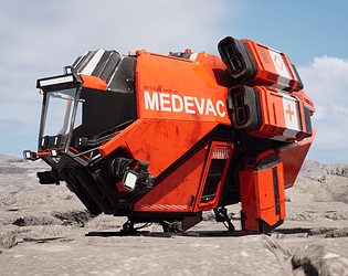
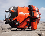
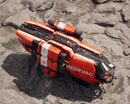
- I have included a more specific half rating in the feedback to give you a better idea of where you sit as the 1-5 system felt quite limiting with the criteria assigned to each star. The official star rating shall be similar to the overall score. R&D 4.5/5 Reference - Nice reference board broken down into areas for particular elements incorporating both Argo ships and real-world reference. The initial concept was thought out with several design sketches and models Some story and narrative behind the design. One minor thing is I felt like the interior didn’t have proper consideration looking at the size and shape at the bottom of the vehicle. Creative 5/5 Manufacturer Style - Feel like it could be in the Argo line of ships Forms and Details - Main forms fit with the Argo style with a nice balance between primary, secondary and tertiary with good levels of detail in focused areas. Design - Overall the design feels good from all angles with not much that I could add with regards to the form. The rear VTOL thruster being super close to the ground feels a little odd. The materials feel of good quality with the wear not feeling procedural but also not feeling like it has been driven by story or use. The colours break-up is done well and is nicely balanced Technical 3.5/5 Textures & Shaders - Nothing particularly technical here however it is nice to see the use of decal texture to ensure some fidelity in those areas. Workflow - The workflow as acknowledged by themselves was not optimal for this and a tileable, trims and decal workflow in line with Star Citizens would be much more appropriate in the future. Textures were quite expensive with 2 Sets of 4k textures. Modelling - Overall the model seems good with a few areas for improvement as this felt a little more like a concept mesh than a game mesh in place. There were a few bits of clearly crashing geo, and the cable/pipes across the ship were quite wasteful with edges considering their size Documentation 3/5 The presentation was clean and efficient and covered almost everything with only wireframes missing which could be viewed via the Sketchfab viewer There were plenty of images from various stages of the process to get an of the process. Final Presentation 5/5 Rending - Overall final images are presented well with the materials reading reasonably well. The lighting is in a good state and helps to sell the hard work on the vehicle. The vehicle was presented in an environment which helps to ground the vehicle nicely. The addition of the sketch fab viewer was nice for the purpose of being able to look at maps and wireframes but also does leave some areas open to scrutiny with normal errors and untidy geo Overall a strong piece artistically. I do get concept art vibes from it because of some of the crashing however that doesn’t distract from a ship that feels Argo despite being different from the roles Argo currently fills in-game. Impressive
- This is what I like to see. High quality art piece, focused on your strength. Not overly complicated in a scene with complicated lighting or many assets. Just focused on one thing and that thing is well executed. Well done, makes me happy to see this quality from students.
- Big fan of this, could defo see us doing something like this one day in the game chunky argo looks very cool haha and you nailed the cockpit and engine style so great work.
- hi Luke, Research + Development For this phase especially for vehicle I would have done way more research for each individual part for this ship and gather references of each of them. I would advise to roughly study functions, mechanism of those parts so you can infuse functionality in your design. Technical / Workflow Uvs are automatically packed and created and it shows on the texture once we zoom in on the hull. There are seems visible on the biggest orange panels on the top of the ship, also you might needed more resolution on those textures as the details get blurry. Looking at the Sketchfab inspector I could see the resolution of the window is way higher than the rest of the ship. Which is unnecessary since there is not much texture on this. Modeling wise I would have beveled fare more edges, especially for the biggest elements like the door and it's frame. The landing gears since the player would be fairly close to it ingame. Creative Development So far good design, my orverall critic would be to every mechanism looking more functional and grounded to reality. Look at references on jet fighter, airline planes etc. Final Presentation I would appreciate turntable with shaded, greyscale, wireframe renders too. Project Documentation Cf Research and development. Alexandre Quintin - senior hard surface artist - VFX industry
Challenge Tier
Search For A Star
Chosen brief
Vehicle Art (Cloud Imperium)




Leave a comment
Log in with itch.io to leave a comment.