Play asset pack
The Stock's itch.io pageResults
| Criteria | Rank | Score* | Raw Score |
| Technical / Workflow | #51 | 2.000 | 2.000 |
| Research + Development | #52 | 2.500 | 2.500 |
| Final Presentation | #64 | 1.500 | 1.500 |
| Project Documentation | #65 | 1.500 | 1.500 |
| Overall | #67 | 1.800 | 1.800 |
| Creative Development | #70 | 1.500 | 1.500 |
Ranked from 2 ratings. Score is adjusted from raw score by the median number of ratings per game in the jam.
Judge feedback
Judge feedback is anonymous.
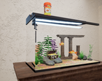
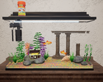
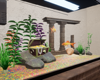
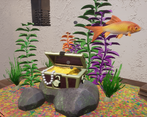
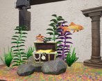
- Hi Ellie, Technical / Workflow I would have used more normal maps to give volume to your surfaces, especially for the colored floor that looks flat for now. Also it's important to show your UVs and topology to be judged on them. We kinda see them with the texture maps but it's too difficult to give real advises based on that. Creative Development As the theme is simple I was expecting a very high standard of realism. You might want to spend more time on each textures, especially the fish and dive into details to make them believable. I'd love to have a way more complex structure for the columns, you could concept and build your own that is intricate, on multiple levels, insert some good sculpting on them, having fishes going through the pillars, etc... Final Presentation You'd need to show wireframe, greyscale renders, some turntables, upload the images with the website feature so we can scroll through them without having to open images on separate tabs... Lastly I'd say you can render those images with a high lighting quality, definition, moodiness...
Challenge Tier
Rising Star
Chosen brief
Environment Art (Standard)


Leave a comment
Log in with itch.io to leave a comment.