Play asset pack
The Interchange's itch.io pageResults
| Criteria | Rank | Score* | Raw Score |
| Final Presentation | #1 | 5.000 | 5.000 |
| Technical / Workflow | #4 | 4.000 | 4.000 |
| Creative Development | #6 | 4.000 | 4.000 |
| Overall | #18 | 3.600 | 3.600 |
| Research + Development | #24 | 3.000 | 3.000 |
| Project Documentation | #53 | 2.000 | 2.000 |
Ranked from 1 rating. Score is adjusted from raw score by the median number of ratings per game in the jam.
Judge feedback
Judge feedback is anonymous.
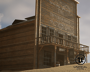
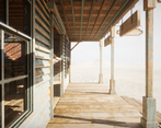
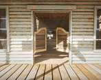
- Hi Nathan! Well done for completing the scene within the given timeframe you've done a fab job! :) I loved the final presentation with the video being a nice touch. Overall your modelling and texturing are very strong. You can clearly see where you've taken inspiration from along with how passionate you are. You've created a strong atmosphere inside of the building. Your models have great wireframes and strong modelling skills! I would have liked to see more details of how each asset was made though: both technical and creative ideas/pipelines as it makes it a little difficult to mark in the documentation category. Clearly displaying what software you used, texel density, map size and tri count are very important when searching for a role in industry, as it's often a question asked in an interview. Your textures are good and are consistent across the scene. It's great seeing how you created them in SD, and SP. To push it to the next level, including more small details will be hugely beneficial. Adding grunge variation on the wall paper, water marks on the tables from mugs and burn marks from cigarettes will add character and realism to the scene. I can see your potential as you've added these water marks on the bar, and scratches on the piano- I want more! :D This could be done in several ways e.g. decals, vertex painting or just baked into the texture set. As touched on before, texel density is very important so just make sure this is consistent between assets. It's hard to tell from the video/screenshots but it looks like there is some variance between the floor and piano: I could be wrong but just make sure it's the same! There are also a couple issues with the textures warping or not sitting right on the model e.g. the arms on the chairs which are easy fixes. Overall, a very strong project. I loved the small details such as the music playing after pressing E on the piano and the flags. The composition was strong, with a strong 3D skillset. I would have liked a little more thought gone into the lighting as it does seem extremely harsh, along with more technical breakdowns but given the timeframe very well done.
Challenge Tier
Search For A Star
Chosen brief
Environment Art (Standard)
Leave a comment
Log in with itch.io to leave a comment.


Comments
No one has posted a comment yet