Play asset pack
The Safehouse's itch.io pageResults
| Criteria | Rank | Score* | Raw Score |
| Project Documentation | #11 | 4.000 | 4.000 |
| Research + Development | #24 | 3.000 | 3.000 |
| Overall | #45 | 2.800 | 2.800 |
| Creative Development | #48 | 2.000 | 2.000 |
| Technical / Workflow | #49 | 2.500 | 2.500 |
| Final Presentation | #54 | 2.500 | 2.500 |
Ranked from 2 ratings. Score is adjusted from raw score by the median number of ratings per game in the jam.
Judge feedback
Judge feedback is anonymous and shown in a random order.
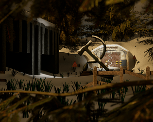
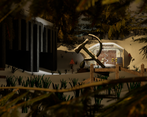
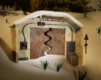
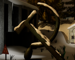
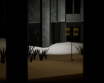
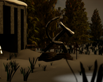
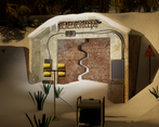
- Research + Development Hello Jonathan, I can tell and see in your work that there is a lot of good will. In terms of research, one big asset seems to be your bunker but also the communist symbol. Unforutanetly this symbol seems to overhwhelm the rest of the image since it is so central. It looks like to me the hero asset of your since as it is very big on screen compared to the bunker on the first image. I would say you need to inspect how things are connected in the real world, how they are riveted together, blended, sewed, etc. The bunker door also needs more research and a deeper design pass as it is meant to be hero asset. I would have loved to see more references of specific parts of the bunker. Everything is important in a hero asset, the console, the wires, the way they are attached to the wall, everything should be considered and researched. Technical / Workflow modeling wise : I can tell you've been using CAD models or booleans on some of them as the topology seems to be auto resolved and triangulated. This won't work in the industry as you'd like to have more control over the topology to have as less tris as possible while maintaining good details and curves definition. If we look at the topology density of the communist logo it seems very heavy for the amount of details there are in it. I'd highly reduce the polycount before baking a normal map. for the Uvs : there are serveral rules of thumb to respect. The first one would be not to use auto UVs as I can see on some props in the pdf. Second rule would be to avoid having diagonals oriented shells, has the Uv maps is made out of pixels your edges will be jagged if positioned in diagonal. please fin a UV template of the AWP weapon of cs go here : https://external-preview.redd.it/zRtlTd3su3-JbzWUIsXUWDa8eh21cOZEgjViubuFgSc.png?auto=webp&s=11f8dc6a40023c3e6c258a588e610bca59d20f7e everything should be arranged by proximity so it is easier to read for the texture artist. also you'd want to use as much space as possible in your UV tile. For now there are too many gaps in them. Creative Development As there is very little conception in your project I've been keen on the realism of the scene. You might want to do less assets but with higher attention to details and textures. Also notice how different the vegetation around the scene is compared to the grass pocking out of the snow. The difference of realism here can pock and I would be careful to have the same level of realism on every pieces. Keep going, I'd suggest you do less but higher quality on your next project. Alexandre - Senior hard surface artist - VFX industry
- I like the story of this and the extra effort taken to put the snow ontop of things, very easy to just avoid that. I would just be careful that your materials read well and hold up next to each other for example the snow can look very flat at times, where as actual snow has a lot of light interaction.
Challenge Tier
Rising Star
Chosen brief
Environment Art (Standard)
Leave a comment
Log in with itch.io to leave a comment.


Comments
No one has posted a comment yet