


Play asset pack
On the Edge's itch.io pageResults
| Criteria | Rank | Score* | Raw Score |
| Research + Development | #10 | 4.000 | 4.000 |
| Final Presentation | #12 | 4.000 | 4.000 |
| Overall | #14 | 3.800 | 3.800 |
| Technical / Workflow | #16 | 3.667 | 3.667 |
| Creative Development | #22 | 3.667 | 3.667 |
| Project Documentation | #27 | 3.667 | 3.667 |
Ranked from 3 ratings. Score is adjusted from raw score by the median number of ratings per game in the jam.
Judge feedback
Judge feedback is anonymous and shown in a random order.
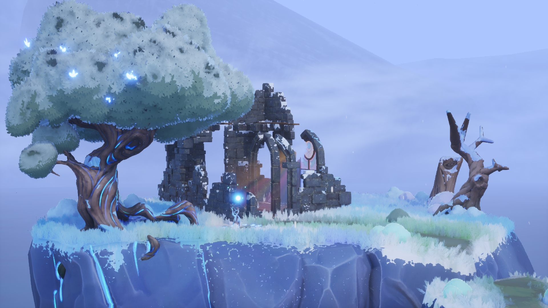
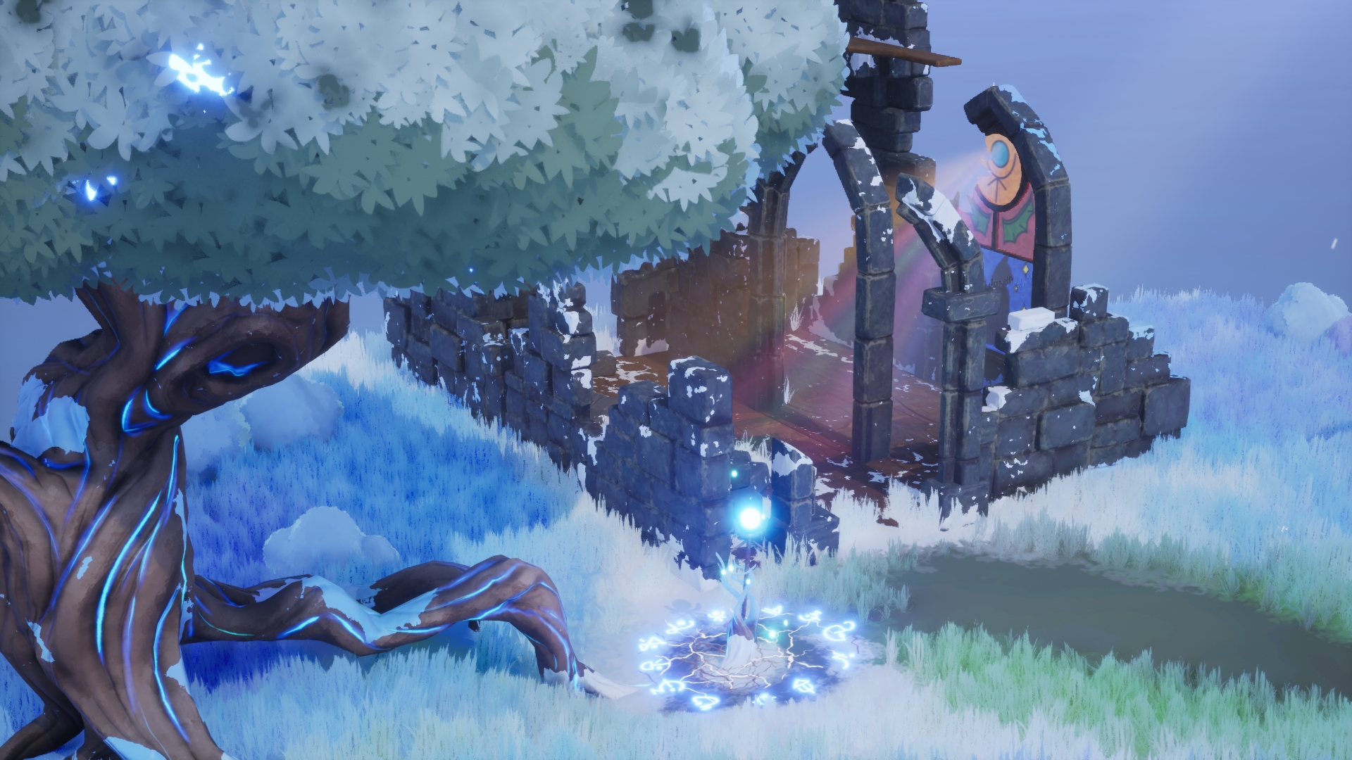
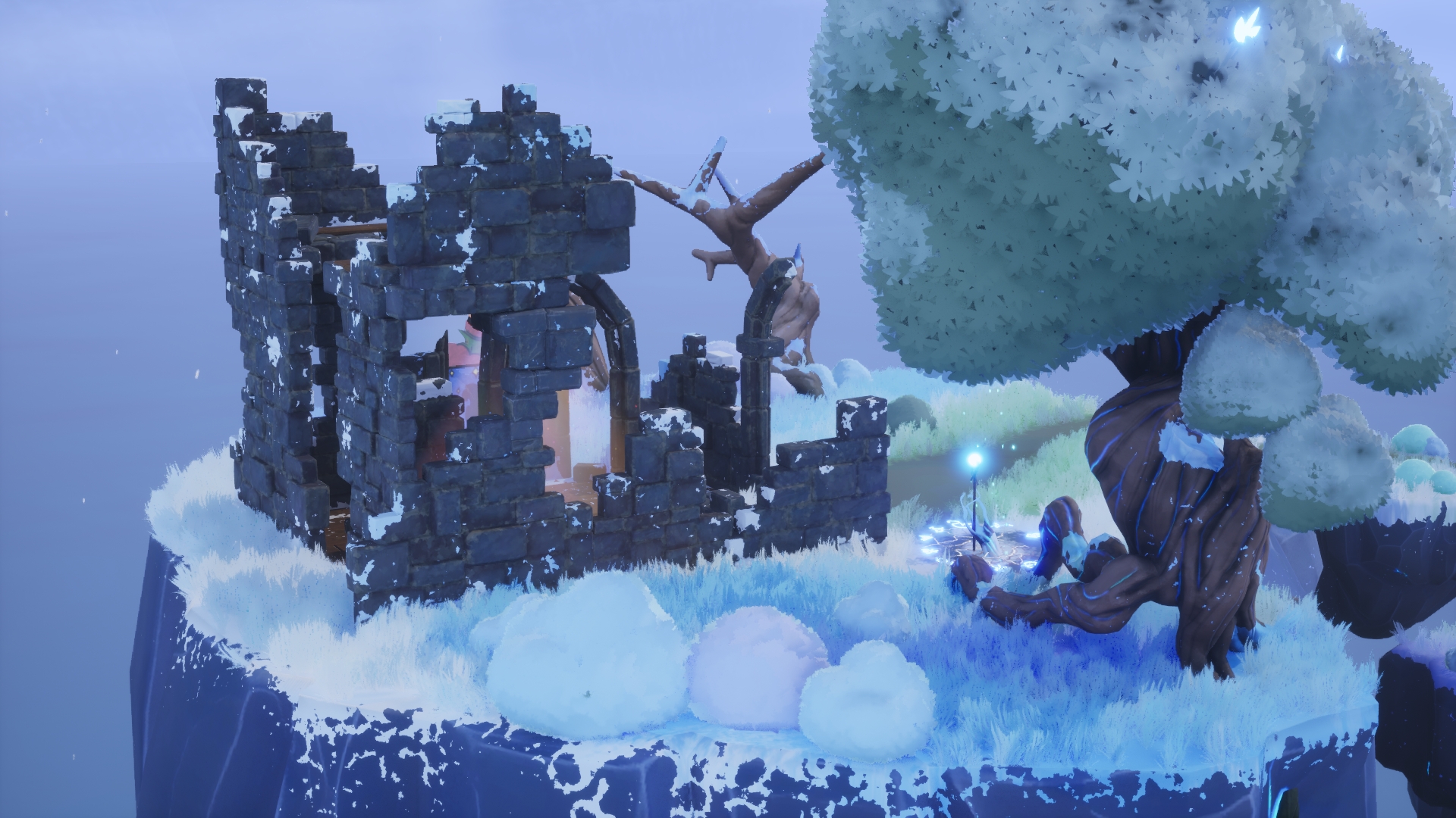
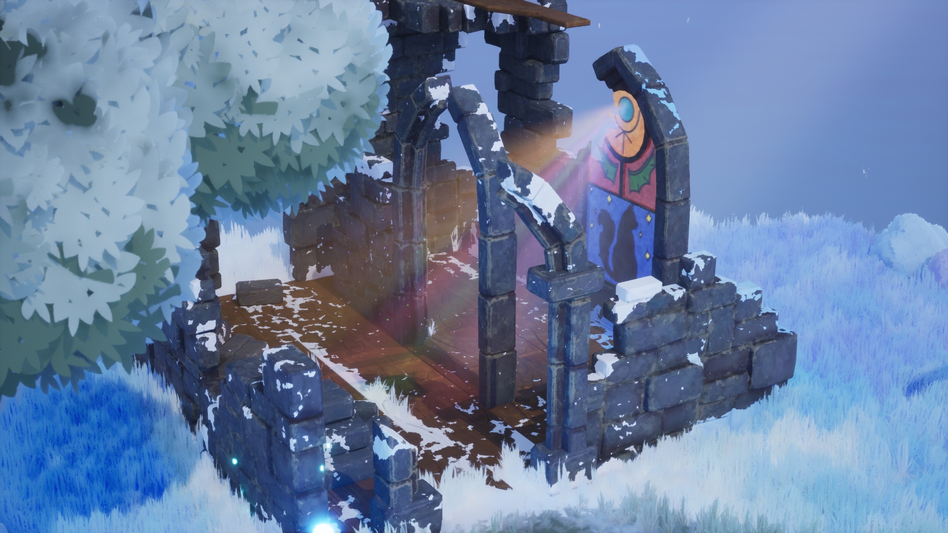
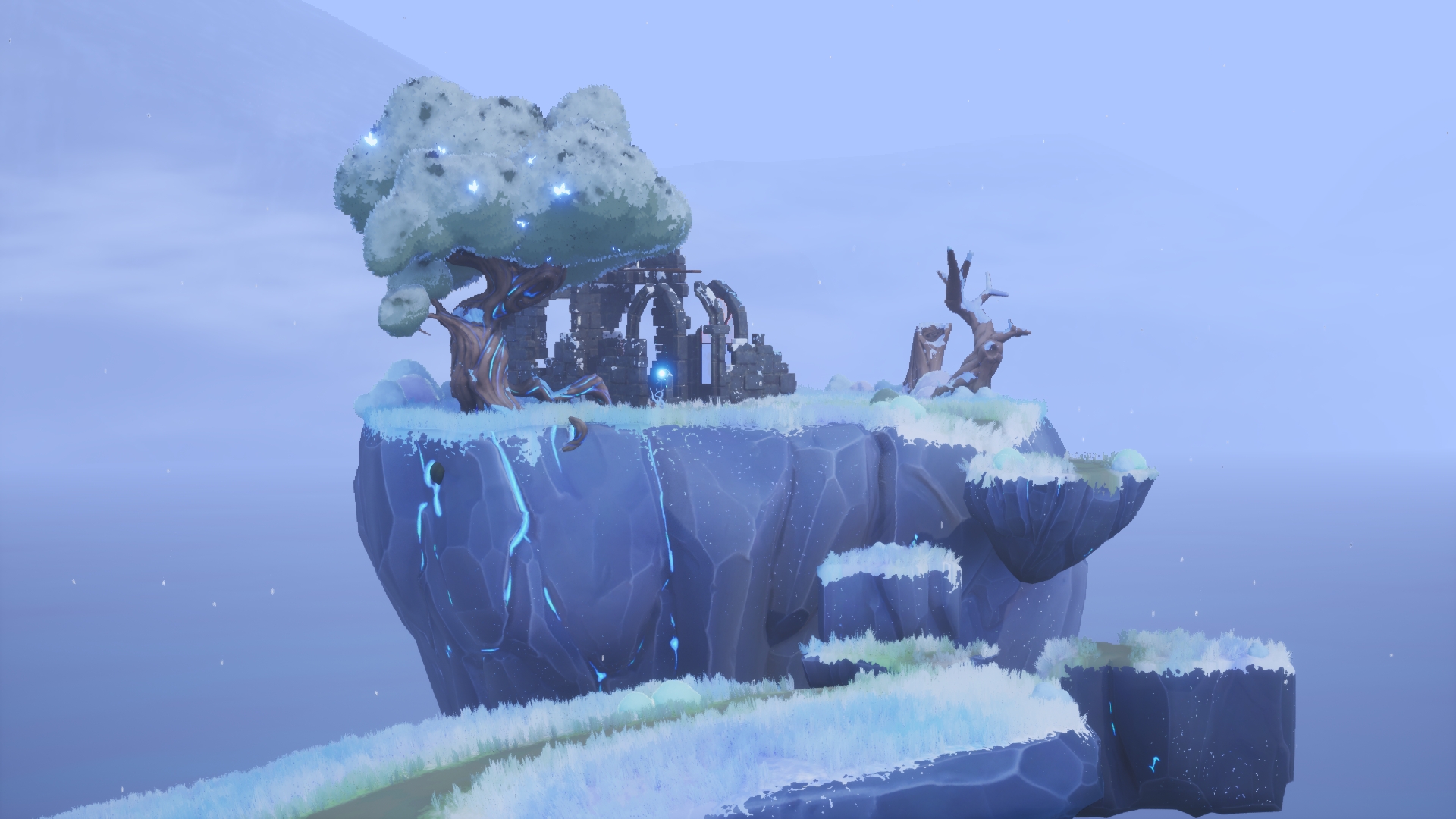
- Firstly, I'm really impressed by your work! As a rising star, I can't wait to see how you further progress on your course/career. Your passion for stylised artwork shines through as you've hit the nail on the head with the art style :) I love how strong your reference boards are! I really enjoyed looking through your pre-production workflow. A helpful tip, especially for stylised workflows is perhaps focus on creating ref boards of sculpting methods/brushes of the specific artstyle that you wish to replicate. Stylised games normally have a very specific set of rules to make sure all of the assets match the style. This can sometimes be a big learning curve when approaching a project. Making a ref board specific to the style is very important so may be useful for next time! Your texturing of the tree is great. I love the handpainted look to it. However, it is a little difficult to see whether there was any consideration for texel density/map size. Making sure this is consistent is important. There is a fantastic tutorial from Stylised station on youtube on creating a procedural Ghibli material which may be useful for future. An area of improvement would be the emissive on the wand. If you take a look at your technical references again, they rely a lot more on the base colour than emissive, with the emissive just adding that extra something, giving it that “magic look”. I think you’ve done a fab job of the particle effects, as they bring the scene to life. To bring it to the next level, I would have liked to see a little more narrative building with the lighting. The lighting in the church was definitely a nice touch, and I would have liked it gone a little further for the rest of the scene. At the moment it’s a little flat looking so would benefit from some extra contrast; it’s great seeing explore methods like fog cards but be careful not to over use them as it definitely washed out the water/mountains. It’s great seeing you explore unreal’s toolset such as RVTs and mesh painting. Overall, good presentation pdf! Clear and personable :) It is also nice having a video! I would have liked to see a little more technical breakdowns including tri counts, map sizes used, texel density etc, but it was nice to hear your thought process. In terms of themes, in future it may be nice to colour code your production stages using your custom backgrounds along with choosing a font fitting of the magical theme. For next time try and keep some time (even 30 mins) to have a photoshop touch up for your main shot(s). Playing around with the contrast/colour/tone would have made it pop! You can also do this in unreal playing around with the post process settings. Overall, for 4 weeks brilliant work!
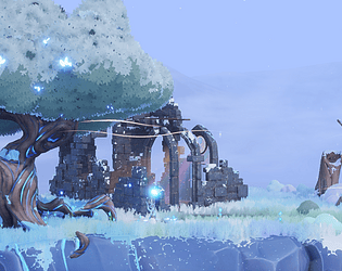
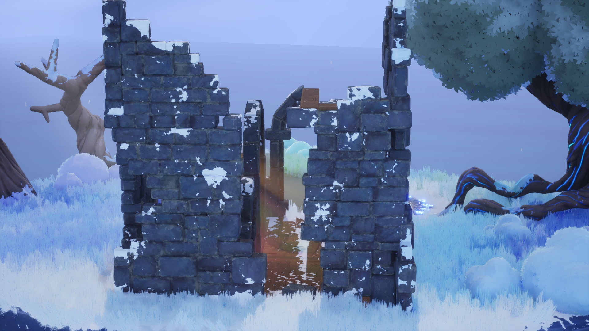
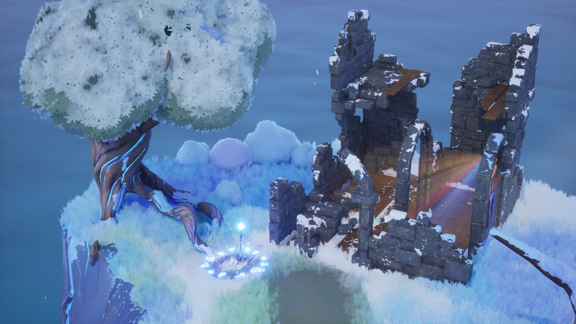
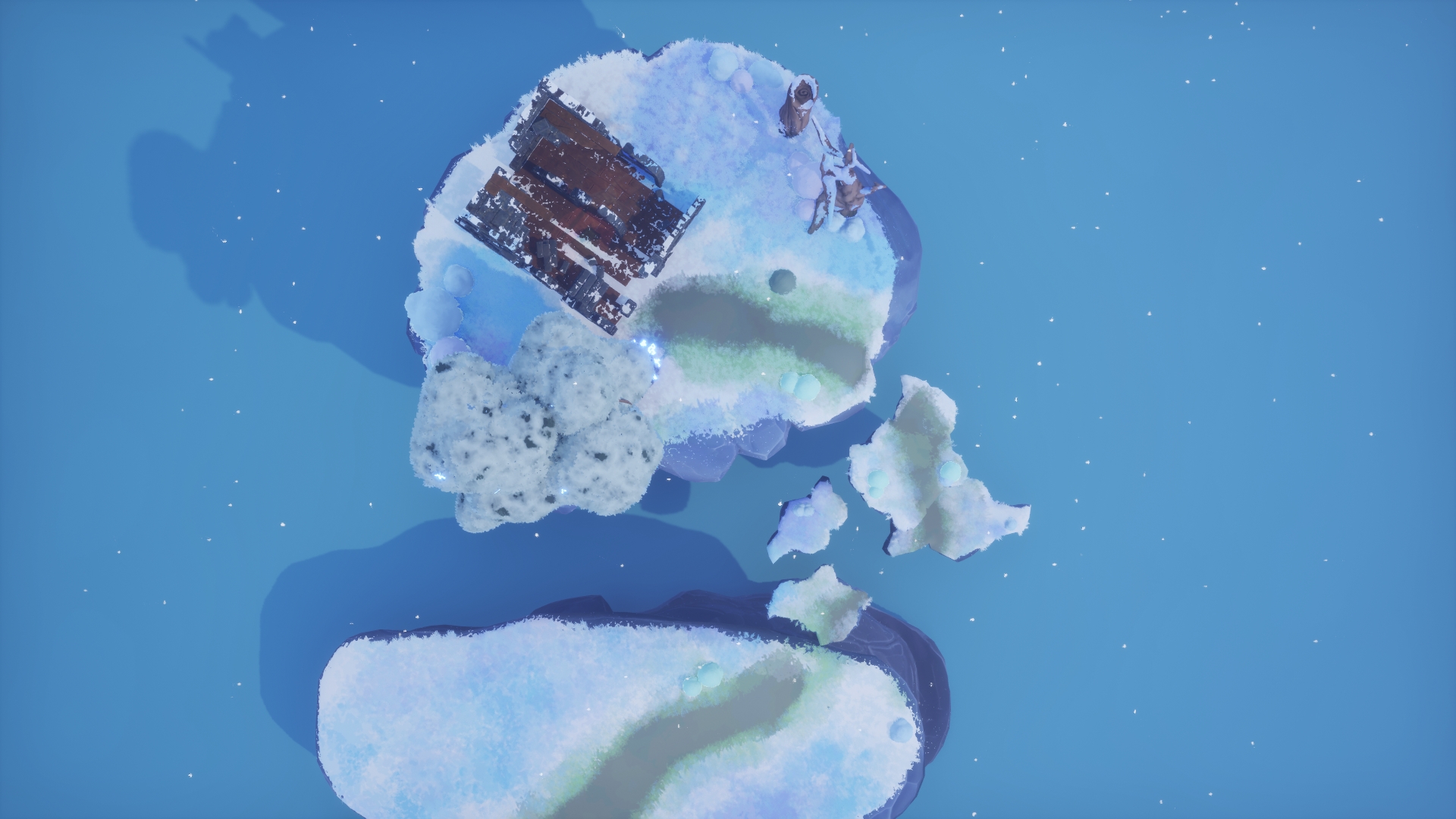
- Very well done! The scene is beautifully presented, nice work! The art style is very nice and consistent throughout the scene. The sculpted work is very high quality, and works really well to fit the style. The biggest room for improvement for me is UVs, and the way the LP meshes were constructed. There is lots of UV space wasted in these assets, ideally you want to use as much as possible to get the most out of your textures. The LP for the brick wall works very well as a final result, but the way it was made, left little room to get a good unwrap on it. I would have opted for sculpting a small handful of individual bricks, and baking them down onto some low poly versions, all in one texture set, and then assembling the ruins out of those bricks like little lego pieces. This would allow for a nice texture resolution, and more control over the build of the scene, allowing you to reuse the bricks however you want without adding new textures. This could then be broken up with a 2nd UV channel, to allow for masks to add contextual details to the meshes. Great job overall though, excited to see more work from you in the future!
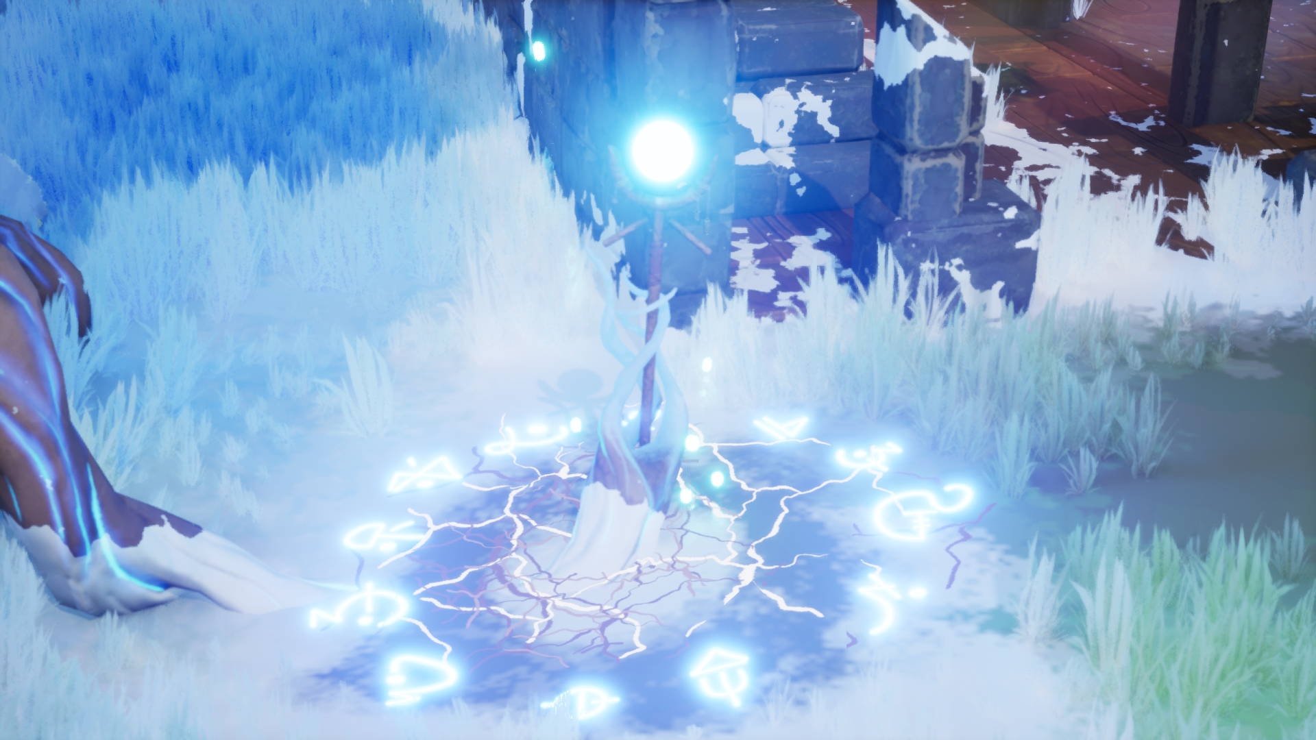
- Hi Alexandra Research + Development For this topic I would have loved to see more researcher on the wood planks for the ground, the style of it also for the foliage and the stone bricks. You need to have more research on how a wall is built so you can make a more accurate ( and stylized ) representation of it. An extra research on the crystal, separated of the staff would have been great, too. Technical / Workflow Uvs seem to be a bit messy and could be more clean, especially for the tree. I'd say try to keep everything "readable" on the Uv template and grouping things by proximity while having the less shells as possible. Make sure branches are placed on the Uv template roughly like the would be placed on your model, that the shells are oriented towards the right direction. Same thing for the stone wall on the left on the documentation page 25. Creative Development I appreciate you took the time and put the effort to create your own design. You could push it further, especially for the architecture and the arch. They are a lot of references on Pinterest to help you having a better design as of now it looks too simplistic for an important piece. Overall I'd say there is too much discrepancy of style between the semi realistic feeling of the stone walls and the trees foliage for instance. This make me think that you do not understand the idea of stylized feeling. I would strongly suggest to sculpt more on Zbrush some stone, statues and looking at the work done by blizzard on such environment, done on WOW or Overwatch. I that regard you've done a much better job on the floating rocks that support the whole ruin. I would exepct this king of feeling for the textures : https://www.pinterest.fr/pin/690106342913660652/ https://www.pinterest.fr/pin/801288958716121758/ To get this implies to have strong sculpt to bake normals from. Sometimes it feels the painting had been rushed compared to other aspects, especially for the ground around the staff. The wall destruction does not convince me as you would have more debris on the ground, smaller rocks and the way the wall is built is no credible. I understand it is stylized but even Pixar does make things credible. You would have more layer of materials showing for those walls, broken bricks on some corners and angles, etc. Final Presentation This is looking ok so far. I would have worked more on how the camera pans around your environment as of now the camera movement feels " cranky ". Lighting it a bit flat, I would have tried to something more dramatic using stronger sider light. Wireframes and greyscale would have been appreciated too Alexandre Quintin - senior hard surface artist - vfx industry
Challenge Tier
Rising Star
Chosen brief
Environment Art (Standard)
Leave a comment
Log in with itch.io to leave a comment.
Comments
No one has posted a comment yet