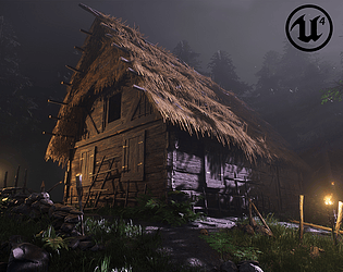
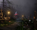
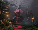
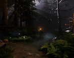
Great use of volumetric fog, adds a lot of atmosphere and mood to the scene. Bonus points for creating the foliage from scratch. Very solid submission!
Play asset pack
Cabin in the Woods's itch.io pageResults
| Criteria | Rank | Score* | Raw Score |
| Documentation | #2 | 4.625 | 4.625 |
| Technical | #2 | 4.000 | 4.000 |
| Overall | #3 | 4.250 | 4.250 |
| Creative | #4 | 4.125 | 4.125 |
| Research + Development | #4 | 4.375 | 4.375 |
| Presentation | #5 | 4.125 | 4.125 |
Ranked from 8 ratings. Score is adjusted from raw score by the median number of ratings per game in the jam.
Judge feedback
Judge feedback is anonymous and shown in a random order.
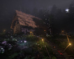
- The scale of the scene and knowing that you made every element is a very impressive achievement. You've utilized industry-standard workflows in a lot of this scenes development, demonstrating impressive shader techniques like RGB masking for scaleable detailing, as well as sculpting organic elements to a high standard. Visually, there are a few areas that I'd love to see improved, namely in the presentation. I think you have some solid areas of focus, especially the execution of the cabin itself, the materials authored and the primary beauty shots. Despite this, some of your lights are creating harsh shadows in areas that would benefit from softer bounce lighting from the moonlight. I'd also adjust the hue on the flames and attached lights to emit a stronger orange to push closer towards the blue/orange complimentary colour scheme. There are also areas that I'd love to see further developed from a composition perspective, like shifting some trees away from the cabin to prevent them drawing away attention unnecessarily. I like that you have two areas of interest within the space - in that regard, you've created an area that feels closer to a playable game space. But with that comes additional angles to tailor your lighting and set dressing towards, which ultimately is all time that could've been spent elsewhere. I love the goliath rock and its execution, but part of me would've loved more attention to be put into the cabin, potentially finding a method of combining them both into a single composition that feels more cohesive. Regardless, I'm nitpicking! This is a fantastic display of skills, especially with regards to material authoring, modularity and organic asset creation. You should be very proud of this :)
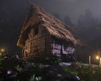
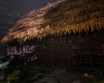
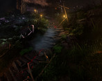
- The cabin is well model and works really well, it has a good amount of detail and is believable, with more time have a open door so you could see the interior, and this would of added another light source to the scene. foliage and ground cover works well in the scene, one area in general where you could look to push would be adding more blended materials so you can get dirt on things like the stones of the path or moss on wooden poles this would help to bed them in better. In general weathering and dirt passes to make everything feel lived or old giving element a history really feel with raising the level of realism. Even in a stylised environment adding blending brings things together. It's a difficult thing to get a well lit night time scene The moon light trying to break through could of been pushed further but i like the direction you choose. Well done.
- Very well presented. Lighting helps lift composition but could do with more supporting lights to balance light dispersal. Research nicely compiled and communicated. Well done!
- Submission Title: Cabin in the Woods Submission Tier: d3t Rising Star Assessor: Dominic Shaw Environment Artist @ Firesprite Research + Development There was some really good planning and execution in this project, the documentation showed a good breakdown of the all the workflows used in the project. The project also had some nice references for both the props and the mood/lighting of the environment. Creative Art I think that you did a great job at lighting a really dark level, the environment has interesting composition and you lead the eye to the focal points pretty well. I think that you captured the intended mood from your original planning really well and you did a good job at creating what you set out to create. The blood on the rock was pretty good story telling a really nice way to lead the player to the focal point, however I think that the shader could do with some more work as it’s feeling more like paint than blood at the moment. The values of the blood are really bright compared to the rock and I think that this is causing it to stand out a bit too much and not sit well in the environment. You already have a good master material set up for the blood decals so you can just edit this and darken the colours a bit. Technical Art The workflows that you used in the project was pretty good and you clearly understand the game art pipeline. You had some nice designer materials and the method you used for creating the modular kit for the hut was nice and efficient! I really liked the rock sculpts that you made and the workflow that you used for this was also spot on. You used master materials really well which is a good workflow and you did some good channel packing. The ‘ARM’ textures had the ‘sRGB’ value off which is correct, however your mask textures for the rocks didn’t have the ‘sRGB’ value off so I would change that. A quick fix is to change the compression setting to ‘Masks’ for this sort of stuff. Inside of Unreal, there is still some work that you could do in unreal to improve the frame rate and house management of the project. This includes adding LODS to all the meshes, unreal can do this automatically for you pretty fast and then decreasing the attention radius of the lights. Overlapping lights can cause the frame rate to drop. As for the house management of the project, you need to make sure that you are naming things correctly, adding proper prefixes and separating the textures, meshes, materials in to their own folders. This is nit-picky stuff but is expected in a studio so it’s a good habit to get into. Documentation The documentation had a good breakdown of everything and you know all the workflows needed to create this project. Final Presentation Overall, you have done a really nice job on this project so you should be proud of yourself and the final images had interesting compositions.
- impressive student project, level art and modeling are great, very interesting mood. Minus is the lighting: love the volumetric light and fog but it is looks half night = half day, a bit weird to me. It doesn't look like the directional light is coming from the moon. Great work overall!
Challenge Tier
d3t Rising Star


Leave a comment
Log in with itch.io to leave a comment.