


Play asset pack
Wizardess Study's itch.io pageResults
| Criteria | Rank | Score* | Raw Score |
| Documentation | #40 | 2.828 | 4.000 |
| Research + Development | #42 | 2.828 | 4.000 |
| Technical | #43 | 2.121 | 3.000 |
| Presentation | #46 | 2.121 | 3.000 |
| Creative | #49 | 2.121 | 3.000 |
| Overall | #49 | 2.404 | 3.400 |
Ranked from 1 rating. Score is adjusted from raw score by the median number of ratings per game in the jam.
Judge feedback
Judge feedback is anonymous.
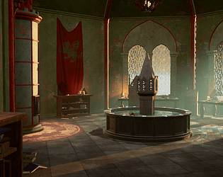
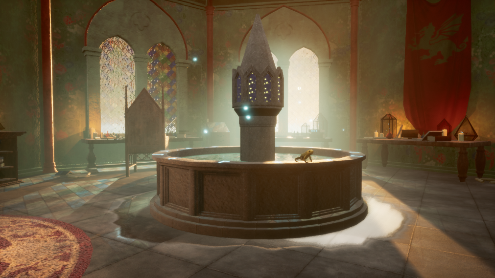
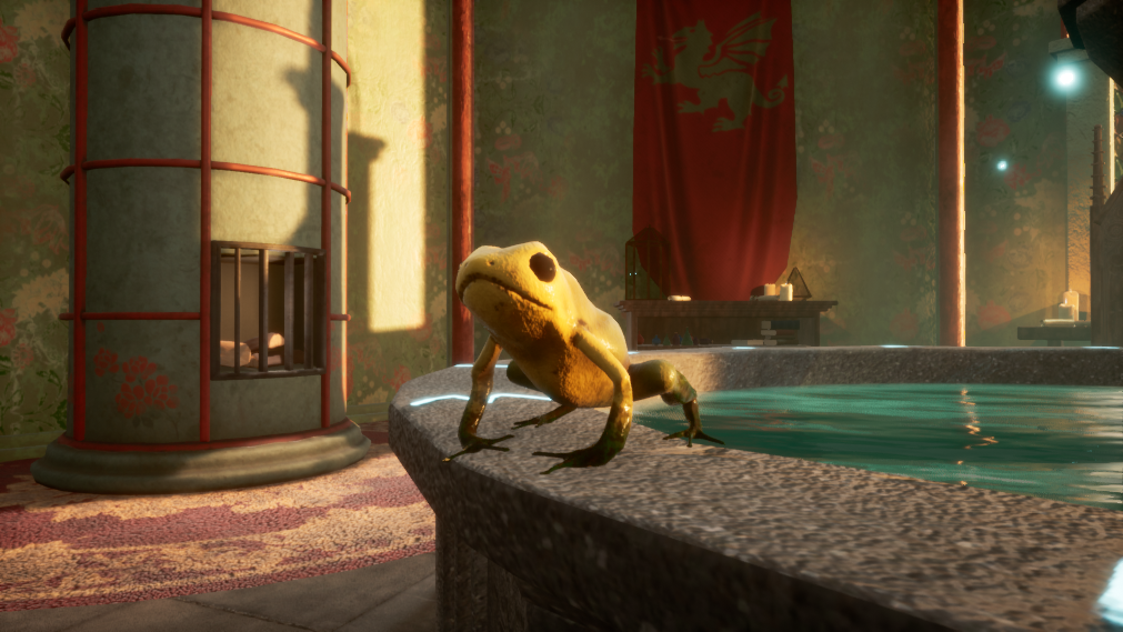
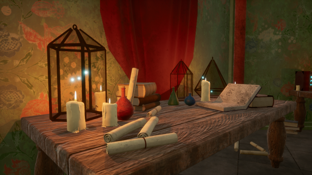
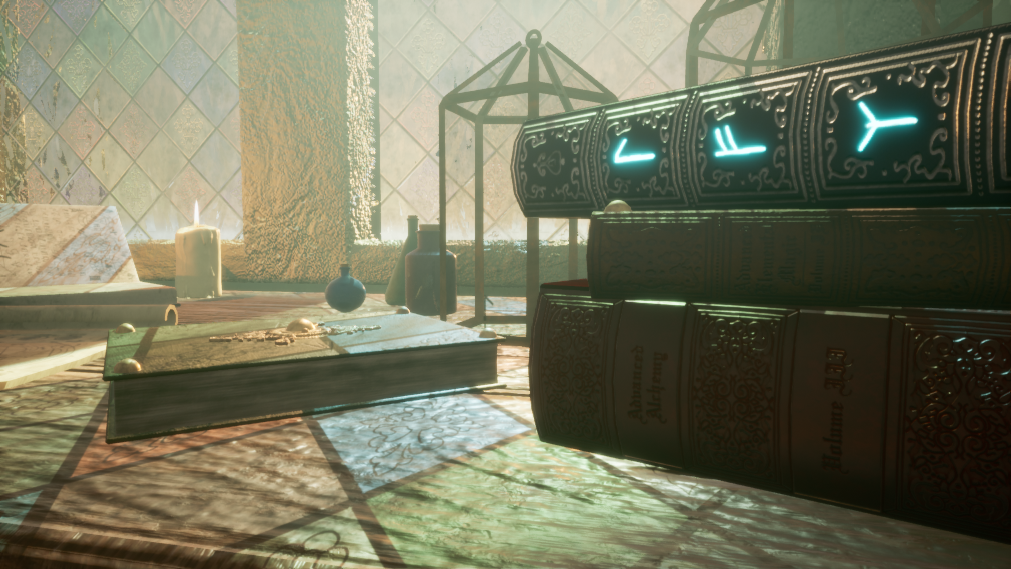
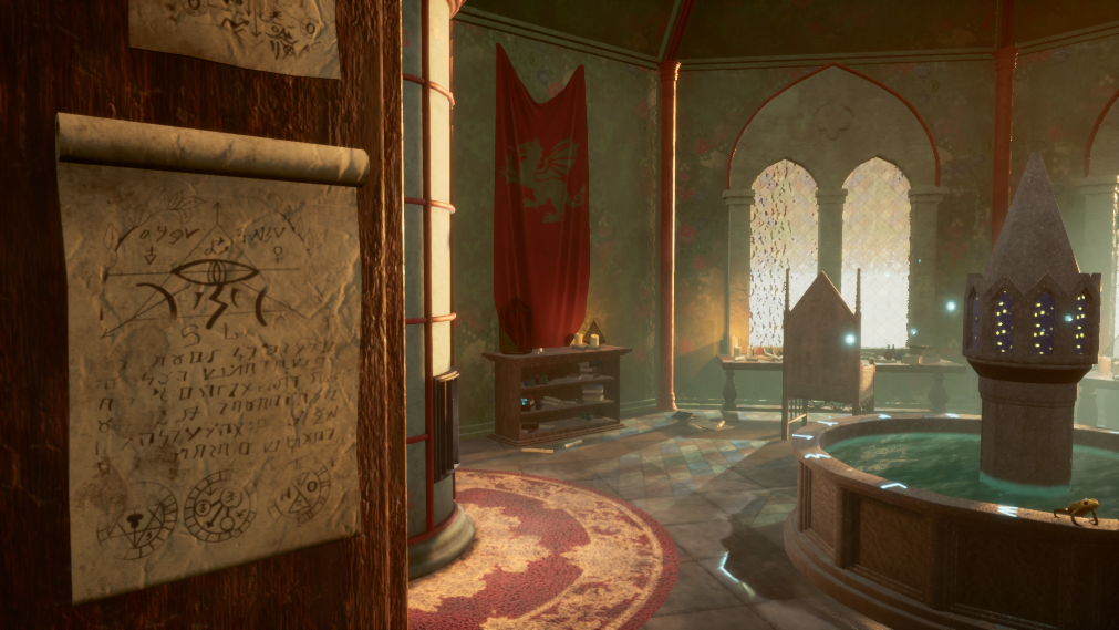
- Submission Title: Wizardess Study Submission Tier: Search for a star Assessor: Dominic Shaw Environment Artist @ Firesprite Research + Development You have done a really good break down of the concept and provided good reference for all props needed and I like that you created asset lists with estimated times for each task too. Planning is really important in environments has there are so many tasks to do, so good job on this! Creative Art You have done some nice storytelling throughout the level with set dressing and even though it was a big space, it was still an interesting environment to look around. The lighting you have done is good and it shines on the focal point which is great, however I would add some darker shadows in areas such as where the door is to create more visual contrast in the environment. Having everything bright, can cause the environment to look flat so just need so more value separation in there. I also really like the windows that you have made with the different colours but personally I would remove or lower the intensity of the wavy normal running through them and simplify it a bit as it’s a bit noisy to look at. Technical Art You have done some good techniques for this project such as modular kits, channel packing and the trim sheet for the fountain prop. There were a few small errors that I noticed that you could improve on such as the UV’s on the wall meshes not lining up correctly causing a seem at the corners where the two modular pieces meet. This is caused as the unwrap for that is scaled down on the texture sheet whilst it should be mapped to the full 0-1 texture space so that it tiles correctly. You could also take a look to into master materials on your next project has I noticed you had a lot of the same materials, this is where you set up one material, expose parameters and then use material instances for each material and then when you change the master material it will change all the linked material instances with it. I noticed a few areas where there was Z fighting near the windows, this is where two faces overlap perfectly and will cause visible flickering so I would just do a quick pass to clean these up. The baking of you have done is really nice and I like especially like your chair asset, I would more chamfering for the other props in your level too has I noticed a lot had hard, un-chamfered edges so you could chamfer these in your high poly and then bake that down, will give you nice edges in the scene. Documentation You have done a really good breakdown of everything with nice methods used in the environment such as trim sheets. This was a really well thought out project so you should be proud of what you have made! Final Presentation The final renders are nice and interesting, they have good compositions and showed off the focal points, I would try to get more contrast in the lighting and add some darker shadows around. It was nice to see a video of the project but if you are going to do a video for the portfolio, I would do it through the use of sequencer than screen recording yourself playing as this will look more cinematic and removing the first person default gun is always good to do.
Challenge Tier
Search For A Star
Leave a comment
Log in with itch.io to leave a comment.