Play asset pack
Lunar Lab's itch.io pageResults
| Criteria | Rank | Score* | Raw Score |
| Research + Development | #3 | 4.286 | 4.286 |
| Overall | #9 | 4.000 | 4.000 |
| Project Documentation | #10 | 4.143 | 4.143 |
| Creative Development | #12 | 3.857 | 3.857 |
| Technical / Workflow | #16 | 3.714 | 3.714 |
| Final Presentation | #17 | 4.000 | 4.000 |
Ranked from 7 ratings. Score is adjusted from raw score by the median number of ratings per game in the jam.
Judge feedback
Judge feedback is anonymous and shown in a random order.
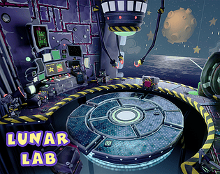
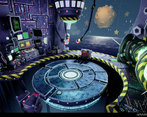
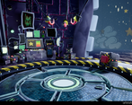
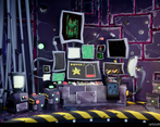
- There's a certain uniquenes about the style of this which is quite nice. There are a few inconsistencies however - it's very hard getting a "wonky" style to work properly. I would mainly go back and check the round things as some of them are smoother than others, and visually the crookedness of the console unit doesn't match the square shapes in the tiling texture behind it and the geometry on the base (that tiling texture also doesn't sit great on the curved floor). The scene generally feels cohesive and fun, and the background has an LBP sort of vibe which I enjoy. Would have been nice to see some UV layouts of the props.
- - Nice one with getting feedback from a developer from the Crash games - I love the style, form and silhouette of your models but I think it would be better if you created high poly models and baked them. This would not only improve your models by removing the low-poly sharpness but will also give you more maps to use when texturing them (ie, AO, Curvature, ect.) - Another way that you could get better edges would be to use edge weighted normals. - You’ve made good use of trim sheets, however looking at the high-poly in your documentation a lot of the bevels are way too narrow to be picked up effectively in engine. You need wide bevels, especially for such a stylised look. - Overall, a really nice portfolio piece
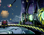
- This is a truly fantastic effort! I love the charm and character that the scene invokes. You can instantly see the inspiration from the crash bandicoot series and it has been executed fantastically. I really appreciate your very clear documentation and your understanding of the pipeline. I also love the fact that you tried something outside of your comfort zone and even went so far as to ask one of the artists about the trim sheet usage! In looking at the scene with a fine toothed comb I do have a couple of suggestions for you to consider for future projects. Trust me, these are minimal things and I am just being very nit picky at this stage! Be careful of where your seams are when using trim sheets. Also be careful of hard edge. On the front of the generator you can see examples of both a seam and a hard edge. These are minimal issues but could be easily hidden / resolved so it's always good to do a pass of your entire scene for this sort of thing before final submissions. Overall though you should be extremely happy and proud of your work that you have done on this scene. I have been inspired to do something similar myself now! Also, a "Wackiness pass" is totally something that all scenes should have done to them!! Well done you ^_^
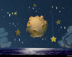
- You've matched the Art style really well and I knew exacty what is was based on, before I looked at your Documentation. In the future explore more reference rather than just Crash Bandicoot. I know the Scene is inspired by it, but it's always good to look at other franchises or even real life reference, just so you can plan out your "stylisation" better. Most or even all Stylised Art is inspired by real reference as a base and then you add your twist to it. Would have been nice to see some of them pipe elements underneath the Player area, like you have in your Concept Art, but I like that you've added some kind of falloff with the lights and fog, which is giving it some extra depth. Very cool that you reached out to a dev and supplied some intresting information and applied it to the project I'm a big fan of the use of Trims instead of unique Materials.They are super important for getting consisentcy in the scene and better for optimisation. For the outer Platform I think the floor could have done with another texture or another variation of the inner platform texture applied to it. I also, feel like you were losing some texture resolution in some areas, due to having everything crammed onto 1 Trim. Next time, don't be afraid to make maybe 2 trims. 1 for Decals and Details and the other for the more basic trims for example. Also, make sure your Texel Density is consistent. There's a lot of areas that are inconsistent. The ones that stand out are the floor and walls. Good use of Substance Designer to create Tileable Textures. Some clearer reference showing how you got to that result would have been nice. VFX used for the Screens, the Generator and the subtle wobble on the stars, really helps bring life to the Environment. Not a fan of the Background, mainly the water. I feel like its taking away from the overall quality of the scene. Some props, like the Desk are getting a little lost due to the lack of contrast between the colours of the wall and the Desk. The screens help it pop a bit, but the base of it is blending in a lot to the wall from a distance. I also, feel like some difference in Roughness values would help break it up too and make it a little less flat. To fix this I would look into Blend Masks. They allow you to add some very easy variation, with colours and roughness or use a Trim/Unique Hybrid method. Heads up on when exporting an Unreal Project for download, I recommened you look into Migrating your level to a blank level. This removes all the stuff you aren't using anymore, meaning the Project file size is smaller. I noticed unnecessary folders like "Starter Content" were still present and full of unused assets. Although, I state a lot of Feedback points, please be aware this is a really good Environment Piece and I love the way it turned out. I'm a big fan of the style you took and I really liked that you quickly realised to switch over to a new project, instead of being blocked on something you didn't want to do. You clearley enjoyed this and I'm looking forward to seeing more stuff like this. The overall Environment is nicely laid out; there's a lot thought been put in from concept to Polish. I hope this helped and well done :)
- The project ideas are solids such as the documentation behind. I would suggest to give more love to the background area and generally to the color composition. In your references, you will notice that usually there is some layering related to critical path, background elements/not accessible. Prior lighting, you should always take a look at the color composition of your albedos in "unlit/albedo" mode. Critical path has to stand out. There is an easy way to understand if your video/picture is working : desaturate your scene. You can grab a screenshot, desaturate on photoshop, and look at if you understand where are the elements and where the player is supposed to be. Your asset creation (modeling & texture) is good for a 3D Artist junior position, I would focus on color theory and composition if you look for environment artist positions.
Challenge Tier
Search For A Star


Leave a comment
Log in with itch.io to leave a comment.