Play asset pack
The Pantheons Protectorate.'s itch.io pageResults
| Criteria | Rank | Score* | Raw Score |
| Research + Development | #47 | 2.739 | 3.000 |
| Technical / Workflow | #47 | 2.556 | 2.800 |
| Project Documentation | #54 | 2.556 | 2.800 |
| Overall | #55 | 2.446 | 2.680 |
| Creative Development | #57 | 2.373 | 2.600 |
| Final Presentation | #65 | 2.008 | 2.200 |
Ranked from 5 ratings. Score is adjusted from raw score by the median number of ratings per game in the jam.
Judge feedback
Judge feedback is anonymous and shown in a random order.
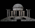
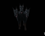
- Reviewing Environment art: Confident use of lighting for a relatively simple scene, although the creature is not emphasised as much as I would expect., possibly due to the shadows and the relatively dark texture. The beginnings of some visual story-telling through the art is evident. Maybe some damage to the dome in the large scenery piece would have helped break up the symmetrical nature of the scene.
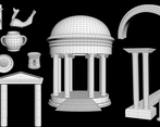
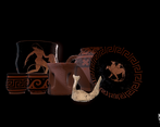
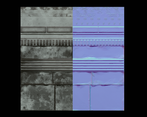
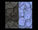
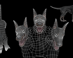
- Unsure of connection to theme - feels more like you just made a thing you wanted to make. Good ref collecting and use of this to make textures. Would have been good to see this extended to Greek architecture and particuarly pillars. Looks like maybe the normals were reversed on the inside of your dome and that's maybe why it wasn't working originally. Good stab at the Cerberus sculpt, although the body could have done with the same attention as the heads. Could he have been posed a bit more threateningly? Lighting improved a lot through the project but could stil have gone further - the source is unclear, and if meant to be moonlight the tones are still too warm.
- Sadly I didn't have access to the project, google link doesn't give access to the archive. My comments are based on your documentation and video. The video seems to have a really low FPS, I cannot say if it's related to your asset/game optimisation or recording. The overall idea of the project is not bad, but there is a lack of quality in the execution (asset creation, composition, lighting). I would suggest highlight more your main character in the scene, put more in evidence the center (shaping), give more atmospheric with local fog/volumetric fog. A good exercice is to desaturate your picture/screenshot, and check if you understand what is happening, what are the important elements. Everything important, for the player, the critical path, has to stand out. If you minimize your screenshot, and your eyes are not able to read/understand the scene, you may have a composition problem. Some of your textures tend to have a too dark albedo, try to get closer from middle grey and let the lighting make your night mood. This scene has a good potential, I would suggest to rework some elements and the composition in general. For the Cerberus; I would push on more quality, maybe add some fur to it.
Challenge Tier
Search For A Star
Leave a comment
Log in with itch.io to leave a comment.


Comments
No one has posted a comment yet