Play asset pack
Cyberpunk Scene's itch.io pageResults
| Criteria | Rank | Score* | Raw Score |
| Technical / Workflow | #44 | 2.667 | 2.667 |
| Final Presentation | #52 | 2.500 | 2.500 |
| Creative Development | #53 | 2.500 | 2.500 |
| Overall | #57 | 2.433 | 2.433 |
| Research + Development | #59 | 2.333 | 2.333 |
| Project Documentation | #61 | 2.167 | 2.167 |
Ranked from 6 ratings. Score is adjusted from raw score by the median number of ratings per game in the jam.
Judge feedback
Judge feedback is anonymous and shown in a random order.
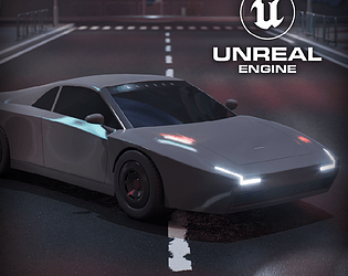
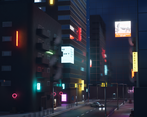
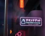
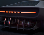
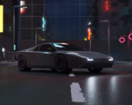
- The first impression of this scene is that it is incomplete likely due to the over scope and scale of the scene. Be careful when planning to fully consider the scope of the scene. A smaller area or a corner will often reduce scope while allowing for better density and improving the overall quality. Move on to the assets, starting with the car. The car shows some promise with some nice details at the back of the car. But this more exposed design feels a little bit conflicting with the rest of the vehicle with its smooth and un-modified curves. It would be nice if some of the characters from aftermarket bits were carried into the details and texturing of the rest of the vehicle to give it more of a story or history to it. Moving on to the environment. One issue likely due to time constraints and scope is the lack of clutter. Using the vegetation painting tools can be a quick way to scatter assets you have created to fill out the world. Neon signs always have some level of drawing the eye by their very nature. With that in mind, more time and resources could have been assigned to them (some could have had physically modelled tubes and/or advanced shaders so they feel like they are glowing from the inside). From a showing good use of texture space point of view, several of the signs textures could have been combined into one texture. Your consideration for modularity and trim sheets is good for making a large environment. I think keeping timesheets mostly to one type of material /surface type so you can you can utilise them fully. This is particularly true for a portfolio piece where quality is really important and this can allow you push them that quality without the added complication of atlasing the materials. If i may suggest something, while still learning the skills I would recommend to focus on either environments or vehicles one at a time. This give you some focus with developing workflows and skills related to each one. I would always encourage you to make what you enjoy and if you enjoy both as your skills are fleshed and developed this is where you can start to integrate these together more. While i appreciate the ambition of creating such a large scene overall this scene and many of its issue are direct result of scope. The artist shows that they have an understanding and have considered modular workflows which can be good for both workflow and performance. Going forward I would recommend creating smaller more focused environment to allow you to really take time to push the quality of each element of the scene (modelling, texturing, storytelling, lighting) while honing and developing skills.
- I think the effects are what pulls this scene together - the world itself seems bland and under-textured. I would have liked to have seen more done with the road texturing as it would help with the overall wet-look to the scene. The lighting FX are generally well realised and there is a variety of techniques. The Chinese lanterns' Fresnel lighting doesn't work for me, but it is a nice effect that perhaps would be better served on another type of object. An attempt to illuminate some of the windows would help to bring the world alive. A lack of documentation means it scored low for both R+D and Project Documentation categories.
- I sense this is more of a car submission than an environment submission. Unfortunately the lighting is quite dark and doesn't show either off very well - the cyberpunk aesthetic is there but could have been pushed further, and if you want the car to really shine then it needs some kind of lighting focussed on it (and that lighting needs to make sense in the context of the rest of the scene). Good use of trim sheets and from what I *can* see the car looks promising.
Challenge Tier
Search For A Star
Leave a comment
Log in with itch.io to leave a comment.


Comments
No one has posted a comment yet