Play asset pack
Haunted Art Studio's itch.io pageResults
| Criteria | Rank | Score* | Raw Score |
| Research + Development | #29 | 3.167 | 3.167 |
| Project Documentation | #29 | 3.333 | 3.333 |
| Creative Development | #33 | 3.000 | 3.000 |
| Overall | #38 | 3.000 | 3.000 |
| Final Presentation | #40 | 3.000 | 3.000 |
| Technical / Workflow | #52 | 2.500 | 2.500 |
Ranked from 6 ratings. Score is adjusted from raw score by the median number of ratings per game in the jam.
Judge feedback
Judge feedback is anonymous and shown in a random order.
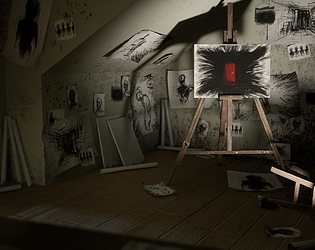
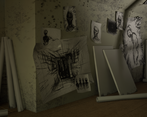
- This is a visually striking and effective scene that largely achieves the goals set out in the documentation. The lighting (and shadows) and expressive in-scene artwork bring the horror vibe. Good work! If I were hiring for a studio role, I'd want to see more detail in the underlying scene. The room lacked skirting boards, the doo has no frame and the wooden floor material is too basic. Try to think about wear on each asset; the door for example should have most grime near the handle (where it is often touched) in the lower quarter (where people push it open with their feet) and neat the hinges (where dust and oil emit over time) - this subtleties will help the overall scene feel more convincing.
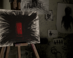
- I like the research behind this project and all the process to get there. The unreal scene is not available so I can only judge on 2D content. Your strong point is the story telling, the quality of your 2D art. There is a quality issue on the interior elements, such as walls, treatment of the ground. It does look like blockout stage. The lighting is also pretty rough and doesn't sell what you were looking for during your research. I would push you more to focus on the quality of your assets (modeling, texturing), then the quality of your general composition.
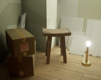
- Great documentation. Good to see greybox development and moodboards, and evidence of planning of assets needed, prioritising, and tracking stage of production. When UV-ing it is a good idea to try and straighten your UV shells wherever possible as it will make your life much easier when texturing and also reduces "jaggies" in your textures caused by straight things being textured on an angle. You could probably have removed some edge loops and made the assets a bit cheaper - remember to split UVs along hard edges in this case. Would have been nice to see some subtle worn edges on the props, curvature maps can be useful for this. Look into rectangular textures, it will help you save some texture space. Make round things round! We don't want to see polygonal edges if we can help it :) Pay close attention to construction details eg. skirting boards, screws, etc,. also the lamp could have done with a cable and a plug/socket. Overall good stab, keep at it.
Challenge Tier
Search For A Star
Leave a comment
Log in with itch.io to leave a comment.


Comments
No one has posted a comment yet