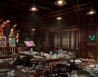
Play asset pack
Chaotic Artist's Atelier's itch.io pageResults
| Criteria | Rank | Score* | Raw Score |
| Research + Development | #6 | 4.167 | 4.167 |
| Creative Development | #6 | 4.167 | 4.167 |
| Overall | #8 | 4.033 | 4.033 |
| Final Presentation | #9 | 4.167 | 4.167 |
| Technical / Workflow | #12 | 3.833 | 3.833 |
| Project Documentation | #14 | 3.833 | 3.833 |
Ranked from 6 ratings. Score is adjusted from raw score by the median number of ratings per game in the jam.
Judge feedback
Judge feedback is anonymous and shown in a random order.
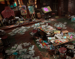
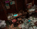
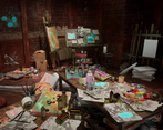
- A very nice scene! The chaotic nature of the scene is reined in by the colour palette which could have looked messy and random. However, if this was in a game you might have to pull some of the assets back just because of the quantity of assets and textures.
- The complexity of this scene is commendable but it's also very busy, the paint is a little bit Jackson Pollock, and I'm not really sure where to look. Everything is an equal intensity of noise, there's no small focus areas (maybe highlighted by lighting) etc., the eye is not drawn through the scene, it's more of a confrontation. The normal on the parquet is way too strong and the scale is off, usually that kind of flooring tiles a lot more. The scale on the bricks is also a little strange, they look too long. It would have been cool if the impasto in the painting scultps corresponded to the texturing more closely. Watch the directions of your wood grain on the props. Check the scale of the paint splat decals as they feel a little large. You didn't hit your spooky vibe, it feels a bit too warm and inviting, but the overall level of detail in the set dressing is really, really impressive.
- I really like this scene, the overall idea is great. You could focus more the lighting to improve the aesthetic and understanding. Your dressing is providing a nice story telling but messy doesn't mean there is no focus point in your picture or layering. You can improve lighting, fog in your scene to focus on a specific place (central, side?) of your scene. I have to take a point from not providing the unreal scene in the project. It's a good job in term of env art overall; main improvement will come from a better lighting shaping the scene and subjects.
Challenge Tier
Search For A Star
Leave a comment
Log in with itch.io to leave a comment.


Comments
No one has posted a comment yet