Love it! I'm in awe! It feels so alive because of the animations you've done.
Play asset pack
Eternity Gateway's itch.io pageResults
| Criteria | Rank | Score* | Raw Score |
| Research + Development | #1 | 4.429 | 4.429 |
| Creative Development | #3 | 4.429 | 4.429 |
| Overall | #3 | 4.314 | 4.314 |
| Project Documentation | #4 | 4.429 | 4.429 |
| Final Presentation | #6 | 4.286 | 4.286 |
| Technical / Workflow | #7 | 4.000 | 4.000 |
Ranked from 7 ratings. Score is adjusted from raw score by the median number of ratings per game in the jam.
Judge feedback
Judge feedback is anonymous and shown in a random order.
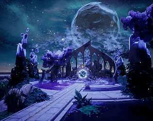
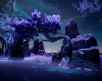
- I like your environment and treatment of the thematic. If I have some con and improvement to point out; I would suggest to layer more with DoF, or Fog your background, especially since we can notice the end of the world, it doesn't blend well at the horizon. The difference of color is mainly giving this hash line at the horizon. Maybe adding some fog would help ? In general, being able to see the end of the world in a game or picture, when it's not "smooth" should be avoided. I liked your drawing and development to get there!
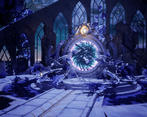
- A very professional-looking submission. The colour palette and art style are both excellent. Good modeling, especially the rocks. Personally, I'd prefer the moon not to be so prominent in the scene as it draws the eye away from the composition of the arches and the portal. Other than, that this is great work.
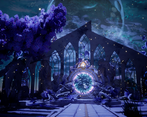
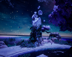
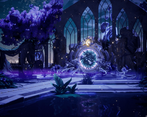
- Hello, After checking your documentation, the Unreal scene and images you provided my conclusion was that you managed to achieve what you aimed for in the amount of time you were provided. The fantasy mood and the story you wanted to convey comes through and it is clearly visible that this piece was created with affection toward the theme. Overall it is pleasant to the eye to look at your presentation. In the following I will share my thoughts about your work divided by criteria of this art challenge. 1. Research and development. Lof of work and thoughts were put into this piece. Collecting references and analyzing them, explaining your thinking process, presenting the idea and creating your own drawings are well executed. My only note here would be that planning your time for each phase (blockout, modeling, texturing, etc) could help you to pivot better for your the goal of the project and also have some buffer time to revisit things. 2. Technical Art It was visible that you have a good understanding how the material editor works and how to use material instances and material functions. Also nice use of trim textures. The polygon usage was good overall too. But I would share couple of things you could pay a bit more attention in the future: Fog card could have been facing towards the camera. On ground level they are not visible and the scene lose a lot from its mood. Better organized UE project and naming assets, textures. Rocks feel a bit washed out. The references of rocks have sharp edges. This comes from two factors: The normals of the rocks are really noisy due to the micro details you added and the lighting of the scene. Materials need some polish. Metal (ornament on your trim sheet) and stone feels really similar. Arcade structure to sharp and perfect. It blends in the environment well but does not feel it is really part of it. Reason is that everything is broken around it. Another note regarding this assets that it is a big structure. It would have been better to go with a tileable texture for it and break it up with vegetation or decals. This applies to the Moon as well. The Moon is a big asset so a tileable texture would have been better for the albedo. How the Portal was textured it makes it noisy because it has a lot of detail with those bricks. This is really visible from a distance. The vortex has the details so the portal what frames it would have been better to have less details. The water lily placement close to the portal does not feel natural. Certain pattern in the placement is really visible which gives breaks a bit its natural placement. Regarding the materials would be better to be a bit more organized. For instance in the Moon material what 1 and 2 refers to is hard to tell at first glance. Name it properly so anybody can understand your logic and intentions immediately. Regarding the composition overall is good but with a few adjustments you could improve the readability of assets and also setting the focus more on the portal. The Moon and the broken pillar behind the portal are in the center just like the portal itself. You created two main focal points with this (portal and moon) and on top of that the pillar adds noise. The moon would have been better on the side of the image. The pillar would have been better if you just remove it so the shape of the portal was more readable. This scene is really strong but as every environment scene has a crutial key factor to make it really good. That is the lighting. If this is not set up well it can ruin the scene. You picked a night time for your scene. In these type of scenes the main light usually is low intensity. Your main light is too strong. Lowering the intensity of the main light and increasing the intensity of the light at the portal would have created the focus on the portal itself. In this case you would have not needed the additional rectangle lights to make the area visible behind the portal. Because the main light is so strong it washed out the details on the assets in general. Also the contrast in the scene was really soft or not really visible which should be the opposite for night scenes. To avoid really dark shadows a fill light could have been used to brighten up the shadows in the scene. 4. Final Presentation Overall quality of the images is ok. The mood and tone implies your intentions well. The time to create this work was short so it is understandable that you did not have time for everything but with some improvements on lighting, material and composition this piece could look even better and become a strong portfolio piece. 5. Documentation The project documentation was well structured, clear and easy to read. Overall great job and I hope these notes can help you.
- One of the best entries I've seen so far. Well done!
Challenge Tier
Search For A Star



Leave a comment
Log in with itch.io to leave a comment.