Play asset pack
Desolate Factory's itch.io pageResults
| Criteria | Rank | Score* | Raw Score |
| Creative Development | #36 | 2.921 | 3.200 |
| Project Documentation | #41 | 2.921 | 3.200 |
| Final Presentation | #42 | 2.921 | 3.200 |
| Overall | #42 | 2.775 | 3.040 |
| Research + Development | #47 | 2.739 | 3.000 |
| Technical / Workflow | #55 | 2.373 | 2.600 |
Ranked from 5 ratings. Score is adjusted from raw score by the median number of ratings per game in the jam.
Judge feedback
Judge feedback is anonymous and shown in a random order.
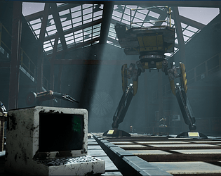
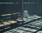
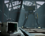
- There's a lot to be pleased about here; some great exploration of ideas (great to see sketch work!) and the process through blockout and final artwork. Now the hard work is done, this scene is ripe to be used for additional lighting passes. The current lighting is too stark - bleaching materials in the bright, and losing all definition in the shadows. It's be great to see more ambient light as well as additional light sources placed in the scene.
- I am not sure the factory fully fits with the theme but you have kind of made it work. It would have been nice to see some more specific texturing on the props, particularly the main assets, rather than just relying on smart materials which can be a little generic. In particular there is a lot of grunge splated onto things eg. the wooden tables which doesn't work so well. The overall vibe of the scene works pretty ok, the lighting is maybe a bit busy but nice work faking some of it with light blockers. Look into trim sheets and tiling textures, and pay attention to construction details (eg. on the metal framework, there should have been bolts and joints and so on) and making sure round things have an appropriate number of edge divisions.
- There is a lack of quality in the asset creation (modeling too low poly, rough textures, too low resolution and bump maps). The stating itself for some shot isn't bad but in term of game dressing it looks maybe a bit empty/not living. I would have enjoyed more dressing for the ground, the structure itself of the building.
Challenge Tier
Rising Star
Leave a comment
Log in with itch.io to leave a comment.


Comments
Hi, I'm not too sure how to edit my project after submitting. Here's a video of the scene I made an hour ago :)