Play asset pack
SFAS_UNDERTHEDOME_MELIS_ESER's itch.io pageResults
| Criteria | Rank | Score* | Raw Score |
| Final Presentation | #34 | 3.104 | 3.400 |
| Technical / Workflow | #36 | 2.739 | 3.000 |
| Project Documentation | #41 | 2.921 | 3.200 |
| Overall | #42 | 2.775 | 3.040 |
| Creative Development | #44 | 2.739 | 3.000 |
| Research + Development | #56 | 2.373 | 2.600 |
Ranked from 5 ratings. Score is adjusted from raw score by the median number of ratings per game in the jam.
Judge feedback
Judge feedback is anonymous and shown in a random order.
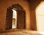
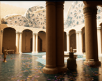
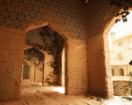
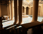
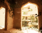
- Hi Melis, The final result here looks really great thanks to your sculpting and lighting work. It captures that aesthetic really nicely. Zbrush and texture work elevate your assets however I think the scale of a few textures could be changed as they read as oversized. Another thing I noticed here was that your floor tiles are cut off at the edge where they drop down a step. Lining something like this up is an easy win to add to the realism, just something to watch for next time. I really like the modular approach of your asset work. Workflows like this are vital for game development and its good to see you thinking like this in your work. I'd say don't be afraid of adding a few more support polys to certain areas, e.g. the circular fountain and foliage. Its good that you're being conscious and trying to think of memory saving solutions, but things like projected decals can sometimes end up being more costly. Games these days can take a lot more polys and they would really help push the visuals of this work. Overall really nice piece that is presented well and was worth pushing those last little extras like the lighting and post processing.
- There is an issue with the modeling in general, all the elements are looking blobby even if it's made of concrete. The lighting itself is too powerful, you maybe should dim more and work on getting contrasts and reduce the lighting bounces. The unreal scene wasn't provided.
- The lighting has a pleasant warmth and the scene was well balanced in post-processing, but watch your texel resolution as it varies across the scene and makes some areas look a bit blurry. Pay attention also to edge details and how these kinds of structure would be built in normal life - the tile pattern for example has some odd sculpted edges and kind of fades out in places. Looks like some of your meshes didn't have enough resolution before they went into ZBrush as there are visible edges after subdividing? Check your poly density overall - some things could use some more edge divisions, while things like the candles are quite high poly for what they are. Remember to split UV shells along hard edges and make sure you're straightening your shells as much as possible where possible, which will make them easier to lay out - also need to use your UV space a bit more efficiently.
Challenge Tier
Search For A Star
Leave a comment
Log in with itch.io to leave a comment.


Comments
No one has posted a comment yet