Play asset pack
Telescope Lounge's itch.io pageResults
| Criteria | Rank | Score* | Raw Score |
| Research + Development | #52 | 2.571 | 2.571 |
| Project Documentation | #52 | 2.714 | 2.714 |
| Overall | #58 | 2.429 | 2.429 |
| Final Presentation | #59 | 2.286 | 2.286 |
| Technical / Workflow | #59 | 2.286 | 2.286 |
| Creative Development | #61 | 2.286 | 2.286 |
Ranked from 7 ratings. Score is adjusted from raw score by the median number of ratings per game in the jam.
Judge feedback
Judge feedback is anonymous and shown in a random order.
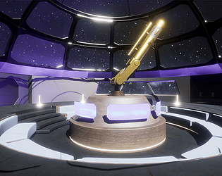
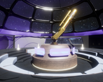
- This is a fun scene, well documented with a structured approach to hitting the deadline. There are hints of 70's kitsch design with the sunken, circular seats and the window frames that feel like early Star-Trek. Whilst this entrant is clearly capable of dressing a scene, the quality of the individual assets is lacking and I'd encourage more focus on prop building. When the two come together, you'll have great diorama scenes.
- An interesting concept, but it's difficult to see where the art direction is going at this stage, A cylindrical environment can be challenging due to the symmetry I would suggest adding some asymmetric elements to add interest to the overall composition
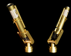
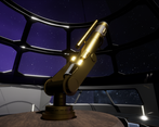
- Good to see evidence of trim sheet workflow, and I like that you designed the telescope carefully with thought to how it would move. When you come back to this I'd start with the lighting as it is a bit confused with an overly bright centre and then very dark areas all around. Interesting concept, would be cool if you can pull it off.
Challenge Tier
Search For A Star
Leave a comment
Log in with itch.io to leave a comment.


Comments
No one has posted a comment yet