Play asset pack
ChewChew Temple's itch.io pageResults
| Criteria | Rank | Score* | Raw Score |
| Technical / Workflow | #4 | 4.167 | 4.167 |
| Final Presentation | #9 | 4.167 | 4.167 |
| Project Documentation | #15 | 3.667 | 3.667 |
| Overall | #15 | 3.800 | 3.800 |
| Creative Development | #16 | 3.667 | 3.667 |
| Research + Development | #25 | 3.333 | 3.333 |
Ranked from 6 ratings. Score is adjusted from raw score by the median number of ratings per game in the jam.
Judge feedback
Judge feedback is anonymous and shown in a random order.
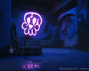
- This is an impressive submission to the competition. A very pragmatic approach, fuelled by good technical knowledge and a solid final presentation. It's always nice to see traditional sketches before committing to 3d. The use of vertex paint was a good fit for the end goal. The final lighting with ultra-violet effect images was effective. If there were one comment, it would be that the development phase didn't show any evaluation and evolution of design before committing to production. I would always encourage artists to spend more time in the R&D phase which often only account for 5% of the production time, but is where the key decisions are made.
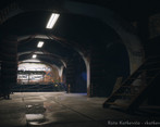
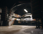
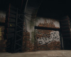
- Your asset creation is nice, there is some quality there. I would push more on getting more highpoly / feeling less low poly for some elements. Your environment itself is nice, maybe a bit too empty on ground level. Lighting could definitely being improved, more atmospheric, feeling the fog and better the neon tube lights. A lot of potential!
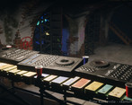
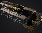
- There's some really cool stuff going on here and your technical approach to things is quite clever, I can see that minor in tech art coming through strongly. However I am struggling at little to add up which bits of the scene reflect the 4 things that were needed to submit. While I appreciate the need for speed, it would have been nice to see eg. the decks properly individually textured, as well as more information on the UV layouts and wireframes of other elements in the scene apart from the walls. The lighting and materials look great, I would maybe also just question whether having so much water lying around in a place with all that electricity is a good idea!
Challenge Tier
Rising Star




Leave a comment
Log in with itch.io to leave a comment.