Play asset pack
Midnight Alley's itch.io pageResults
| Criteria | Rank | Score* | Raw Score |
| Research + Development | #21 | 3.500 | 3.500 |
| Final Presentation | #23 | 3.500 | 3.500 |
| Overall | #25 | 3.367 | 3.367 |
| Technical / Workflow | #25 | 3.333 | 3.333 |
| Creative Development | #26 | 3.167 | 3.167 |
| Project Documentation | #29 | 3.333 | 3.333 |
Ranked from 6 ratings. Score is adjusted from raw score by the median number of ratings per game in the jam.
Judge feedback
Judge feedback is anonymous and shown in a random order.
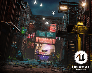
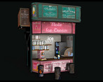
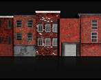
- the lighting and composition of the scene is nice. The texturing and texel ratio for the building is a bit odd (giant bricks?). I would focus on refining the texture quality and shading of your elements. The ground treatment is also a bit odd of a city. Your strong point is definitely composition and lighting. If I was you, starting to look for a job, I would try to push in that direction.
- This is a very nice scene, it just needs a bit more polish on existing assets and a wider variety of objects.
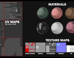
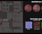
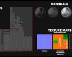
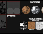
- When creating buildings, even low poly ones, take care to look at the architectural details. Windows should usually be recessed, with a sill or lintel where the bricks are slightly different. Pay close attention to how these things, and the floor and the roof, align with the rows of bricks. You shouldn't have a brick that is cut in half horizontally. Tiling textures and trimsheets would have worked much better for the buildings rather than mapping them uniquely. UV maps overall could be a bit more efficient - try not to UV on weird angles as it packs badly, straightening UVs wherever possible also helps avoid "jaggies". Some of the text looks a bit squashed (and there's an obvious wiggle on one of the signs). The wood grain on the pallet is going the wrong direction - again, attention to detail and pay close attention to reference material. I'm also not really sure why the stone floor of the alley way would be quite so wobbly: in the context of the scene it doesn't make sense. How did it get that way? Furthermore the large floating stars don't really tie in with the realistic art style, and make me feel like maybe you already had this idea before the themes were announced and tried to loosely attach the idea to a theme. Overall it looks nice but there's a lot to improve, you did do some quite technical documentation though.
Challenge Tier
Search For A Star
Leave a comment
Log in with itch.io to leave a comment.




Comments
Due to big project size, download link is via Google Drive in the Project Page.