Play Project
Dinosaur Playground's itch.io pageResults
| Criteria | Rank | Score* | Raw Score |
| Overall | #2 | 4.333 | 4.333 |
| Creative Development | #2 | 4.444 | 4.444 |
| Technical / Workflow | #3 | 4.222 | 4.222 |
| Research + Development | #4 | 4.222 | 4.222 |
| Final Presentation | #5 | 4.444 | 4.444 |
| Project Documentation | #5 | 4.333 | 4.333 |
Ranked from 9 ratings. Score is adjusted from raw score by the median number of ratings per game in the jam.
Judge feedback
Judge feedback is anonymous and shown in a random order.
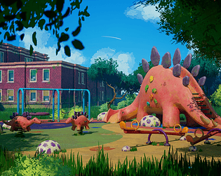
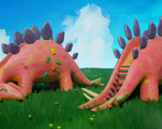
- Nice fun scene, love the design of the dino playground elements. Nice appealing colours. I would be tempted to beef up the saturation on the whole thing - lean into it. Would be nice to see a bit more roughness variation on the materials like the dino slide
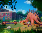
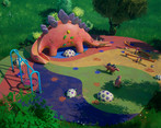
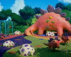
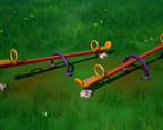
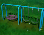
- Hello, After checking your documentation, the Unreal scene and images you provided my conclusion was that you managed to achieve what you aimed for in the amount of time you were provided. The mood and the story you wanted to convey comes through and it is clearly visible that this piece was created with affection toward the theme. Overall it is pleasant to the eye to look at your presentation. In the following I will share my thoughts about your work divided by criteria of this art challenge. 1. Research and development. Collecting references and analyzing them, explaining your thinking process, presenting the idea and creating your own drawings are well executed. Doing a clear planning and asset list show that you can work in an organized way and prioritize what has higher priority. My only note here would be that as you have your blockout pieces put it immediately in the game engine. Do not assemble the scene in the 3D software. You should assemble the scene in the engine and see your work through a camera you set up. In 3D software you can get a basic understanding and can set up a good shape language with a good polygon flow but your perception of things can change after you put everything in engine and observe it there under a lit condition. It can help you to judge better you composition, to spot scale issues or what should be adjusted to improve its readability which are easy to overlook in a 3D software. 2. Technical Art It was visible that you have a good understanding how the material editor works and how to use material instances and material functions. Also nice use of modular kit, tileable and trim textures. But I would share couple of things you could pay a bit more attention in the future: The Master material for the bricks, props and floor share many things. Might have been easier and cheaper resource-wise to write one shader for all of them and build in switches to enable certain functions where you really need it. Some of the materials could be a bit more organized like using comments or frame the elements that belongs together better. You did this in some of them but not in all of them. If you are consistent and open the project later it would give you a clear overview where what you did even if you can not remember. Also if someone else looks at it they can understand your logic and your approach faster regardless which material they open. When you have a long model like the dino mama slide you could consider to use a half texture than a square one. Half texture in these cases could be a better fit because you could lay out the uv in a better way and fits better to the dimensions of the asset. Also with organic shapes it is hard to do but whenever possible straighten the uv where it bends. You might have to deal with a little bit of stretching but overall it would be easier to paint the texure on those parts and also would give you a cleaner uv layout at the end. Another good technique to save uv space that the elements that are the same and reused they are overlapping in the uv. For instance the scale on the dinos. If you aim to create environments for games here is a production tip: It is important to work with a fixed texel density for the whole scene to keep everything visually consistent and not having blurry textures close to the camera for instance. (Still it can happen that some assets are having more or less texel density than others because of their size of for other reasons.) In your scene the texel density does not seem to be consistent and some of the assets are using big textures even they have really high texel density. In production this would mean these big textures are using way too much memory and reuving and retexturing the asset or ,in best case scenario, just scaling down the texure would be required. It is a valuable skill to understand and be able to work with texel density and if you can show this in your portfolio that is a big plus. When you create something that will be reused a lot of time like the flower keep the polycount as low as possible. Even though that nowadays computer and game engines can handle it these can eat a lot of resources and generating a lot of draw calls which in production something what you would like to avoid. Using very little to create something nice looking is another skill which an environment artist needs to aquire because in production you have to work with a lot of limitations and you need to be creative to find the solution for every case. For the lighting would be better to set the min and max exposure to 1 in the post process volume so you disable the auto exposure. That can mislead the eye and probably especially when you try to use a PBR workflow. I assume because of the default exposure you set the main light intensity so low. 3. Creative development The scene has a charm and warm but I was a bit confused regarding one thing. The painted metal looked almost new compared to the rest of the scene. So this broke the immersion for me a little bit because the environment implies this is an abandoned playground but the metal material tells otherwise. You did nice concepts to plan how the assets would look like and how they would function. But in the final scene the design of the see-saw does not really work for me. It is a bit hard to believe that such a design can actually function. Even though your goal was to create a stylized scene the main reference is real life. To make the asset more believable probably creating this asset based on one of the references of see-saw you had would have been better. Looking at the final image I assume the dino mama would be the focal point of the image. But couple of things are interfering with this: One of them is the school. It is a background asset and has a lot of noise due to the brick texture. As on your concept it does not have too much detail. So if you had used a plaster for instance it would attract the eye less. The reason I focus on the school is that in front of it there is the frame of the swings which color really calls my attention. First you picked a color which would have blended better with the environment but at the end in the Material instance you changed it to blue. Another thing that the color of the slide part of the dino mama is blending with the ground. Using a different color for that part would really help to tell apart the slide and the ground. Speaking of the ground. The ground material and texture definition is not clear what type of material you try to present here and feels really noisy. Usually the ground has low contrast to not to call to much attention (unless it is intended) and you use it as a base to put things on it. On playgrounds usually they use this foam material which has a certain texture pattern. This is visible on your reference images too. Because of the noisiness and the grass patches the ground asset feels a bit unnatural. Lowering the noise and instead of grass you could have used leaves, twigs or the toys you mentioned in your documentation to break up the big, flat ground. Regarding the models they seems to be midpolygon models to me. I do not know if you had any polygon budget but here and there some models could be more optimized. When it comes to their high poly detail my note would be that you should put detail where it really makes sense. Imagine which part would be used the most by kids, where they would bump in it or hit it. There you can put scratches, imperfections and also supporting these in the texture. This applies to the moss as well. Steps on the back of the dino mama does not reach to the top. Usually slides have it like that so anybody can climb up safely and slide from the top. I do not know if you did this intentionally. But for me a couple of steps are missing to make me believe that it was safe to go up when it was used. Vegetation in general is not easy to make. The grass you made feels uniform in size even though you created different patches. Also their normal is too strong and lighting picks this up. The color variation for the grass is not coming through from the camera angle. The cards on the trees and bushes are too visible from the camera angle. This breaks the illusion that the canopy of the tree or the bush is one big volume. Regarding the color of the vegetation it feels like that different pieces put together and does not give the vibe that they belong to the same fauna. If you could have had more time to adjust the colors you could have achieved not only the consistency but also the vegetation would have helped to make the dino mama pop out more (just like in the Bird house scene what you picked as reference). Also you show a tree branch really close to the camera and the quality of the texture needs some improvements to be able to use it as a foreground element in the composition. Another thing that could have help to make the dino mama pop out more is some adjustment in the compostion. Originally you had this in your concept (Fig 15) where you used negative space to make the dino mama more visible and recognizable. In the background you have clouds which feel a bit sketchy. Having a bit softer and blurred clouds could have supported the coziness of the scene better. Regarding the lighting you have really dark shadows that almost go in black. Softening and make the shadow a bit brighter would have support better the mood, tone of the scene. 4. Final Presentation Overall quality of the images is good. The mood and tone implies your intentions well. The time to create this work was short so it is understandable that you did not have time for everything but with some improvements on color and composition this piece could look even better and become a strong portfolio piece. 5. Documentation The project documentation was well structured, clear and easy to read. The final thoughts section was reflected well some of the things that could have been improved in case more time would have been available. This is nice to have and in case you want to push this project to the next level doing these improvements could make this piece shine more.
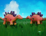
- If there was an award for cutest project, this would be my pick. I LOVE the dinosaurs. Your meshes look clean, and you're one of actually quite few people to do a HP sculpt and retop. You've also straightened your UV shells which I must have written 50 times over in feedback for people! I appreciate the use of smart materials topped up with some hand painting for a more detailed and specific finish. Just a couple of tiny notes: it might have been better to turn cast shadows off the flowers, so they don't look so floaty and blend in with the grass more; and make sure you pay attention to your bricks on the buildings. You don't want to end up with half a layer of bricks eg. at the top or bottom of a window, or cut off by a row of trim. Try and line the brick pattern up so that the bricks are always whole, never cut horizontally in half. Overall a very charming project - as Marie Kondo would say, this absolutely sparks joy.
- Hi Berenika! This piece is absolutely beautiful! Not just from the final renders that really speak for themselves but the approach to timelines, detail of workflows and the fact you've really covered every aspect of the environment art process. I personally don't have much to critique on this piece that you didn't cover in your conclusion, as it really does set a benchmark for what you can achieve in this Game Jam. Anyone looking to participate in the future should look to this as inspiration and a guide. :) Really good job!
- I like your props and composition. There is one con in your scene is the ground treatment of the playground area. You should take a look to improve this gross lines and the texture noise to make it look less flat and "gross" comparing to the rest of your composition. Your mesh actors are nicely made, love the creativity there.
Challenge Tier
Search For A Star
Leave a comment
Log in with itch.io to leave a comment.


Comments
No one has posted a comment yet