Play asset pack
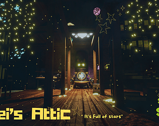
Emei's Attic - SFAS 2024's itch.io pageResults
| Criteria | Rank | Score* | Raw Score |
| Research + Development | #27 | 3.286 | 3.600 |
| Final Presentation | #28 | 3.286 | 3.600 |
| Project Documentation | #28 | 3.469 | 3.800 |
| Creative Development | #31 | 3.104 | 3.400 |
| Overall | #32 | 3.177 | 3.480 |
| Technical / Workflow | #36 | 2.739 | 3.000 |
Ranked from 5 ratings. Score is adjusted from raw score by the median number of ratings per game in the jam.
Judge feedback
Judge feedback is anonymous and shown in a random order.
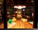
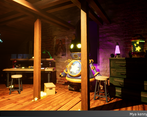
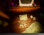
- You have done a wonderful job with this scene. It is both beautiful and creative! I suggest for your next project you look into using a tileable texture for your floorboards instead of having a baked sheet like you currently have. This will allow for more texture resolution and will give you a cleaner result. I also suggest using the directional warp and a random greyscale flood fill mask of the floorboards to break up the woodgrain so that the same pattern doesn't go across 2 boards. This will help add a higher level of realism to your scene. Be careful of doing things like shortening the length of one of the ps1 controller cables too. This is only a small thing but it really breaks the immersion if it's noticed. You could model it the correct length and then have it coiled / bunched up. This will also help with the "lived-in" feel of the scene. Overall this is a really nice scene and you should be very proud of what you have achieved with it. As someone who grew up in the 90s I can tell you that this scene hit me right in the feels! Great work!
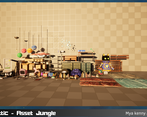
- A like the story telling of the project. There is a LOT of content in term of modeling and hero assets. Which is nice and bad at the same time because it contrasts with the rest of the scene : the environment itself, the ground, structure is lacking of quality (modeling/texture/too low poly). The atmosphere and the lighting isn't selling well the assets, I would refine this part. In general, avoid full black area in a composition, especially when you have lights supposed to bounces. Highlighting is great, but to keep clean the area, try to avoid dark pockets and high contrasts. You could play with fog and dust also to improve the grounding of the scene.
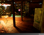
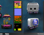
- It's good to see you taking on board advice from a previous submission - I have a few extra things :) Make sure you give round things enough edge divisions, and be consistent about it. It's ok to have things look a bit low poly but it needs to be deliberate and it all needs to be like that. You've got a few probs which are really smooth and others which have quite visible edges. When you're adding damage to an object, think about how that damage actually occurs - for the Wii remotes it would have been easy to collect ref for this rather than adding some splodgy bits which didn't really make sense. Similarly the PlayStation wouldn't get dark edge wear - this kind of thing makes the material hard to read. Check your wood grain direction on various things like the bannister rail, and check your texel rate across the scene, the door frame in particular looks much lower than the surroundings. The fairy lights are a little noisy, perhaps they could have been used in a string to lead the player into the environment. Overall there's really an impressive amount of stuff here. Would have been nice to see a few more wireframes.
Challenge Tier
Search For A Star
Leave a comment
Log in with itch.io to leave a comment.





Comments
No one has posted a comment yet