Play asset pack
The Jester's Workshop's itch.io pageResults
| Criteria | Rank | Score* | Raw Score |
| Creative Development | #40 | 2.833 | 2.833 |
| Research + Development | #45 | 2.833 | 2.833 |
| Project Documentation | #46 | 2.833 | 2.833 |
| Overall | #49 | 2.667 | 2.667 |
| Final Presentation | #52 | 2.500 | 2.500 |
| Technical / Workflow | #57 | 2.333 | 2.333 |
Ranked from 6 ratings. Score is adjusted from raw score by the median number of ratings per game in the jam.
Judge feedback
Judge feedback is anonymous and shown in a random order.
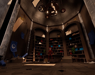
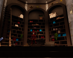
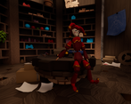
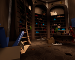
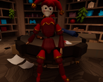
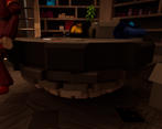
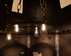
- Good use of tiling textures, try also looking into trim sheets as this will enhance your workflow even further. With your props, be aware of which edges you are smoothing and which you are keeping hard, as there seems to be a bit of a mix going on, especially on the jester. It would also have been good to see some more unique texturing on the props, rather than just using tiling textures, as particularly the wood grain direction was a bit all over the place. Lighting feelts ok, good work placing lights that look like they're coming *from* something a opposed to just being randomly placed to brighten the room. Keep an eye on your poly distribution - parts of the jester were much higher poly than others for no apparent gain.
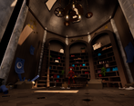
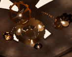
- - The 3D modelling you have done is good, you’ve got nice forms throughout your scene. I think your next steps should be to learn and get confident at high to low poly baking. A recurring issue is that your assets seem to be lacking normal map information, allowing me to see individual polygons in the final model. - The Jester is a lovely centre piece, however please take into consideration of the previous comment, as you can see all of the individual polygons. With a hero asset I would consider trying to take it into a sculpting application and sculpting some form and edge wear. - The moving gears in the final scene is a nice touch. I personally believe having forms of movement make the scene more alive, and in a portfolio sense more interesting than a static image. - You have a good range of substance designer textures, however it would be better if they had more variation. For example, all of your tiles, bricks and planks are the same colour. You can help to break up the repetition by creating variations of those textures and vertex painting them in Unreal. - Good use of framing with the light coming through the window. An easy way to push this further would be to add a god ray, this will create a light shaft and help to add more interest with your lighting. - Overall, a really nice scene and you’ve nailed the narrative elements to make a really unique piece.
- A solid submission to the competition that is well thought out, planned and implemented. Good use on concept art, inspirational text, sketch and blockout. It would have been nice to see more reference to palette and lighting ideals. The modelling is solid and pragmatic, especially for the secondary toys which are just made of wood. The focal objects are well executed and I would encourage more use of the cogs, perhaps some sort of mechanism that turns the table, or lamps - environments are often static and this could have bought movement. One criticism is the lighting; the scene is too dark and missed the opening goal of "Bright and warm", but this is easily revisited.
Challenge Tier
Search For A Star
Leave a comment
Log in with itch.io to leave a comment.


Comments
No one has posted a comment yet