Play asset pack
Holding Out's itch.io pageResults
| Criteria | Rank | Score* | Raw Score |
| Final Presentation | #47 | 2.667 | 2.667 |
| Research + Development | #51 | 2.667 | 2.667 |
| Technical / Workflow | #52 | 2.500 | 2.500 |
| Creative Development | #53 | 2.500 | 2.500 |
| Overall | #54 | 2.533 | 2.533 |
| Project Documentation | #59 | 2.333 | 2.333 |
Ranked from 6 ratings. Score is adjusted from raw score by the median number of ratings per game in the jam.
Judge feedback
Judge feedback is anonymous and shown in a random order.
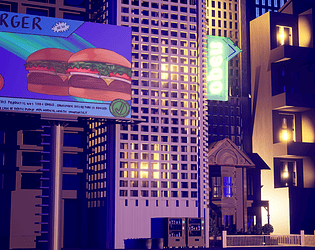
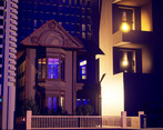
- I like your approach of the theme and what you tried to build. There is an issue with the lighting and composition of the scene (at least for a game). Your current screenshot don't sell the scene, I believe you could improve that with closer camera angle. I would have play with a better skybox and ground so you would have been able to transform the scene like a diorama.
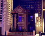
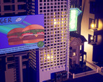
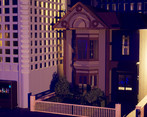
- - To create your buildings you could have made a set of modular pieces, this would have reduced the amount of work you needed to do. - The buildings could have more variation in them to help break up the repetition. I like the elements such as the billboard and the neon sign, it would be better if you leant more into these larger forms to add more colour, shapes and light sources. - It is difficult to make out the smaller house because you have a lot of sharper, orange light sources around the area drawing attention away from it. It would be better if these lights could be moved to the small house as you already have the complimentary colours of the orange lights against the blue post-processing to make the small house a focal point.
- Interesting concept. Would have been nice to see some trim sheet and tiling texture workflows - as you have learned, you can't make everything in Blender and expect it to translate well to engine, and it is a good idea to start getting things into engine even very roughly as soon as possible. Lighting is a little random and could have been enhanced by some streetlights, also think about other buildings that may cast shadows on this area even if they are not in shot.
- Hi Rosie, This is a really unique take on the theme and I really like how you have combined the idea of holding buildings with the dystopian setting really adding to that oppressive theme of large corporations pushing people out. I love the billboard. Its a shame you couldn't get some more random neon signs in there to really push the cyberpunk style and overwhelm the small house. I also think the backwards "open" sign could have easily been fixed. :) Also unfortunately in your documentation, your concept page was formatted strangely (for me at least) and I couldn't really read it. :( I did however like the planning and concepts for this page and this shows how you could have leant into that overwhelming billboard idea. You mention in your documentation that you were losing materials between Blender and Unreal. It is often the case in game development that a material will have its "proper" set up done engine side, and anything before that in the modeling software will just be there as a placeholder. This is because shader setups and functions are often unique to the specific engine. In future I would worry less about the Blender set up if you know you will be rendering it in an engine like Unreal. Your little house is nicely modelled with some nice supporting assets around it for clutter. Its a good focal point but just watch its scale against the other buildings. A cool take on the theme, and a good attempt at realizing it.
Challenge Tier
Rising Star
Leave a comment
Log in with itch.io to leave a comment.



Comments
No one has posted a comment yet