Play asset pack
Old Man's Garage's itch.io pageResults
| Criteria | Rank | Score* | Raw Score |
| Final Presentation | #23 | 3.500 | 3.500 |
| Creative Development | #26 | 3.167 | 3.167 |
| Project Documentation | #29 | 3.333 | 3.333 |
| Technical / Workflow | #29 | 3.167 | 3.167 |
| Overall | #30 | 3.200 | 3.200 |
| Research + Development | #45 | 2.833 | 2.833 |
Ranked from 6 ratings. Score is adjusted from raw score by the median number of ratings per game in the jam.
Judge feedback
Judge feedback is anonymous and shown in a random order.
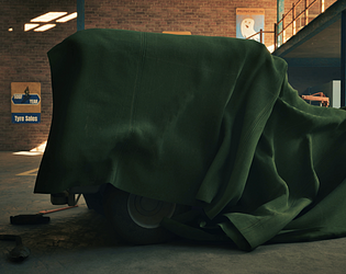
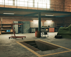
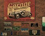
- There are some strong core skills on display here; gather research, modelling, texturing and lighting. The subject matter is ripe for a great scene. It would have been great to see more props cluttering the space and for them to be haphazardly placed to support the narrative. For example all the number plates are perfectly horizontal - ideally some would be a jaunty angles where they've slipped, or were put up in a rush. Also missing is a gleaming car. This is an important contrast asset to the concept work where the dirt, grime, oily scene is balanced by the focus of the mechanic - a beautifully kept, restored, polished car.
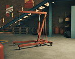
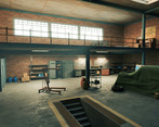
- I like the story telling and your approach of the theme. The scene is lacking of treatment for the structure : ground and walls. It does give an overall felling of emptiness when generally a garage is a bit messy, dirty and oily with more atmospheric and fog (as your reference are showing). I would focus on refining the lighting (lightshaft, fog, atmopshere). Adding more life to the elements, the ground (painting on it), more dirt.
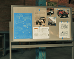
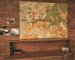
- I don't love the whole "choosing a project and then shoehorning it into a theme" thing if I'm honest, there's a few projects that have done it and it really stands out against projects that were created specially for SFAS. What I think would have really benefitted you is to only make the space as big as it needed to be, rather as big as it *could* be. This would have allowed you to create a much more intimate and well-fleshed out place, as what you have feels a little empty - working more on your references and iterating more on your blockout would have helped with this. Overall the scene looks nice in the screenshots, but it would have been nice to see some slightly more unique texturing.
Challenge Tier
Search For A Star
Leave a comment
Log in with itch.io to leave a comment.


Comments
No one has posted a comment yet