
Play asset pack
A World Without Art is Colourless's itch.io pageResults
| Criteria | Rank | Score* | Raw Score |
| Final Presentation | #34 | 3.104 | 3.400 |
| Technical / Workflow | #36 | 2.739 | 3.000 |
| Creative Development | #44 | 2.739 | 3.000 |
| Overall | #45 | 2.775 | 3.040 |
| Project Documentation | #48 | 2.739 | 3.000 |
| Research + Development | #53 | 2.556 | 2.800 |
Ranked from 5 ratings. Score is adjusted from raw score by the median number of ratings per game in the jam.
Judge feedback
Judge feedback is anonymous and shown in a random order.
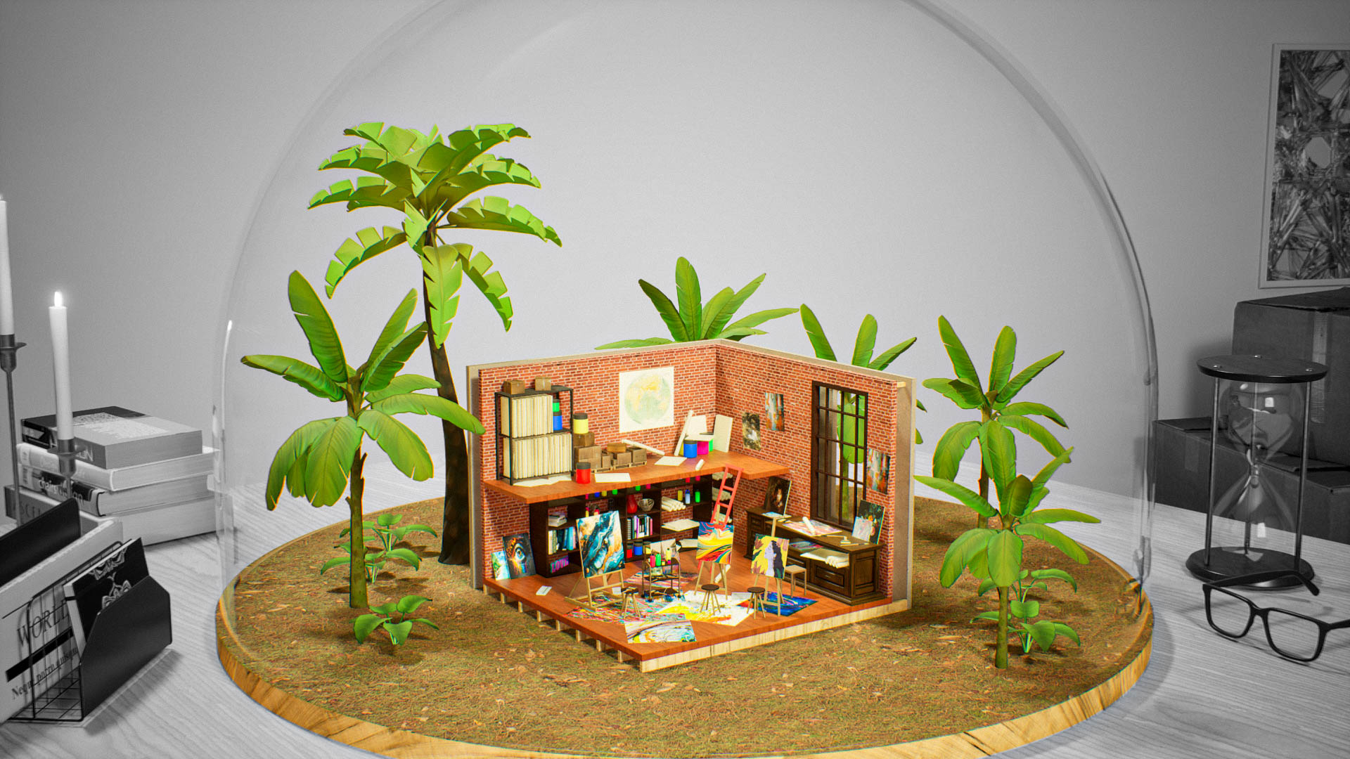
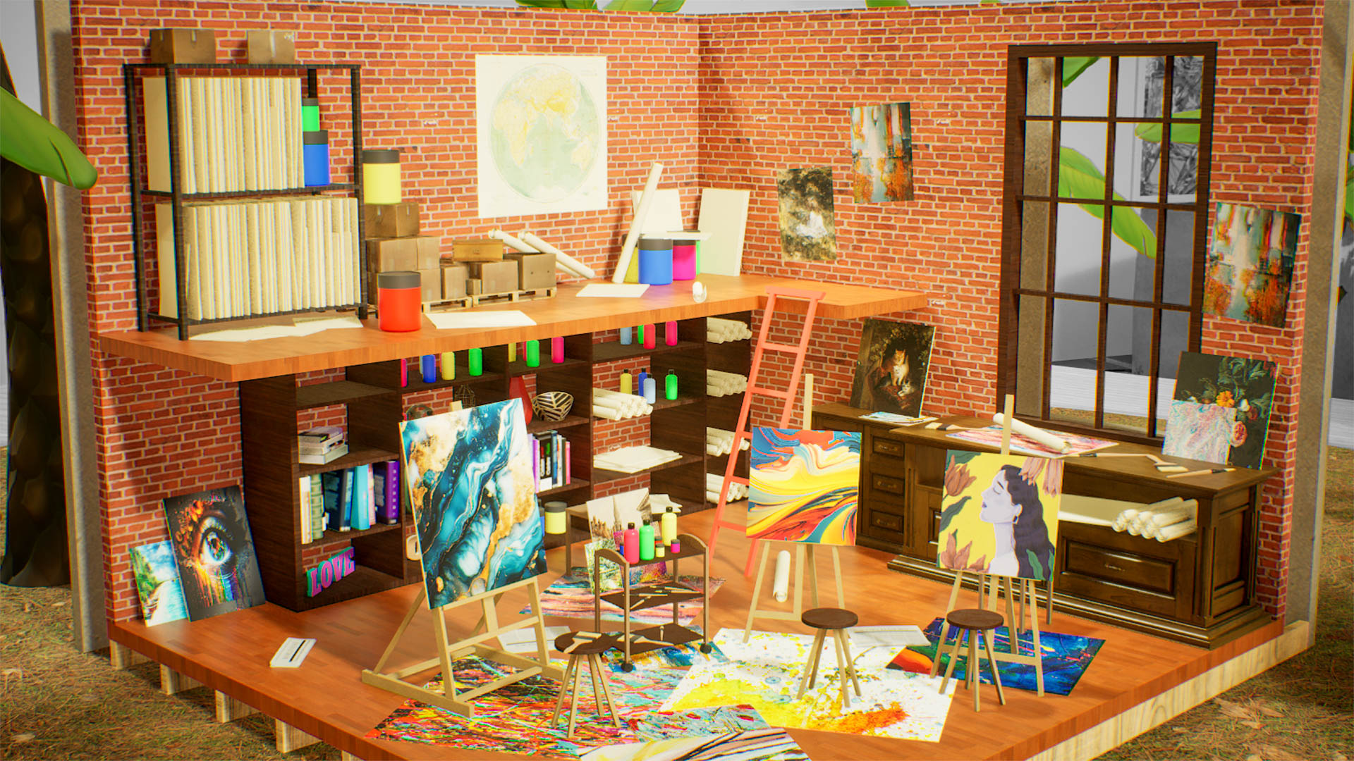
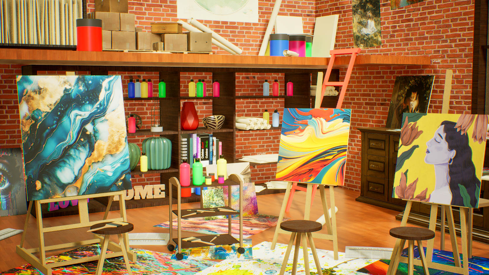
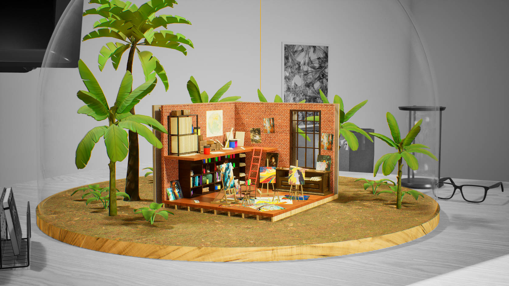
- Cool and different interpretation of this concept compared to others. Working at a small scale does often cause unexpected things to happen and can do really weird things to eg. physics, but you caught this early and worked around it - another solution could have been to scale the whole scene up by a certain factor. Some of your geo looks very high poly for how small it is but that partly depends on how this scene is expected to be viewed or interacted with. Regardless it would be good to see slightly less empty space on your UV maps - consider combining multiple objects onto one T-page to try and avoid this. Working at such a small scale poses some interesting questions such as how does the wood grain scale work? If you make small things out of wood, the grain doesn't get smaller too. So it would be good to see some thinking behind what is this diorama made of, rather than it just being a small version of a normal sized room. The scale of the bricks is also off, they look too small. Similarly with the foliage - it's a nice addition but how does it work in the context of the diorama. Overally it's a nice piece, I would have liked to see more in your documentation about your texturing process.
- Main idea is nice. I find that the overall scene is maybe a bit too messy and/or over lit. Adding more contrast would have being nice to understand what is happening. If you look at your pictures and scale them down/minimize, it's hard to understand what is what. Overall there is some good quality there but some assets have too many edges.
- A great competition submission! Well thought out, planned and implemented. Refreshing to see something colourful and brightly lit. Nice to see camera and lighting exploration early in production so that asset creation & placement can be checked as they are produced. Well done! Some of the poly resolutions are way to high for real-time. Whilst it's good to see UV acknowledge texel resolution and not stretching, there was a lot of wasted space (spatula) and I'd encourage more appropriate UV sizing, or grouping assets together. Great to see a final post fx stage (we often do this on screenshots) but the difference was negligible and you might have pushed vignette more to frame the core assets. And maybe play with Depth of Field again to bring the primary asset in to focus.
Challenge Tier
Search For A Star
Leave a comment
Log in with itch.io to leave a comment.
Comments
No one has posted a comment yet