Play asset pack
After the Carnival's itch.io pageResults
| Criteria | Rank | Score* | Raw Score |
| Project Documentation | #37 | 3.143 | 3.143 |
| Technical / Workflow | #41 | 2.714 | 2.714 |
| Research + Development | #43 | 2.857 | 2.857 |
| Overall | #46 | 2.771 | 2.771 |
| Creative Development | #50 | 2.714 | 2.714 |
| Final Presentation | #57 | 2.429 | 2.429 |
Ranked from 7 ratings. Score is adjusted from raw score by the median number of ratings per game in the jam.
Judge feedback
Judge feedback is anonymous and shown in a random order.
- Generally speaking the assets all have quite hard edges, despite the use of high poly bakes, which shows a slight misunderstanding of the use of high poly bakes. Ideally these bakes would be from high polys with nice smooth bevels so that the low polys can get this normal information. I would also have tackled the larger assets with the use of tileables, trim sheets, decals and masks rather than a unique texture, as the resolution would be very low.
- Asset creation itself isn't that bad. Though in term of environment composition, ground, technical aspect there is a lot of rework to be done.
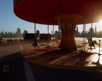
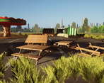
- Good use of non-destructive texturing workflow allowing you to easily make colour variations and multiple levels of damage on the horses - good effort on the sculpting too. Might have been easier to texture the carousel with trimsheets and tiling textures, but you made your method work. Wooden benches look like they have too many planks, remember to check references even for seemingly simple things. Remember to straighten your UVs wherever possible when doing hardsurface work, this helps prevent "jaggies" in your textures. Nice try with the cloth, although the dirt texturing texturing looks very generically placed and it would have been nice to see it collecting around the base etc. Maybe some grafitti or big rips or something to give it some individuality.
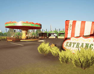
- The scene looks ok but could have told the story better, some more work on the ground surface would help enormously - cracks and litter and more weed-like foliage
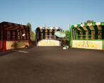
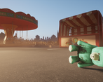
- - More variation/ breaking is need on the road, in all of your presentation renders it takes up a large amount of space. This could be achieved through vertex painting or adding more elements like litter. - All of your props have a very consistent mud splatter on them. Even though this does create variation, it can come across as generated. When it comes to dirt, rust, mud and other elements try to put them where it would realistically appear. - The flat trees in the background are quite noticeable. It would be better if you could do is create tree models and then place the flat trees behind them to make the area look more full. The cityscape in the background could have basic 3D meshes with the same textures placed on top. This issue is not the use of flat planes, but the lack to geometry to help give a sense of realistic space and lighting. - A distance fog would also help to make the planes less noticeable while also allowing the carousel be the focus of attention.
Challenge Tier
Search For A Star
Leave a comment
Log in with itch.io to leave a comment.



Comments
No one has posted a comment yet