Play asset pack
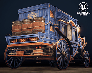
Stylized Wine Carriage's itch.io pageResults
| Criteria | Rank | Score* | Raw Score |
| Project Documentation | #1 | 4.556 | 4.556 |
| Technical / Workflow | #5 | 4.111 | 4.111 |
| Overall | #7 | 4.156 | 4.156 |
| Creative Development | #9 | 4.000 | 4.000 |
| Research + Development | #10 | 4.000 | 4.000 |
| Final Presentation | #15 | 4.111 | 4.111 |
Ranked from 9 ratings. Score is adjusted from raw score by the median number of ratings per game in the jam.
Judge feedback
Judge feedback is anonymous and shown in a random order.
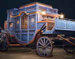
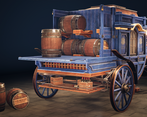
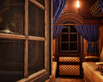
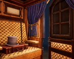
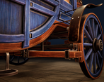
- This is a clean execution and shippable. I cannot give all the point since it's not an original creation. Though it's the quality close from expected for a shippable product. I would add that you can add life to your carriage: it's a bit too clean. You can add dirt decals, variations on the wood planks, also in the interior. Adding life is the missing element, otherwise it's a good job!
- Difficult to assess for Environment Art as strictly speaking it's a vehicle. I considered the carriage as being the architectural statement / structural piece. However, the assets are well crafted, homogenous, and show a high degree of competency.
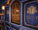
- Excellent documentation, thorough technical understanding of the process, good interpretation of the concept artwork. In terms of feedback and possible improvements I think the textures could benefit from more roughness variation, and could get an interesting contrast between the glossy blue painted wood and the worn and chipped edges. Also it's worth adding colours other than black for the dirt - perhaps a sandy dust. I think you could go chunkier with the bevels on the wooden planks, it would suit this art style. Nice work
- This has some excellent modeling and UVs and good textures. The materials for the blue and brown wood have very similar detail, glossiness, and contrast, some variety between the two would have been better. Some more dramatic lighting would help the renders not look so flat. Also, some variety on the edge wear is needed as it looks the same for the metal, leather, and wood. All in all, this is a very professional model but the materials need more care to make it excellent.
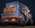
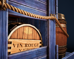
- A lot of the images presented at the start of the documentation are not your own, and are the work of the original concept artist. The link to the theme also seems quite tenuous, as the roof is not really a dome shape at all, and the pavement is barely an architectural element. I feel like you kind of just wanted to make the carriage and picked a theme that sort of (but not really) fitted. You're a very good modeller and your meshes are clean and well-UVed, but I can't really say that this has hit the brief. It would also have been nice to see some more unique texturing and not just using generators. Overall the result is a good folio piece and demonstrates technical acuity inside Unreal - it's not easy creating small interior spaces. Watch out for scalloping on your barrel, baking on to a mid poly mesh and then removing some edge loops would have helped with this.
Challenge Tier
Search For A Star
Leave a comment
Log in with itch.io to leave a comment.


Comments
No one has posted a comment yet