Play game
Search For A Star_ Under the Dome's itch.io pageResults
| Criteria | Rank | Score* | Raw Score |
| Research + Development | #10 | 4.000 | 4.000 |
| Project Documentation | #11 | 4.000 | 4.000 |
| Overall | #18 | 3.711 | 3.711 |
| Creative Development | #19 | 3.556 | 3.556 |
| Technical / Workflow | #19 | 3.556 | 3.556 |
| Final Presentation | #27 | 3.444 | 3.444 |
Ranked from 9 ratings. Score is adjusted from raw score by the median number of ratings per game in the jam.
Judge feedback
Judge feedback is anonymous and shown in a random order.
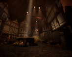
- The scene is really dark but you seem to have learned a lot in a really short space of time so well done for that. Maybe try upping the number of bounces on the global illumination? Good use of tiling textures and trim sheets, would have been nice to see a bit more unique texturing, eg. the barrel could have been a nice little self-contained asset rather than sharing the tilable wood textures. Try and straighten your UVs as much as possible wherever you can, it will make your life easier, pack better, and help prevent "jaggies". Not sure why you didn't export AO and metallic maps for your textures? If this was just the style you were going for then it would have been nice to see some evidence of that line of thinking.
- Gosh - there's a lot of positives in this highly commendable submission. The developments process was spot on, with description, concept reference, actual concept art and evolution of ideas - with elements being rejected. It's great to see this internal feedback loop happening before the big commitment of authoring artwork. Technically the approach was great and well documented - it was refreshing to see notes about texel & poly density. More-over the document was well presented with a font matching the tone, background wallpaper etc that felt like a true extension of the project. I have absolute confidence that this mind set and approach applied to future projects (this only being your first!) will yeild better and better results. Well done! ... Of course, I do have one area of note for improvement, and that's lighting. In a sea of thumbnail images, this project didn't leap out. The final images are dark, which is a result of the theme, but often horror films are surprisingly bright, or high-contrast and it's the suggestion of darkness that's on display. Take a Google image search for 'horror film lighting' to learn more.
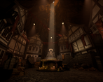
- - You mentioned that when exporting textures that you only exported base colour, roughness and normal. You can stack your roughness, metal and AO into a single texture that way to have more detail to use at little extra cost. - Good job with getting the focal point props into zBrush for sculpting, however some parts of these props have too dense of a polycount. Moving forward you could look into retopology techniques to reduce that polycount whilst keeping the detail in the bake and silhouette intact. - Excellent use of modularity for the buildings, I especially like the top parts of the buildings looming over. You have done well to avoid to many straight angles as this gives of an artificial look. The wooden supports could do with some wonkiness, don’t worry about the minor addition to polycount. - Nice work with creating different variation with the plaster material. It is hard to tell from the documentation if you used vertex painting in engine with them. If not, vertex painting is something that you should look into. - Excellent work with the focal point in the final shots. The light shaft really highlights and frames the scene. Try putting in distance fog to add depth to the scene.
- Appealing environment, good use of modularity, very thorough documentation, nice composition, good grasp of tools and workflows. Ideas for improvement: Maybe get more roughness variety in the materials, Perhaps some metallic elements, glossy reflective windows, and arrange lights to show reflections better, make some windows lit with emissive. Overall global illumination seems a bit lacking, lots of dark black corners, maybe play with Lumen settings.
- Good work. A lot of time and effort has gone into this scene and although it's not of professional quality yet I don't think it'll be long before you get up to speed. The scene is a little let down by the human figure; human figures are hard to model and unless you want to specialise in characters I would avoid them. In a company environment, the statue would be handed over to a character artist anyway. All in all, it's well-modeled, textured and lit. I think if you had more time you could have made it special.
- Please note that the following opinions are my personal observations and do not reflect the views of Maxis or Electronic Arts in any way. The foundations for a good understanding of the development process of environment creation and authoring are all present, and you have shown that you have a good idea of what's generally expected for typical environment composition. I think the project shows that you are headed in the right direction from a creative and theoretical point of view. From the initial ideas and development through to elements such as focal lighting and creating a sense of scale within the environment. Some tips for further development would to be to now hone those skills you've developed on this project even further, and just pushing those ideas a little outside of what you already know. Potentially exploring multiple lighting scenarios within your planning/blockout stage to broaden your options or to suggest multiple "moods" would have been nice to see to show why you went with this particular approach as opposed to another. Often lighting is an afterthought in a lot of people's personal work but actually it's an essential part of trying to convey a particular atmosphere/mood. You'll also find that setting your lighting early on actually helps with asset creation and standardisation within your materials. There's a tendency to create each asset in isolation in personal work which can sometimes lead to ambiguity in materials, silhouettes and often modeling styles themselves. Treat the lighting as part of the blockout phase and you'll be amazed at how much more quickly you can iterate on the modeling/texturing aspects. On the more technical side, the asset creation process was well thought out but lacked some aspects of production art workflow such as texel density consideration. The modular stairs are a good example of what looks to be some irregular texel density. Your approach to the cloth simulation makes sense for your scene, but also consider things like vertex animation within shaders to keep the polycount down a little - even if you don't use that approach there's some evidence of your consideration. Your theoretical use of modular sets to build the environment was the appropriate approach for this project, but some of the elements such as the archway focal asset could have been further optimised when looking at the game mesh. The witch state focal asset looked like it had fewer edge loops than the archway, and the density of the mesh was higher in the arms than in the larger, more visible areas like the base and skirt. Try to keep a uniform mesh density where you can, as it's a statue you can get away with reducing the overall poly count on the shackles for example - you'd be surprised how far you can push normal map details. Whilst on the subject of the statue, keep a look out for the edge loops and topology of the arms, there are a lot of edge loops there that aren't contributing to the overall silhouette and can be removed. On texture resolution, much studio work requires a higher authoring resolution than what is actually in game. Artists tend to rely on multiple UDIMs for complex objects that cannot feasibly fit into the 0-1 UV space at the appropriate texel density - often with 2 or 3 separate texture files at a lower resolution than a single one at 4k. Obviously this can differ by project, but I have rarely ever been able to use a single 4k texture for a single object during production at any studio I've worked at. Just something to consider. Overall I think this is an excellent attempt, and as I said previously you're developing all the right skills for a great foundation in environment production. My advice for you now would be to continue to analyse existing environments in games that you aspire to emulate and dive as deep as you can into investigating some of the points I've raised in this feedback. It's not always easy to hunt for some of the knowledge, so make sure you ask an Industry Professional for more advice or explanations on anything you're not too sure on - whether that's technical or process based. Good luck in your future projects! Antony O'Sullivan - Senior Environment Artist @Maxis/EA
Challenge Tier
Search For A Star


Leave a comment
Log in with itch.io to leave a comment.