Play Carousel Scene
Wonderval Carnival!'s itch.io pageResults
| Criteria | Rank | Score* | Raw Score |
| Project Documentation | #17 | 3.651 | 4.000 |
| Research + Development | #33 | 3.104 | 3.400 |
| Creative Development | #44 | 2.739 | 3.000 |
| Overall | #44 | 2.775 | 3.040 |
| Technical / Workflow | #60 | 2.191 | 2.400 |
| Final Presentation | #61 | 2.191 | 2.400 |
Ranked from 5 ratings. Score is adjusted from raw score by the median number of ratings per game in the jam.
Judge feedback
Judge feedback is anonymous and shown in a random order.
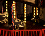
- There is texel resolution issues in general. You need to think that your element, which is the main actor here, has to get a good resolution (optimized) and put quality there. It looks okay in substance painter but not in the engine. Lighting might be one of the issue, it's not selling our scene and asset. Focus on refining the quality of your asset; maybe it doesn't need a proper environment but something more neutral like diorama style.
- Overall it turned out quite nicely! The main thing that stood out to me was the use of several texture sets for the large asset. Ideally you would use a mix of tileable textures, trim sheets, decals, 2nd UV channel masks, modular pieces to build an asset like this. There were also several elements with quite high poly assets, with wasted geometry that didn't add to the meshes final result.
- Some more thought into the presentation environment would help to sell this work better. Not much evidence of technical challenges and how they were overcome. Not clear if the drawn artwork on the carousel was the artists or not.
- Good work putting lots of small props on one texture page. If I had one single piece of advice it would be to look at your poly density and distrubution, as it is wildly varying - often far too dense for what is necessary, and yet at others not dense enough, as with the round things like the base of the carousel. There should be no such thing as "unseen UV shells"? If you can't see something, delete it! Second piece of advice would be to learn trim sheets as this would really have made your life easier and avoided a lot of the visible texture seams.
Challenge Tier
Search For A Star
Leave a comment
Log in with itch.io to leave a comment.







Comments
No one has posted a comment yet