Play asset pack
The Duskfell Carnival's itch.io pageResults
| Criteria | Rank | Score* | Raw Score |
| Creative Development | #1 | 4.667 | 4.667 |
| Final Presentation | #2 | 4.500 | 4.500 |
| Overall | #4 | 4.233 | 4.233 |
| Technical / Workflow | #7 | 4.000 | 4.000 |
| Project Documentation | #7 | 4.167 | 4.167 |
| Research + Development | #16 | 3.833 | 3.833 |
Ranked from 6 ratings. Score is adjusted from raw score by the median number of ratings per game in the jam.
Judge feedback
Judge feedback is anonymous and shown in a random order.
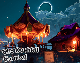
- Overall it's a great project. I would push a bit more on the modeling aspect to get more high poly on some elements. It would work for mobile games, but at the moment we can push a bit more even if it's stylized, at least to avoid the aspect "I can see the polygon". I could use smaller textures instead of a big one also for your props to get a better texel resolution. Some elements looks a bit low res when they shouldn't. The GPU will always load faster (in most of engines not using megatexture tech) few 512x512 than a unique 2048x2048. Generally from camera perspective it's fine, but thinking about a game with camera moving in the environment, you may need to refine the texture quality on the assets.
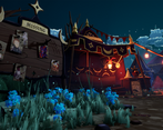
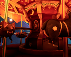
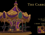
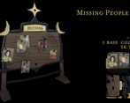
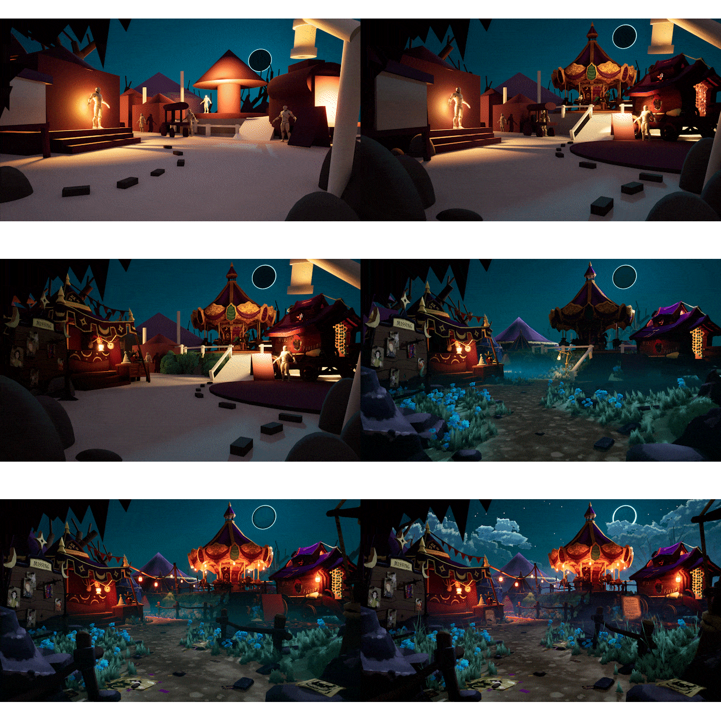
- Low poly is fine but there needs to be rules to make it consistent and eg. with the carousel the animals stand out as being a lot smoother and rounded compared to the obvious faceting on the main body of the carousel. Interesting that you didn't use roughness at all - I think this could have been pushed further with the addition of more specific edge highlights. It wasn't super clear to me whether your textures were a bit low res or intentinonally blurry - I think it is probably a bit of both. I found it a little frustrating on my eyes, my brain really wanted to bring things into focus more, and there are inconsistencies across the scene with some pieces having much sharper texturing such as the noticeboard. I wonder if you could have made use of some tiling textures and trim sheets to help alleviate this. Overall the scene came together quite well however, it has a nice vibe and the hand painted textures bring a level of uniqueness.
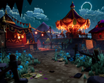
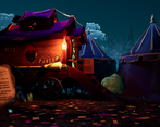
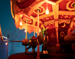
- This is quite a professional submission and it has the look and feel of an old Lucasarts game like Full Throttle. The lighting of the scene is excellent and garnishes the low-poly style. Some of the items that the player can get close to e.g. the carousel animals, I would have liked a bit more detail in the mesh. Overall this is a very creative submission, with a nice art style, controlled colour palette and excellent lighting.
Challenge Tier
Search For A Star
Leave a comment
Log in with itch.io to leave a comment.


Comments
No one has posted a comment yet