Play asset pack
The Cerulean Artificer's itch.io pageResults
| Criteria | Rank | Score* | Raw Score |
| Research + Development | #8 | 4.143 | 4.143 |
| Creative Development | #9 | 4.000 | 4.000 |
| Technical / Workflow | #10 | 3.857 | 3.857 |
| Final Presentation | #11 | 4.143 | 4.143 |
| Overall | #12 | 3.943 | 3.943 |
| Project Documentation | #23 | 3.571 | 3.571 |
Ranked from 7 ratings. Score is adjusted from raw score by the median number of ratings per game in the jam.
Judge feedback
Judge feedback is anonymous and shown in a random order.
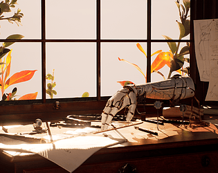
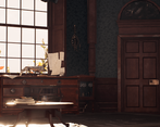
- There are some good qualities there. I like the idea behind the project and the story telling with the arm/hand crafter. I would refine some texture with more micro details (smaller texture tiled) to give more definition on closer shots. Your lightmap density is way too low resolution for the structure. The size of your texel is making half meter for some, which is way too low. Don't hesitate to have 1k lightmap on such small piece of environment. You will not catch any shadow and natural occlusion with large pixel for your lightmap.
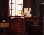
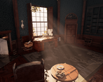
- - I love the focus and story telling that you have put into the prosthetic arm. The framing of this is also really well done. - Large areas of the scene, such as the walls, flooring and carpet could do with some variation or breaking up. - You have good 3D modelling skills, however a lot of your modelling is too dense with a lot of bevels, edge loops and geo that can be reduced further down. Normal maps can do a lot of the heavy lifting here. - You have really put attention into the lighting of the scene, it really gives of the right feel. I like how it frames the scene and highlights your focus point.
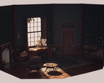
- I loved your attention to detail in the written letters and the hand drawn sketches used both as concept and throughout the piece. The prosthesis design is very intricate and an unusual idea, and it was interesting to read about how you linked it to the eternal artistic struggle.. Overall you tied everything together well, the style of the room feels appropriate to the blueprint designs and the writing in the letters. Couple of quick notes: make round things as round as they need to be (the coffee table for example looks a little chunky), watch your woodgrain (look at furniture and panelling construction methods), and it looks like there's something odd going on with the book pages on the shelves and the interior of the fireplace looking much brighter than their surroundings. Making the foliage outside the window could have been more effective, and it would have been nice to see a few more details in your documentation eg. UV maps. Nice work.. as long as there's no hidden sins ;)
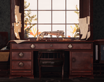
- Hi Olivia! A spectacular piece of work. This project has so much depth and story. I love how much you have considered every aspect of this piece, from the shape of the room, to the way the light falls. The scene is dripping with storytelling and world building, even without the pages of fully realized letters! (that's when you know you're enjoying building this world!) I think you show a lot of creative workflows and your models are clean and well realized. I especially like how effective the outdoor foliage is considering it was self sourced. If I was to critique one small thing, it would be that some of the surface details of the background objects look a little cloudy. The roughness in the lid of the prosthetics bin and the AO/grunge around the handles on the desk unit. Both could do with some breakup noise. This is very minor as the whole project stands together very nicely.
Challenge Tier
Search For A Star
Leave a comment
Log in with itch.io to leave a comment.


Comments
No one has posted a comment yet