


Play asset pack
SFAS: Carnival!'s itch.io pageResults
| Criteria | Rank | Score* | Raw Score |
| Final Presentation | #33 | 3.143 | 3.143 |
| Creative Development | #39 | 2.857 | 2.857 |
| Overall | #40 | 2.857 | 2.857 |
| Research + Development | #43 | 2.857 | 2.857 |
| Project Documentation | #45 | 2.857 | 2.857 |
| Technical / Workflow | #46 | 2.571 | 2.571 |
Ranked from 7 ratings. Score is adjusted from raw score by the median number of ratings per game in the jam.
Judge feedback
Judge feedback is anonymous and shown in a random order.
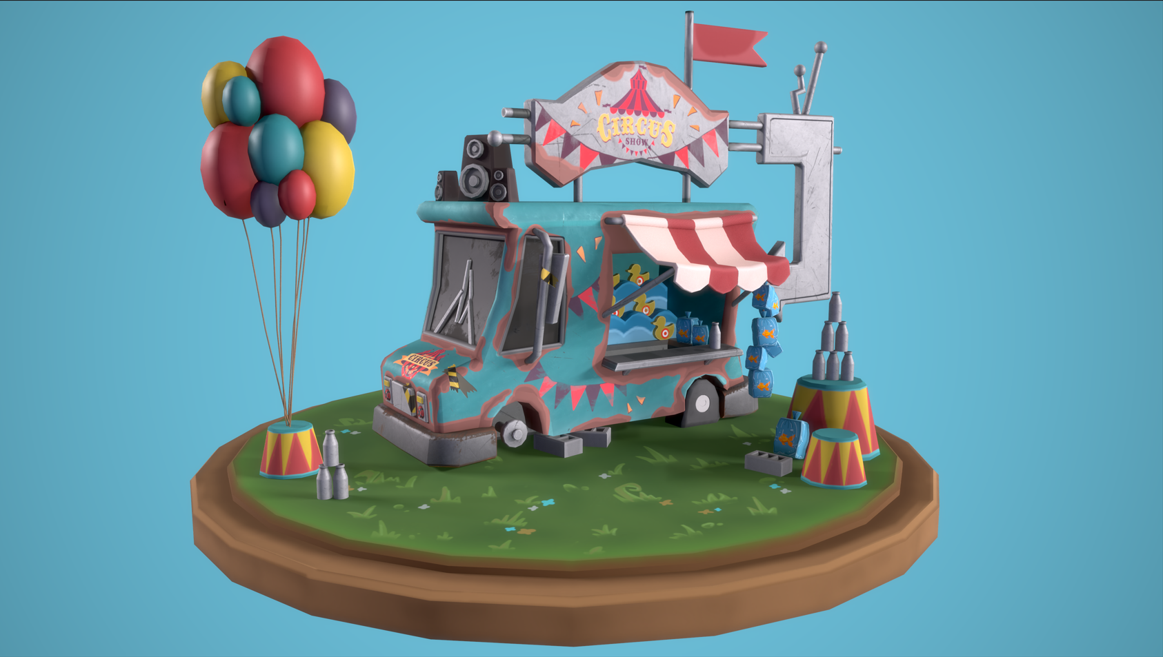
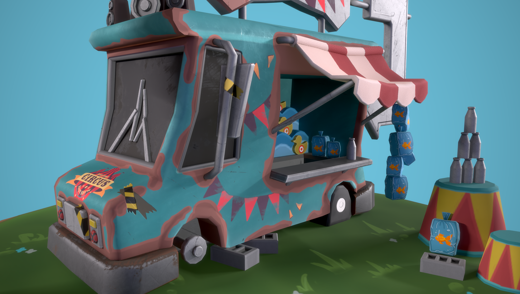
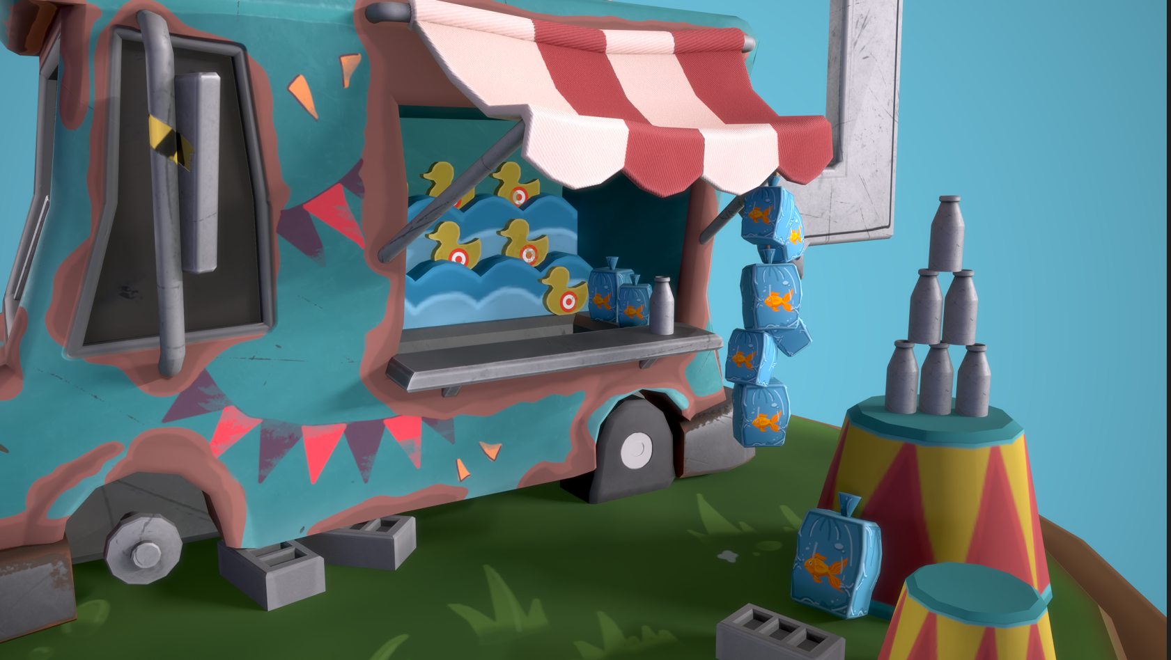
- - Excellent use of form and proportion for the silhouette - You’ve kept your model very optimised, however there are many areas that could do with the added geometry. You can see in areas such as the cloth or the frame around the front window that the silhouette is very blocky. - Moving forward I would highly recommend you get comfortable with creating a high-poly model and baking down the detail. The main reason for this is that when texturing stylised work you can use the baked information such as curvature, AO and World Position Normals to create masks during the texturing process. Examples such as using curvature to add edge details or the World Position Normals to create gradients. - The model itself has great levels of detail and narrative elements. Adding subtle moving elements can really push this aspect. Maybe have the ducks move or have the flag and balloons moving in the wind.
- It's a nice prop but I'm afraid I don't think it fully hits all the points of the brief. Particularly there's no architectural or structural element? It would have been nice to see some more breakdowns including your UVs, also watch for consistency with how round your round things are - the bottles look like they're much smoother and have way more edge divisions.
- It is a cute diorama. For mobile, the technical aspect would be okay. For current gen consoles and computers, you may have to improve your mesh resolutions with more edges on strategic places to make it look less low poly.
- I really enjoyed reading through the project documentation for this piece, it's great that the idea behind the scene has been developed through an initial idea moodboard and a second one that is more refined. I can see that you decided about the composition of the piece in your concept, I'd love to see what alternate options you sketched and what influenced your final choice. You have achieved the stylised appearance you were aiming for. Your documentation states that you were influenced by Overwatch for the piece, this can be a challenging task as they implement a very specific method of modelling and texturing. They use large edge bevels, painted highlights and have a general softness to their models. I think if you took your models to Zbrush and did a high poly polish pass it would help reduce sharp edges. Alternatively, applying chamfered edges in Maya would work. To be more efficient in your texturing, try organising your UVs by hand and arranging them to make the best use of available texture space Here's a presentation about the technical study of the Overwatch art style. Have a look at the environment section. https://polycount.com/discussion/170394/technical-study-overwatch-image-heavy The final presentation of the piece is clear and easy to read. The choice of background colour has washed out the scene slightly, but increasing the brightness of the lights and perhaps having a rim light would help with contrast. It would also be great to see some more variation in the material roughness, especially between the balloons and the painted metal surface of the truck. The piece is also the perfect diorama shape to present as a video turntable. I love the style of the project documentation, it's clear that you put a lot of thought into the project. I'd be interested to see what you thought of the reference images you chose for your moodboard using annotations. Consider using PureRef for collecting and organising your reference images. It's good to see that you reflected on your decisions for the piece during the whole production process. This is a great piece! You've demonstrated your competence for modelling in this art style, the assets are cohesive, and everything is presented well.
Challenge Tier
Search For A Star
Leave a comment
Log in with itch.io to leave a comment.
Comments
No one has posted a comment yet