Play game
Forgotten Memories's itch.io pageResults
| Criteria | Rank | Score* | Raw Score |
| Research + Development | #13 | 3.875 | 3.875 |
| Final Presentation | #13 | 4.125 | 4.125 |
| Creative Development | #15 | 3.750 | 3.750 |
| Overall | #16 | 3.775 | 3.775 |
| Technical / Workflow | #20 | 3.500 | 3.500 |
| Project Documentation | #21 | 3.625 | 3.625 |
Ranked from 8 ratings. Score is adjusted from raw score by the median number of ratings per game in the jam.
Judge feedback
Judge feedback is anonymous and shown in a random order.
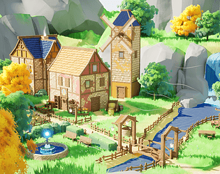
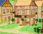
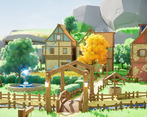
- It looks pretty. The global esthetic is nice. I would refine a bit the sculpting of the ground/landscape which would benefit from more love. The scene is a bit overlit and exposed. You can reach a pale/ghibli look without washing out the scene with the lighting.
- Good lighting and execution, buildings are a bit too orthogonal in design and placement
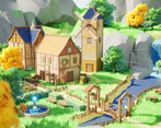
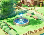
- - Some UV areas are stretched, have the wrong texture applied and look unfinished. - The modelling is good, however the props and buildings are all very straight. When it comes to stylised work, don’t be afraid to add more geometry, or other elements to help to break up the silhouette. - You have lots of areas of interest (ie. The fountain, the waterfall, the windmill) but lacking a true focal point, one of the previously mentioned areas could be developed on and become the focal point of the scene. - For the final presentation I really like all of the moving elements. It really gives the impression of a liveable space rather than a presented image. I personally believe that elements like this elevate environment work.
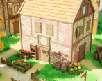
- Really nice result! The mood is very nice and compliments the style. The main visual drawback to me is the lack of geometry on assets - I.e the roof tiles look like flat planes with textures, with no silhouette breakup at all. Overall there's is a good use of tileables, shader work, lighting, vfx, speedtree.
- The fact that you did this in such a short amount of time is quite impressive considering the charm and cohesion of the result. Saying that, I don't see much evidence of the original concept coming through, beyond the colour palette of the "living" zone! It would have been nice to see a bit more of the development of your style, and why you chose to eg. do the tree leaves or water in that particular aesthetic, or why the houses were designed that way. I would also have really liked to see some wireframes and some UV layouts. Could the fruit for example have all been on one T-page to save having separate textures for each? Overall though it's really cute and I love the set-dressing.
Challenge Tier
Search For A Star
Leave a comment
Log in with itch.io to leave a comment.


Comments
No one has posted a comment yet