Play asset pack
BlueScrn Hide out's itch.io pageResults
| Criteria | Rank | Score* | Raw Score |
| Final Presentation | #34 | 3.104 | 3.400 |
| Technical / Workflow | #36 | 2.739 | 3.000 |
| Creative Development | #36 | 2.921 | 3.200 |
| Overall | #39 | 2.921 | 3.200 |
| Project Documentation | #39 | 3.104 | 3.400 |
| Research + Development | #47 | 2.739 | 3.000 |
Ranked from 5 ratings. Score is adjusted from raw score by the median number of ratings per game in the jam.
Judge feedback
Judge feedback is anonymous and shown in a random order.
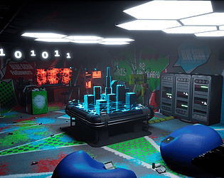
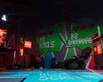
- Geometry looks mostly ok but could have been optimised further in some cases. It's also not advisable to leave ngons on meshes you import into game, as the engine may triangulate these with unwanted results. The use of the pop art thematic is interesting but I'm not sure it's been well applied - with such a bold aesthetic you can't really just chuck it in, it needs to make sense. How did those patterns get there? Did the hackers paint them themselves? Would it have been better to add some drips etc. to the ones on the walls, make them less regular and printed, and add some wear and tear to the ones on the floor? My large concern however is that I have no idea what theme this is supposed to fit, and it's discussed nowhere in the documentation which kind of makes me feel like you ignored that part of the brief. Which is a shame because some of the models are quite detailed and cool.
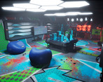
- Your scene would benefit from being less noisy visually and focus your lighting on your hologram table. There is generally a color and composition issue; not that elements are bad individually but the overall looks a bit noisy/without proper direction. It is fine to have colors in a scene, but you need to give an order and importance to each one. It could start by adding light/more presence to the hologram, dim the exterior, add some fog. The lights on your ceiling are too strong. You should desaturate your scene on photoshop, and look at improving the visbility of what is important (with a layer on the top of your screenshot, you paint with a black and white brush. Then you make it softlight mod in addition of your screen. It should be your target look).
- The overall result is great. Seems to have a good understanding of composition and individual asset creation. I would say the areas to improve on in the next project would be texturing and lighting as I feel they are what is holding this back slightly
Challenge Tier
Rising Star
Leave a comment
Log in with itch.io to leave a comment.



Comments
No one has posted a comment yet