Play asset pack
Internal Search's itch.io pageResults
| Criteria | Rank | Score* | Raw Score |
| Final Presentation | #34 | 3.104 | 3.400 |
| Creative Development | #44 | 2.739 | 3.000 |
| Technical / Workflow | #47 | 2.556 | 2.800 |
| Overall | #48 | 2.702 | 2.960 |
| Project Documentation | #48 | 2.739 | 3.000 |
| Research + Development | #56 | 2.373 | 2.600 |
Ranked from 5 ratings. Score is adjusted from raw score by the median number of ratings per game in the jam.
Judge feedback
Judge feedback is anonymous and shown in a random order.
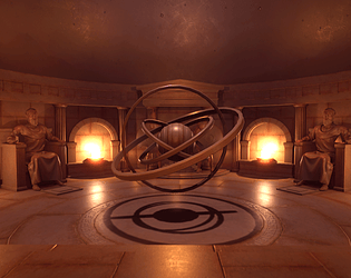
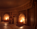
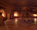
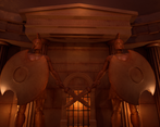
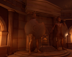
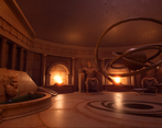
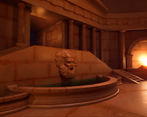
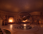
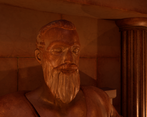
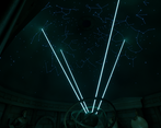
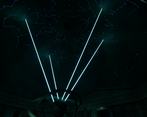
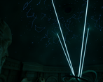
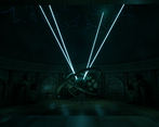
- There's some really great work here - the overall design and especially the character modelling/texturing. There's a lot of content and it's an achievement to have the scene wrapped up on time. The overall presentation might be improved in two main areas: 1. Use of differing colours (the scene is overwhelmingly beige) such as creams, or pink granite - that compliment the current material, just to break up the plinths, archways, or columns. 2. Until I saw the laser projections, the roof looked flat. Some details of stone courses, structural lines or even a few up lights would help show it's curvature. Otherwise - good work!
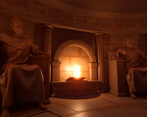
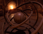
- Using Russell Crowe as a reference for a Greek warrior is a bit of an interesting choice, I would probably have looked at some classical sculptures and art from that region. It would have been nice to see some surface detail sculpted into the statues rather than just doing the basic shapes, especially as the texturing suggests that it isn't all perfectly smooth. The star looks like it was made slightly inefficiently due to the amount of black space on the texture and the spare space on the T-page. The dome needed some kind of texture or construction detail as it seems very plain compared to the rest of the room. Watch for using the same trim sheet at very different resolutions as it can do funny things with the scale and messes with the texel rate. Having a specific floor trim sheet may have been something to think about. Also make sure that round things are round and have enough edge divisions! Overall nice vibes though, the lighting has a certain opulence about it. Feel a little like you shoe-horned the theme into something you were already making though.
- I think you have a good base, material are good quality such as your sculpt. You need to play more with cold areas vs warm for your lighting. Currently, everything is too reflective : what is the benefit of a bright ceiling?
Challenge Tier
Rising Star
Leave a comment
Log in with itch.io to leave a comment.


Comments
No one has posted a comment yet