
Play asset pack
Airborne Atelier's itch.io pageResults
| Criteria | Rank | Score* | Raw Score |
| Creative Development | #8 | 4.017 | 4.400 |
| Technical / Workflow | #11 | 3.834 | 4.200 |
| Overall | #14 | 3.871 | 4.240 |
| Research + Development | #15 | 3.834 | 4.200 |
| Final Presentation | #16 | 4.017 | 4.400 |
| Project Documentation | #17 | 3.651 | 4.000 |
Ranked from 5 ratings. Score is adjusted from raw score by the median number of ratings per game in the jam.
Judge feedback
Judge feedback is anonymous and shown in a random order.
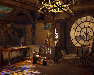
- This is a great scene. I would add DoF for the exterior or brighten the window (like the bounce of sun light you get inside). It's less interesting to see behind the window, the player should focus on your interior. Additionally, your scene would benefit from some atmospheric/volumetric fog, some dirt flying to create a more dense atmosphere that you may find in these places. It would pick some interesting lighting details also.
- This is a strong scene that is a nice addition to your portfolio. Through the documentation and final piece, it displays good execution both artistically and technically. Starting with the materials, it is always good to see that you have a clear understanding of the concept of texel density and used a sensible density. The materials look great and you got good use out of them. I would consider having separate images showcasing these materials if you feel the hold-up under scrutiny The scene has a great feeling of story and is executed very well with only a couple of potential minor improvements. Firstly starting with the composition of the shots. Although an interesting model and a requirement for SFAS for me the chandelier detracts from the shots. In one even blocking a proportion of what could be a great view down into the interesting artist's area blowing. Second, the highlight on it draws attention to it, and away from all the nice little details in the scene. I think removing the light source from the chandelier might help so the attention isn't drawn to the highlight on it. May also be worth considering moving it as I think could help the composition of the alternative shots without really effecting the main shot. Demonstrating how the assets can be utilised to create additional rooms is a nice touch. I wanted to mention that from a technical standpoint, you have demonstrated a good knowledge of optimised models and efficient workflows (An effective modular kit, combining textures into one and being effective with your polygons when considering the scale of the objects). You demonstrated this effectively with nicely laid out and clear breakdown images. A minor thing may be to consider combining the albedo, roughness and normal into 1 image. Something else that is great to see time management and decision-making to realise you needed to scope down your scene so you could achieve a quality scene. And lastly, one area that could improve that isn't directly related to the quality of work is the video. I think however cliche it is, having panning shots showing each area /shot would make them more cinematic than the single fly-around shot. However, this is mostly a personal preference To summarise a great piece with a nice style and quality to it with the bonus of showing technical skills and understanding. I think looking at this and your portfolio you are very much ready to start applying for jobs while continuing to add environments to your portfolio. I would suggest removing most of the pieces from before your guitar as at a quick glance they don't feel like an accurate depiction of your current skill). Great work and good luck with landing a job
- You get all the cookies for your attention to detail with the wood grain in terms of direction and edge details, nice work. When picking and choosing references from different eras, make sure you're anchoring them somehow in the way you're choosing them - these choices should make sense in context to eg. the technology and construction processes that exist in the game world. I think it was the right idea to cut the scope, if only because it would have likely made the scene bigger than the specified bounds. Table edge UVs could have been straightened - a bit of stretching is ok if it makes your life easier and it will reduce teture "jaggies" as well as making things easier to pack. Try not to place lights that obviously aren't coming from anywhere - I spot a few point lights in the middle of rooms and corridors when there are plentiful lights along the walls to act as your light sources. Some slightly rough edges to the papers on the wall would have been nice instead of the perfect CG straightness? Overall well planned and executed, well done.
Challenge Tier
Rising Star
Leave a comment
Log in with itch.io to leave a comment.
Comments
No one has posted a comment yet