Play asset pack
Clearspring Grove's itch.io pageResults
| Criteria | Rank | Score* | Raw Score |
| Final Presentation | #19 | 3.833 | 3.833 |
| Technical / Workflow | #20 | 3.500 | 3.500 |
| Overall | #23 | 3.433 | 3.433 |
| Creative Development | #24 | 3.333 | 3.333 |
| Project Documentation | #25 | 3.500 | 3.500 |
| Research + Development | #34 | 3.000 | 3.000 |
Ranked from 6 ratings. Score is adjusted from raw score by the median number of ratings per game in the jam.
Judge feedback
Judge feedback is anonymous and shown in a random order.
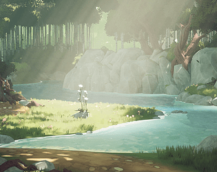
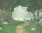
- The environment is looking pretty, I don't have specific comment about the technicality of the building. On the composition aspect, as you may have noticed in your references, there is maybe a lack of contrast in the aspect you picked. You should reduce your fog a bit, contrast a bit more to get more from your highlighted elements/center piece. You can get a pastel look without adding a strong fog layer on the top of the picture : pastel textures. You have a strong base, it needs some tweaks to be perfect!
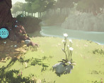
- Really beautiful scene. The vibe is really nice and comes through strongly. The individual assets and foliage hold up very well and work together cohesively, and the final presentation in the engine is great. My main critique would be maybe a little heavy on the fog and bloom as it gets a little unreadable in the video especially, but still works very well. Going forward I would look into utilising 2nd UV channels with large assets to texture with tileables and masks/bakes combined rather than purely using unique textures, as the resolution is limited otherwise.
- I really like that you did something a bit different with the technical elements of this scene, it definitely feels a bit different to a lot of the other entries. It would have been nice to see more planning, particularly a blockout where you figured out how to arrange the scene and light it to get the best out of the composition. Watch your texel rate across the scene as it looks like there is some variation eg. some larger rocks look blurrier. Also in the main screenshot the ground in the foreground looks really flat and could do with some small pebbles or something to break it up so it feels a bit more natural.
Challenge Tier
Search For A Star
Leave a comment
Log in with itch.io to leave a comment.


Comments
No one has posted a comment yet