Play asset pack
Echos From The Deep's itch.io pageResults
| Criteria | Rank | Score* | Raw Score |
| Technical / Workflow | #15 | 3.750 | 3.750 |
| Creative Development | #17 | 3.625 | 3.625 |
| Research + Development | #18 | 3.625 | 3.625 |
| Overall | #19 | 3.575 | 3.575 |
| Project Documentation | #21 | 3.625 | 3.625 |
| Final Presentation | #31 | 3.250 | 3.250 |
Ranked from 8 ratings. Score is adjusted from raw score by the median number of ratings per game in the jam.
Judge feedback
Judge feedback is anonymous and shown in a random order.
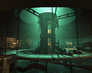
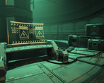
- Nice colour and composition, good modularity and use of trim sheets, very efficient in terms of textures and assets. I think you could afford to use a lot more polygons in your assets and be a bit more ambitious with the detail. There is no need to skimp on the poly count for a personal project, just push the boat out. Check out the latest and greatest game and then make that your benchmark for detail.
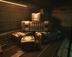
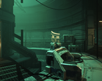
- A dramatic and well-realised scene. The animation helps to breathe life into what would otherwise be a very dead environment, some particle FX would have helped here.. Illumination effects would show off reflected surfaces and add more high frequency detail. The boxes, whilst nicely textured, could have been better value if they were less symmetrically design so they could be rotated for variety.
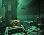
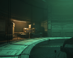
- Overall pretty competent, and the scene is framed nicely. Some things to look out for: the tiling texture used on the floor is also used on the wall and it doesn't work so well on the floor, making a specific floor texture would have been better. Edge detailing on the consoles is a little generic and overkill - I'd expect these to be less battered than eg. the crates. The green lighting creates an interesting vibe but it doesn't really fully sell "under the sea" - what could have been done to enhance this?
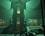
- It would have been nice to see some original sketch/drawing exploring design as part of the R&D phase. Whilst well documented, this was all the result of image captures. Whilst the individual assets were strong, the overall scene lack visual impact. The 'barrel' that houses the Time Machine object could have been far, far taller and deeper. The lighting gives a good sense of mood, but it has almost made the scene a monochromatic shade of green. Variation and balance is needed.
- Hi Malou! I really enjoyed your process of narrowing down which theme to choose and the logical thought that went in to deciding what should go in your scene. I thought this was a professional approach (excluding the expletive....! :D ). Your approach to shader work was an advanced workflow but I think you could have pushed this further and maybe used it on the bulkier parts of some of your props, like using it on the white painted metal parts of your control panel. This would free up more unique texture space for the bespoke parts of the model. I thought the lighting was nice and well thought out, as well as the iteration of composition, which can easily be overlooked but helps so much when its done right. I will say though, just watch out with your trim sheet normal maps. I'm not sure if they were exported in the wrong format or its because you have cut and paste different normals together, but some areas seem to have the wrong lighting direction (from what I can see). Overall great work.
Challenge Tier
Search For A Star
Leave a comment
Log in with itch.io to leave a comment.


Comments
No one has posted a comment yet