Play asset pack
Astrologer's Room's itch.io pageResults
| Criteria | Rank | Score* | Raw Score |
| Project Documentation | #15 | 3.667 | 3.667 |
| Research + Development | #21 | 3.500 | 3.500 |
| Creative Development | #26 | 3.167 | 3.167 |
| Overall | #28 | 3.267 | 3.267 |
| Final Presentation | #32 | 3.167 | 3.167 |
| Technical / Workflow | #34 | 2.833 | 2.833 |
Ranked from 6 ratings. Score is adjusted from raw score by the median number of ratings per game in the jam.
Judge feedback
Judge feedback is anonymous and shown in a random order.
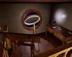
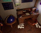
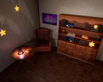
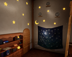
- - This project was really well done and presented thoroughly. - I think moving forward you should look into becoming more confident with your props. You already have low-poly modelling and unwrapping down, but your next step should be creating high poly models to bake down the details. - Your unwraps are well organised and use all of the space available. - Textures from substance to unreal will always look different, this is a good observation. What you should take away from this is the importance of getting thing into unreal quickly and allowing yourself the time to make adjustments to the colour afterwards. - You have the right idea about needing decals to break up the scene more, this can also be achieved through vertex painting and even using different coloured lights in your scene. However, you did break it up somewhat through the use of posters and the flag on the wall and the papers on the floor. - I feel that in the final presentations the lighting is too intense due to the values between your lights and dark.
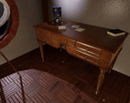
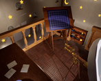
- Excellent organisation, not seen many people using Trello. Good evidence of blockout planning and lighting tests. Polys looks relatively even across the scene but there are a definitely a few curved things that could have used a few more divisions and a few other things that look like they had too much geo for their size. UVs generally look pretty straight, nice! There are a few shells that could still be straightened out though - sometimes a little distortion is worth it if it avoids texture "jaggies". Props are the strongest element of the scene but check construction details particularly when it comes to wooden things. Attention to grain direction will make your assets stand out. Also small room details like a door frame and skirting boards and a proper edge to the mezzanine would have been good. Your lighting is letting you down a little as the point lights are bouncing off the walls with no source - I like the emissive stars though!
- The asset creation is okay. The building structure though is bad, it's basically a cube with a floor texture as ceiling. I would push you to rework your building structure and make something logical and aesthetic.
- Really nice result. overall props are nice but some have some issues with hard edges where the highpoly bake hasn't had any bevels, or maybe they weren't baked - and some have too little topology, meaning you can ealisy see their silhouette are low poly.
Challenge Tier
Rising Star
Leave a comment
Log in with itch.io to leave a comment.


Comments
No one has posted a comment yet