Play asset pack
The Soup of Stars's itch.io pageResults
| Criteria | Rank | Score* | Raw Score |
| Creative Development | #9 | 4.000 | 4.000 |
| Research + Development | #10 | 4.000 | 4.000 |
| Project Documentation | #13 | 3.875 | 3.875 |
| Final Presentation | #13 | 4.125 | 4.125 |
| Overall | #13 | 3.875 | 3.875 |
| Technical / Workflow | #24 | 3.375 | 3.375 |
Ranked from 8 ratings. Score is adjusted from raw score by the median number of ratings per game in the jam.
Judge feedback
Judge feedback is anonymous and shown in a random order.
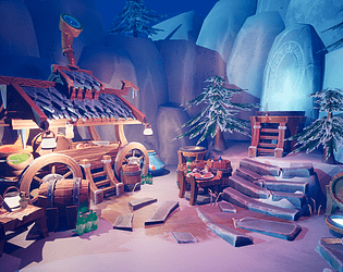
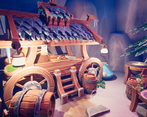
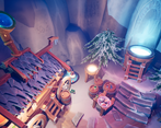
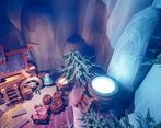
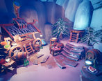
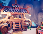
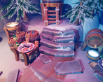
- There is a fantastic amount of development that has gone into this project, I was impressed by the depth of research you've undertaken. It's great that you have been inspired by other game art pieces for your composition, you've read articles and followed courses to learn new techniques and best practices. I liked that you have shown your blockout development and the composition thumbnail exploration, especially the annotated studies and comparisons with other environment art pieces. The visual style you have chosen works effectively in this scene, and I love how you've framed the composition with the rocks in the background. There's also good use of lighting to convey mood and tone. Stylised assets are frequently used in highly optimised games, often for mobile and console platforms. To improve your technical workflow, you could try channel packing your roughness, metallic and ambient occlusion maps into the RGB channels of a single texture. Also, it's best practice to use a clear and consistent naming convention for your files to make it easier for other developers to find and use your assets. I noticed that your wagon consisted of multiple repetitions of the same models, these could have been merged into one asset. Have a look into instanced static meshes, this is a performance improving method that reduces drawcalls when there are multiple instances of the same mesh in one scene. It is a technique used very often when working with modular environments. https://gamedevexp.com/unreal-engine-instanced-static-mesh/ The main presentation image that contains all your assets is framed very nicely; it would have been good to see some more final angles containing the whole piece. Overall, your work is thorough and well researched, and it was good to see so many references included at the end of your documentation. The environment you have created has a strong sense of mood, and the quality of your textures is great. I love the handpainted appearance you have accomplished through your use of Zbrush and Substance Painter. This is a great environment piece!
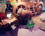
- I really enjoyed the overall palette of this scene and I appreciated the attention to detail with the wood end grain! Try and make sure that you keep your texel rates and treatment consistent, some assets like the small bottles look a little out of place and the background rocks look like they've either been scaled up a lot or the details weren't authored at the right scale compared to the rest of the scene. It's a good idea to try and straighten your UV shells wherever possible, as it will make your life a lot easier and help reduce "jaggies". It also looks like you had room to pack things a little tighter, which would have gained you a bit extra resolution. The least successful part for me is the trees, which look very stunted - a taller variant would have been great.
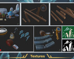
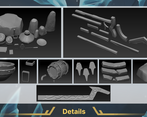
- Hiya! Well done for getting your submission in on time, it looks great :) R+D 4/5 I really liked the fact that you thoroughly took into consideration the composition/lighting in the scene. This definitely helped make the scene feel full and interesting despite it being a smaller scene. I would have liked to see a little more references for the set dressing props, as the sooner you consider the smaller details it will help give you a clear vision of what you want to achieve and help you understand your overall scope. It’s also great to see how much you stuck with the lighting in the scene, as many underestimate the importance of this. In future it may be useful to get some separate references for what the different materials look like in different lighting setups as sometimes it can throw you off once you get into engine. Creativity 4/5 The quality and look of the scene is great! The way you included interesting details and props really lifted the scene: for example the telescope on the wooden hut one side, and the mystical rock and water the other helped give it a strong narrative whilst keeping in line with the chosen theme. If you had a little longer, I would have put a couple more props inside the trailer to really sell the idea of a viking star gazer mapping out constellations: having small details across the scene really helps show employers your creativity and your eye for details. Technical 3/5 You made great use of your reusable assets. When going through the scene in unreal I was really impressed with this. I did notice the “keg holder” assets, only had faces on a couple of the sides. In future, always try and have faces on everything so that you will always be able to reuse it in multiple cases: you never know when it might be useful :) I also thought you made really fab use of all of your normal maps from your high to low poly bakes. I did notice you have a lot of different texture maps rather than channel packing them together; as texture maps are expensive in game engines it’s always best to try and do some channel packing. You can do this by loading all your maps into substance painter in texture set settings and then exporting them using a preset template or creating your own. Another way is in photoshop: https://www.youtube.com/watch?v=0lNYRO6LR0g and then exporting as a png/targa etc. Once you’ve brought these into unreal, instead of connecting the RGB of a map to the node, either connect the separate R/G/B to the given node. For example, if your Roughness is packed into the green (G) channel, connect G to Roughness. There was also some room for improvement in your UVs. It was fab using just 3 UV sets for your whole scene so you’re already off to a good start :D I noticed that you seem to have a lot of very small UV islands which can be combined. In future try and avoid these as when putting textures into a game engine, when compression kicks in, it can really affect the end result and will make it harder on you to texture. From a glance, if I were taking the barrel, I would probably try and have 3 UV islands, for each side and then the middle part. You can totally still have different colour IDs to separate materials. When baking, generally, the only hard edges needed are those of the UV island texture border as otherwise it can cause jagged baking errors. Even in maya if it looks broken with all the soft edges, if you bake it right it should turn out crisp :) 4 / 5 Overall good documentation I would have liked a little more explanation on how you went about breaking the meshes down when planning to reuse them across the scene. Thank you for showing your UV maps and textures, always try and include these when uploading things to your portfolio! :) I liked reading your conclusion although I would have liked to also see a little more reflection about your processes - what worked and what didn’t, did you change any of your processes half way through? Did you achieve what you set out to do etc. These sorts of questions do get asked in interviews, so having practice like this is important! 5/5 Presentation. I think the way you did the kit breakdowns, showed your UVs/Maps etc is really great. The shots had really nice composition and you showed that you spent a good amount of time considering this. When uploading to artstation it might be nice just running them through photoshop to balance out some of the areas which are being slightly washed out with the bright lights but a quick adjustment of contrast/levels will really help :) Overall lovely work! :D
Challenge Tier
Search For A Star
Leave a comment
Log in with itch.io to leave a comment.



Comments
No one has posted a comment yet