Play asset pack
The Sanguine Studio's itch.io pageResults
| Criteria | Rank | Score* | Raw Score |
| Research + Development | #24 | 3.429 | 3.429 |
| Final Presentation | #30 | 3.286 | 3.286 |
| Creative Development | #33 | 3.000 | 3.000 |
| Overall | #35 | 3.086 | 3.086 |
| Project Documentation | #40 | 3.000 | 3.000 |
| Technical / Workflow | #41 | 2.714 | 2.714 |
Ranked from 7 ratings. Score is adjusted from raw score by the median number of ratings per game in the jam.
Judge feedback
Judge feedback is anonymous and shown in a random order.
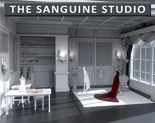
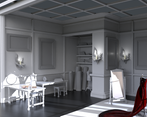
- This is a really interesting aesthetic, but bearing in mind that basically everyone else has attempted to fully texture everything I'm struggling to rate it more highly on the basis that you basically skipped a massive step with nearly everything in the scene. On the plus side the scene is quite nicely lit, and the composition feels spacious and balanced. I would have loved to see *something* done to the white and grey assets to elevate them above what's essentially what we call a "whitebox" - some of the models could also potentially have had a few more polys in them to make them a bit less blocky.
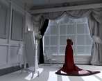
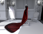
- Obviously incomplete, however an interesting concept that would be worth exploring further. I am sure it's not what you intended, but the scene actually works as a minimalist environment as it highlights the red dress. Some more storytelling components would be an improvement - perhaps some dress making tools or bits of torn fabric to show the dress is in progress.
- This is a well researched project with great defining art and ambiance goals. It's good to see use of Marvelous to achieve the gown. It's significant choice to adopt a plain environment as this gives us limited scope to access texturing ability and lays more weight on the quality of the geometry work, which hasn't come quite to the standard to compensate. There should be more fidelity in the architectural details of wood panelling, window frames etc.
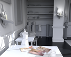
- Hi Claire, This is a really great project, and a very professional attempt as a first year! I really enjoyed reading over your research, it was very well thought out and funny. :) While it was a choice based on time constraints I actually really like the effect of the monochrome world with the dress being the only pop of colour. It really gives the piece style. To say your new to 3D packages, you seem comfortable in Marvelous Designer as I'm sure you will find a lot of it familiar with your textiles background. It would have been good to see some more breakdowns of your dress prop etc in your documentation. And I think one thing that could have elevated this piece a little more would be that, although you chose the untextured background to help budget your time. I think that if you added a few areas of varying roughness (speckles on the carpet, wood grain and wipe marks on the table, this would have pushed the style and could have easily just been tile-able textures to keep things simple and subtle. Overall really nice piece.
Challenge Tier
Rising Star
Leave a comment
Log in with itch.io to leave a comment.


Comments
No one has posted a comment yet